Posted on

Influence of the Week – Bauhaus Inspired Ceramics

It’s early February and we think we’ve just caught the ‘ceramic’ fever. Perfectly timed with the month of love. Just when you think you’ve seen them all, then you stumble on yet another beautiful collection. Maison et Objet 2016 was on last week and has been a fantastic source of inspiration. As always, they showcased a vast array of designers, both upcoming and seasoned veterans.

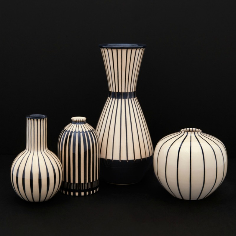
We made an exciting discovery through Architectural Digest. These beautiful Bauhaus ceramics are the epitome of sophistication. They are influenced by the original works of German artist, Hedwig-Bollhagen Ritz.

blog1_maison-et-objet-ceramics_Hedwig bollhagen

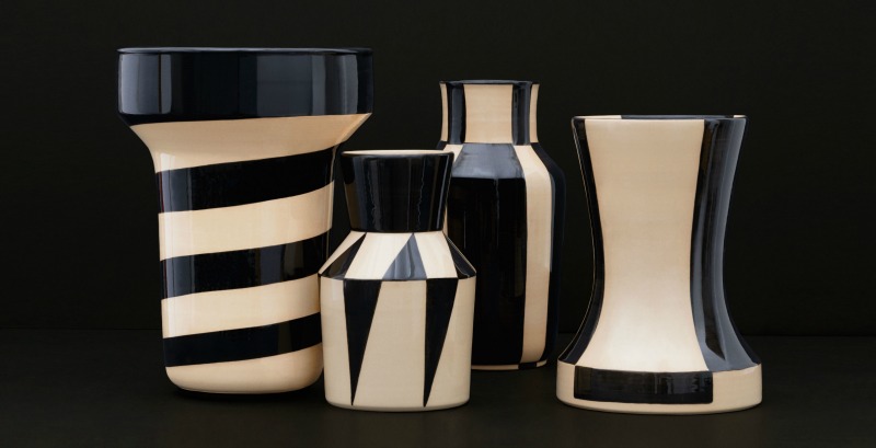
Sometimes it’s the extra details which give a room that extra sense of character. We like the bold and structured use of black and white in the designs. They have a bit of an Art Deco feel to them. Each design seems to work harmoniously with the shape of the vessel.  Whether displayed singly or as a collection, these would look stunning on a coffee table.

blog2_maison-object_ceramics_hedwig bollhagen

Not sure of how to display ceramics at home? Apartment Therapy has some brilliant ideas. We’ll definitely be looking up more of this designer’s work.

Image sources

Maison Objet

Architectural Digest

Posted on

See Different: Discovering the Power of Pattern

Today, we introduce you to Patternity. For something a little bit different, we’re looking at patterns. This is one of the first things you learn as a textile designer. A constant source of inspiration is key for your creations. You’re taught to look at things differently and develop a knack for looking beyond the obvious.

Musical instruments with tremendous detail. Sea creatures in sublime splendour. The galaxy with its hypnotic qualities. Look long enough and distinct patterns start to emerge, colours take a different turn and beauty awakens. The unexpected has a way of fuelling our inspiration.

blog1_PATTERNITY_water-beads-darrell-horner

Stumbling on Patternity was like a child finding a treasure box of sweets.  Their photo archive is a fantastic source of inspiration. From water, hair to soap bubbles, they show you just how ubiquitous patterns are.

Patternity was founded on the belief that “a shared awareness of pattern has the power to positively shape our world”. Originally known for their extensive online pattern archive, they’ve expanded into research and consultancy and also have a creative studio.

blog3_Patternity_Luminescent-Glass

At Moody Monday, one of our core values is seeing hidden beauty and expressing it. We seek out hidden beauty and take out inspiration from unlikely places. So Patternity is a company after our own heart, they align well with our thinking.

blog2_Patternity_Kalaeidescope-Sushi

Our Secret Music collection was inspired by the internal parts of an abandoned organ. A trip to the beach birthed our ‘Gems on the beach’ silk cushion.  Wait till you see our next collection.

Take some time over the next couple of days to look around you for inspiration. You might not want to become a designer but you’ll appreciate your environment just a little better.

All images were sourced from Patternity

Posted on

Stockist Profile – Concrete Wardrobe

For our first stockist spotlight this September, we’re keeping it local and bringing things back home to Edinburgh. The business we’re featuring today is Concrete Wardrobe.

Concrete Wardrobe co-founders, James Donald and Fiona MacIntosh started the business in 2000 with the mission to showcase contemporary Scottish craftsmanship and design. They continue to maintain this ethos and as a result have an extensive team of talented designers which they collaborate with. They also share design stories through their Maker of the Month series.

blog1_ConcWard

The shop located at 50a Broughton Street, Edinburgh is packed with a variety of quality homewares, jewellery, prints, glass, ceramics and accessories. Our Black Keys wallpaper beautifully graces the interior of the shop and you can also find our beautiful range of Moody Monday coasters and place mats in there too.

blog2_ConcWard

Whether you’re new to buying products from Scottish trained or based designers or you’re already an advocate and couldn’t see yourself buying anything else, this store is definitely worth visiting.

blog3_ConcWard

You can find Concrete Wardrobe on Facebook for more news updates or their website.

Posted on

Design focus: Refurbishment of Blake Tower

Architecture is one of our key interests here at Moody Monday. We furnish spaces and buildings with our wall coverings and interior accessories after all.

Conran and Partners, an architecture and design studio has been appointed to revamp the grade II listed Blake Tower into an exceptional residential London development.

blog4_blaketower

The Blake Tower, which was named after the 18th-century poet, William Blake is part of the widely known Barbican Estate in London. The Estate is known as one of the largest examples of the Brutalist concrete architecture and represents a Utopian ideal for inner-city living.

blog1_blake tower

It will be transformed from a youth hostel into 74 luxury apartments. The 17-storey building before becoming unoccupied in 2012 was home to 250 young people as London’s most inner city YMCA. The interiors will be inspired with the shapes of the Barbican’s buildings and the softening of the external public spaces which have established lush greenery and landscape in mind.

blog2_blake tower

A range of one, two and three bedrooms, studios and penthouses will be available. Look out, all keen property investors.

Story and images via Dezeen

Posted on

Remarkable 17th Century Colour manual

Only someone with an astonishing love of colour will go about creating a massive 800-page manual on how to mix watercolours. That’s exactly what a Dutch artist only known by the name “A. Boogert” did in 1692. The manual which was never published provides readers with an unusual glimpse into the world of 17th century painters and illustrators.

In it, A. Boogert carefully details step by step instructions on how to create as many different hues and tones of colours as are imaginable. The entire book is entirely written and painted by hand and is probably deemed to be the most comprehensive guide to paint and colour ever.

blog1_colourguide

Long before the renowned, more recent Pantone Colour Guide which was only first published in 1963, this Dutch artist had such an enviable grasp of colour. Thought to have been used as an educational guide in its time, he painstakingly documented his process, creating an awesome index of colours.

blog2_colourguide

blog6_colourguide

This delightful masterpiece is currently housed at the Bibliothèque Méjanes in Aix-en-Provence, France but is available for online viewing here.

Story via CreativeBoom

Posted on

Inspiring creations – Glass sculptures

Before seeing this, it was easy to assume that it was impossible for something as seemingly delicate as glass and a material as solid as concrete could be a winning combination. By giving glass an almost liquid-like nature, the artist we’re featuring today perfects this effortlessly with great skill, superb intuition and bags of research behind him.

Ben Young creates intricate sculptural works from these two main materials. There is no sophisticated technology or digital help involved in the process as all of his creations are hand drawn, hand cut and handcrafted from 4mm float glass, the ones used in windows. To do the cutting, he uses a glazier’s oil filled glass cutter.

blog1_glass blog2_glass

He usually works on multiple pieces at a time, sometimes up to ten, with each one exquisitely unique in its own right. They vary in how long they take to make, from a few weeks to a month.

blog3_glass

A man of many skills – this self-taught artist, furniture maker, and surfer started this venture into glass-sculptures after seeing his dad make a glass wave years ago. He has no doubt developed his craft to perfection.
blog4_glass

There’s so much more to see of Ben’s work, have a look at his website, www.brokenliquid.com and Facebook page.

All images reproduced with permission from artist.

Posted on

Visual Texture for Interior Walls

We hope you’ve enjoyed the previous post on tactile texture for interior walls and today we’d like to offer a few inspiring ideas for using visual texture, in creating outstanding feature walls.

Using visual texture, the wall mimics a 3D appearance by creating a visual effect of spatiality and depth. The first two examples presented below use strong colours that add a dash of dramatism to the space, while the patterns in the wallcovering design create the illusion of a texture:

Visual textured walls

The textured faux-painting technique (left) creates a rich wall that mimics the patters of natural stone, and is nicely contrasted by using furniture and accessories in neutral colours. Paint can be used to mimic natural stone, leather, wood and even pitted metal.

In more toned down hues, the following implementations also create a nice visual effect; the right one makes us think of a dreamy sunset on a cloudy summer sky, while the image on the left mirrors the flooring pattern, creating a surreal, interesting effect for the living space:

Visual textured wall covering

And yet another use of visual texture is present in these two interiors that use neutral colours, to mimic the appearance of unfinished room or naked tile walls and ceiling:

Textured wall coverings

While we like both equally, we have to admit the concrete wall on the left would look best in a non-domestic interior, while the unfinished naked tile walls can work wonders both in the home and other office or public spaces.

Posted on

Salone Del Mobile, Milano – Part 2: Glass Furniture

A couple of weeks ago we posted about the vibrant root vases we discovered thanks to Salone del Mobile in Milano. Today we’re looking at Patricia Urquiola’s work, also present in the Milano exhibition: and we were quite taken by her innovative approach!

1-Blog-SHIMMER_PatriciaUrquiola

Are you as intrigued as we were? Entitled SHIMMER, the collection comprises low tables, consoles and shelves in laminated and glued glass, characterized by a special iridescent multi-chromatic finish:

2-Blog-SHIMMER_PatriciaUrquiola

The nuance varies according to the angle of the light source and the vantage point, giving the reflected objects a magical and ethereal appearance:

3-Blog-SHIMMER_PatriciaUrquiola

We learned from Glas Italia that the collection items come in opaque or transparent glass, or transparent glass with a special micro dot decoration. We this this one in particular is hypnotically elegant:

4-Blog-SHIMMER_PatriciaUrquiola

Posted on

Here’s How to Turn Small Interiors Into Real Bijoux

They say small rooms can be a headache, but they can also be a blessing in disguise! If you are looking to make the most out of a tiny space – be it a living room, guest bedroom or second bathroom, here are our top tips on making the most of it.

Using a pale colour scheme can make the space look more airy and bright, and even a tiny single bedroom can look quite spacious:

Blog-small-spaces-1

To keep the room from becoming too bland though, we recommend adding some bold patters or textures, such as a feature wall, to give a point of visual interest to the room. Here’s our interpretation, using the Black Keys wallcovering:

Slides 01

Using a small room for multiple purposes can be quite the challenge ass well, so that’s the best time to bring the big creative guns out. For example, consider incorporating furniture that isn’t your typical ‘home office’, but rather something that will bend in with the rest of the room design. Here are two examples, first of a living-room & study area, and the second of a bedroom & home office:

blog-small-spaces-2

And finally, we’ve looked into small bathroom as well. We really dislike than feeling of being crowded and uncomfortable in a tiny restroom. Luckily, there’s a way around it, and we find that adding a dash of personality, with an accent call, can help to create the illusion of more space, even to the tiniest bathroom:

blog-small-spaces-3

Posted on

A Small Bite of Industrial Design

This week we’re taking Moody Monday out, and exploring industrial designs in restaurants. We’ve chosen two quite different ones, to get different perspectives on how industrial design can fit in with the eating experience.

The first is the PAT’S steakhouse in Melbourne Australia:

Blog-2

We particularly liked the uncommon mix of industrial look and cosiness of this space, created by the tangled lighting system on the ceiling build on pipes, and the warm, lively orange hues of the walls. It builds a balanced look for the place, both inviting and enigmatic.

On a more heavily industrial note, we like the Blue Butcher restaurant in central Hong Kong, China:Blog-1

The use of steel, reclaimed wood, leather and raw plaster gives this interior an amazing industrial yet funky feel. According to the restaurant’s own website, Blue Butcher is trying to recreate the atmosphere of the Prohibition era, using exposed light fittings and long steel metal staircases. We think they’ve done a good job, and we particularly like the heavy dark unrefined wood tables. The only question is… will their food be as amazing as the interior design? We hope so!