Posted on

Clever ways to repurpose your old furniture

We all have those items in our homes. The ones we’ve had for donkey years. We don’t want to get rid of them but we don’t know what to do with them. Or sometimes it is furniture we’ve salvaged from a recent home renovation project.

Instead of taking them to the skip, why not give them a new lease of life? We’ve handpicked three clever ways to repurpose your old furniture into a new useful addition to your home.

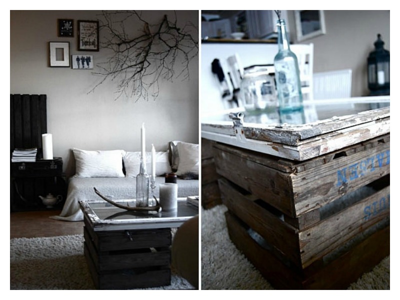
Windows as a Coffee Table

If you’d love to reuse that old window you removed recently but can’t think of how, try this. Make it the top for a new coffee table. Like this one we found, they’ve upcycled a few pallets to create this industrial-style coffee table. Upcycling is sustainable and also rewarding.

blog1_repurpose_furniture_upcyled window

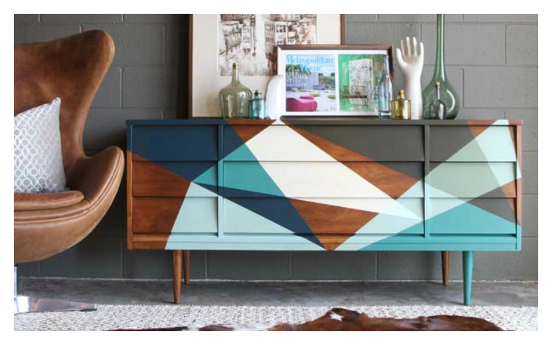
Repurpose an old credenza

Turn your old mid-century credenza into a new statement piece for your home. Although a bit bulky and definitely requiring knowledge of a thing or two on woodwork, you can breathe new life into your old treasure. This salvaged credenza was stripped, sanded, filled, designed and painted. A good amount of work went into it but it is a beauty to behold. The new designs also add the fun factor.

blog2_repurpose_furniture_upcyled credenza

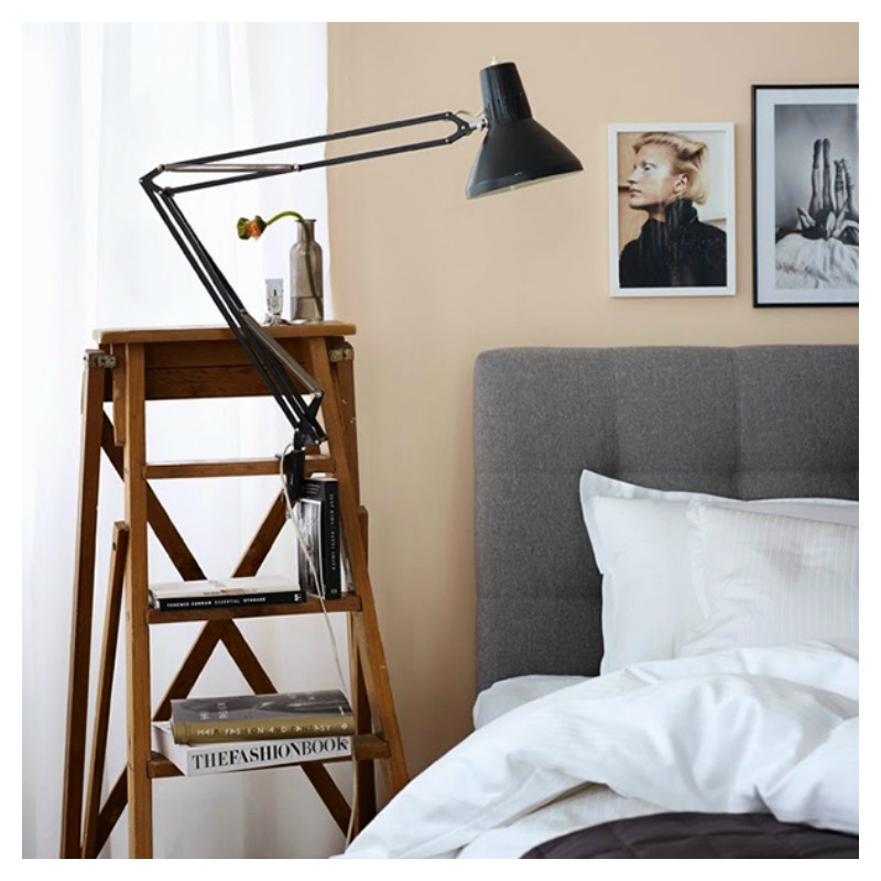
Step up your décor literally

Not often do you get a ladder take centre stage in the home, talk less of in the bedroom. It can be done with a bit of creativity and vision. Make your bedside more interesting by repurposing an old leaning ladder. This example is perfect for book storage and even holds a spot for the lamp.

blog3_repurpose_furniture_upcyled ladder

When wanting to repurpose furniture, the options are endless. You can turn old furniture into extra seating, new display units and even wall art.  Inject personality and sustainability into your home by taking on a few new projects, or maybe one to start with.

Fill us in on your upcycling projects. We’d love to see your photos.

Image sources

DIY Network

Apartment 34

Dream Home Style

Posted on

Adding Texture with Plants

Another unique way of adding texture to your interior design, is through the use of plants and flowers. The foliage in these all-white interiors add texture and a splash of colour. By providing additional visual interest, the plants help soften the crisp, clean lines and prevent these spaces from looking sterile.

blog-1 - Copy

The wall colours and furniture in these rooms provide the perfect backdrop for using indoor plants to add extra character and style. With varying heights and shades, they also show how good placement can be to create a very cosy feel especially for those who can’t get enough of them.

blog-2

Clearly, a few plants can liven a space but why not make a bold statement with a vertical garden. With the perfect assortment of textures, sizes and shades, they show how plants can easily offer a unique texture of their own and fill a room with exuberant life.

blog-3

Posted on

3 Office Designs to Love

We’re really great fans of creative office spaces, as we think they help enhance innovativeness and get people thinking outside of the box. For this reason, we’ve decided to feature our top 3 creative office interiors. Without further ado, here they are below:

1. Groupon’s office in Chicago stands out by making use of colours and modern design to their working space. We particularly like the shades of green and orange they’ve used to brighten up the space:

Blog-1-Groupon-office-interior

2. Edelman, a multinational public relations company also adds bright colours and modern design elements to its office space, and we particularly love the use of colours and natural materials, in creating a relaxed and upbeat atmosphere:

Blog-2-edelman-office-space-design

3. Autodesk an engineering and entertainment software company is making the most of the natural light in their office interior. The use of clear and tinted glass walls that create the feel of a large, open space, while still dividing the areas and providing calm and cosy spaces for their employees:

Blog-3-autodesk-ofiice-interior-design

Posted on

Creating Textured Walls

We’ve already seen that adding tactile or visual texture to wallcoverings can add a striking and luxurious look to your interior. But when it comes to using this technique, a few things are worth mentioning.

One of the most common methods is the use of textured paint, which creates the look and feel of a canvas, which can then be enhanced by using additional materials like sponges, wood, ribbon, lace, sand, leather, birch and many more. Special tools are used to create texture walls, such as putty knives, brushes, towels, sponges, rollers and combs. Perhaps one of the easiest ways to create a simple and impactful texture in your wall paint is to use a dry brush with hard bristle or even a broom:

Creating textured walls

Although textured walls do require for extra time and patience, they are very charming and luxurious, guaranteed to get your guests talking. And on the up side you don’t need to make all the walls in your interior textured, as these walls tend to be the high point of attraction in an interior, so you can keep the rest in a complementary, plain design, to make the textured wall the highlight of the room:

Textured walls in interior design

If you ask us, textured walls are an effort well rewarded: they add authenticity and personality to the room, allowing you to express your own creativity.

Posted on

Tactile Texture for Interior Walls

Walls don’t have to be flat or covered in paint to be attractive. So continuing the theme of using texture in interior design, in this blog post we have looked specifically at textured wall coverings. As with all unusual interior choices it’s best to keep the textured wall surface to a limited area, as not to over crowd the space by having all walls covered with the textured pattern.

As we mentioned in a previous post, texture can be either tactile or visual, creating the illusion of tactile texture. Naturally, wallcoverings follows these two styles as well. In this post we’re looking at tactile texture, and we start with a very exquisite example used on interior walls:

3D wall covering

This is a creative use of ceramic tiles by David Pergier. We particularly like this wall as it conveys the power of 3D textures and the nice glossy surface of ceramic tiles. Also notice how the wall texture is broken into sections by the use of smooth vertical stripes. This further emphasizes the intricate areas, by creating a playful contrast and breaking the monotony of the wall.

One other way of using tactile textured walls is by creating feature walls in an interior space – be it at home or in a shared space. Here are two interpretations, both created using clean, plain white materials:

Textured wall covering

While adding texture to the walls may be enough to create a highlight in the room without needing to add colour variations (as in the examples we’ve given so far), sometimes colour can help go the extra mile, and create a truly unique mysterious or playful atmosphere:

Tactile textured interior walls

These two examples add an extra dramatic effect to the spaces by using dark colours (left) and high contrast, bright colours (right). While both these examples create a powerful look for the interior, they need to be surrounded by contrasting surfaces, to help highlight them. As such, notice the plain green hue used in the example to the right, which naturally draws your eyes to the textured stripe in the middle.

Posted on

Autumn Colour Trends

We’re still quite a long way from autumn, but the season of nostalgia has its very special place in our hearts so in this blog post we’ve decided to share our views on autumn colour trends in interior design, with a Moody Monday spin.

Trying to move away slightly from the cliché red-yellow-orange, we think the blue-green-purple palette to a modern interpretation of the fall season. Just think of half-ripe grapes in the vineyard, or the Northern lights, and you get the picture on what colours we envision:

blog-1-autumn-color-trends

We think the mix of colours is a perfect match for the season: a mystical and wondrous representation of the autumn. In our view, interior designs incorporating these colours look brilliantly modern, exquisite and luxurious. But if you’re thinking dark colours are not as easy to fit into an interior, you’re not alone. However, if used creatively, we believe these tones can create a mysterious, contemporary and cosy atmosphere in any interior – be it a living room, bedroom or a café. Here are some of our favourite examples:

Blog-2-interior-design-northern-colours

What’s more, darker colours can also be used to add spatiality to small spaces – one more reason to love them! We believe these particular hues of blue-green-purple are a perfect match for the shadowy and mysterious autumn season and we highly recommend using them in modern interiors.

Posted on

How to Decorate a Conservatory

If you live in a moody weathered country, but would still like to enjoy the blossoming season, we’ve prepared some tips for you in this blog post. We’re presenting our top two favourite tips for arranging a cosy, inviting conservatory into a delightful design, perfect for city or suburb residences:

Tip #1: Base colours. The main purpose of a conservatory is to bridge that gap between indoor and outdoor living, and one way of doing this, is by allowing sufficient light into the space, and making the best use of it. To take full advantage of the glass walls and ceiling, use colours that reflect it back. Our favourites include a monochrome arrangement, a plain white design, or a naturalistic colour, such as green:

conservatory-1

Tip #2: Complete the look. While keeping the space neat and airy is essential, don’t let it turn too boring. One challenge for conservatories, is the lack of hard walls, which are generally the no. 1 choice for decoration. To compensate, we recommend using soft furniture as a great workaround. Use a few bold design cushions to add personality to the space and at the same time make is look more cosy and inviting. We recommend using colours and patterns that liven up the space, especially if you’re looking to add a contemporary twist to your conservatory space.  In the example below, we recommend three of our cushions that come in high contrast colours, to spice up the look of this conservatory:

Conservatory-2

From the top, the cushions recommended to complete this design are: ‘Black Keys’ Cotton Cushion, ‘O What Sweet Delights’ Turquoise Blue Silk Cushion or ‘Modulate’ Cotton Cushion. Our entire range is available here.

Posted on

Unusual Living Spaces

As humans, we tend to be wary of odd things around us, and the same applies to unconventional spaces. While these may sometimes be a bit more challenging to arrange, it can also be an opportunity to create a unique interior, with a very different feel.

One great example to illustrate the creativity behind the design of an unusual living space this is the triangular house in Muko, a one of a kind design created by Fujiwara room Architects in Japan.

Triangular-house-1

From the outside, the building looks like an unusually geometrical shape, being wrapped in glass and tall vertical louver slabs. The advantage of this is that it allows light to both enter and exit the home, depending on the time of day, and the interior continues to receive sun light throughout the day, from different angles. This creates interesting patters of light and shadow in the interior, at the same time being an ingenious way of making the most out of natural light.

triangular-house-2

Once you step inside the Muko house, the experience changes completely, from the firmness of precise geometric lines and angles, to more fluid shapes that undulate throughout the interior.

Triangular-house-3

The ground floor is arrange as one open plan design, and the use of these, and all the furnishings in this interior are based on curvilinear formations, which give an interesting, flow sensation, making is easy to navigate from the dining are into the bedroom, without the use of any sharp dividers.

Fujiwara room Architects

Photography by: Toshiyuki Yano

Posted on

Big Ideas for Small Space Interiors

Continuing our post from a few days ago on decorating small spaces, we’re now looking at a few more tricks and accessories that can enhance the look of small interiors.

Dark colours. Although some people are intimidated by the use of dark wallcoverings, when used properly, they can add a dash of coziness, intimacy, and dramatism to the space. Moreover, a repeating pattern on all walls makes the lines between them blur, thus giving the impression of a less constrained space. Not to mention, it can transform a featureless room into a super exiting space. Here is our interpretation, using the Geometry of the Sound, Blues / Purple on Black wallcovering from our latest collection:

Geomtry_coloured3

Add a mirror. Probably the oldest trick in the book, and for good reasons too. A mirror will not only make the space feel bigger, but it will also reflect back some of the light – deal for slightly darker rooms, and it will add an extra dash of sophistication to the room, whether you make use of a stylish mirror, or a plain one:

1-small-spaces-mirrors

Round, not square. We agree with House and Garden on this one: a round coffee table creates the feeling of circular space, and also makes it easier to place other objects around, making it ideal tor small interiors:

2-small-spaces-round-coffee-table-2

Make use of vertical space. This one is our favourite! Often times, when we think square footage, we only consider the floor. But with a little bit of ingenuity, walls can easily turn into extra space! While it’s not always the best idea to overcrowd a room, it certainly works nicely with some small interiors. Use shelving units and make the most of the verticality of your room, in a nice and elegant way. Here are some ideas:

3-small-spaces-shelving

To prevent the room from looking too busy, one rule of thumb would be to have only one wall looking like this and something completely different with the other(s). Mirrors and stylish wallcoverings are definitely good places to start!

Posted on

Moody Monday Showcased in Shenzhen, China

It seems as though just yesterday we were (carefully) packing our elegant and contemporary wallcoverings, and shipping them over all the way to Shenzhen, the UNESCO City of Design!

Blog-packing

Three weeks and almost 6000 miles later, there they are, being prepared for display in the Edinburgh Creative Industries taking place in Shenzhen, China. The incubator opens in a very short three days, on Friday 15th May and we’re very excited our work will be displayed in the venue for the upcoming three months.

“I’m really excited about the opportunity of sharing my wallcovering designs with the Chinese market, as Shenzhen is a vibrant and creative city, which falls in line with the designs I create. I’m looking forward to find out how my work will be received in this new market!” Eliza Kesuma, the designer behind Moody Monday.

The designs that will be on display are part of our first luxury wallpaper collection inspired by the inner workings of a musical organ. Here’s what we’ve sent over:

Blog-Wallcoverings-numbers

1. Geometry of the Sound, Reds on Black | 2. Black Keys, Black on White | 3. The Dance, R. Blue on Black | 4. Geometry of the Sound, Blues / Purple on Black