Founder Focus: Meet Eliza
Topic 3: About Eliza’s Work
Where do you generate your ideas for new designs?
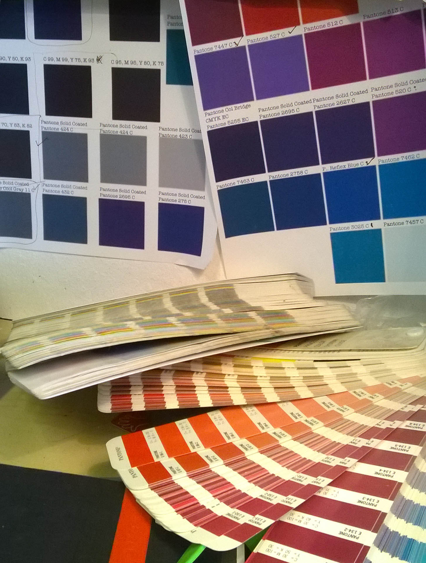
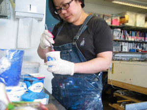
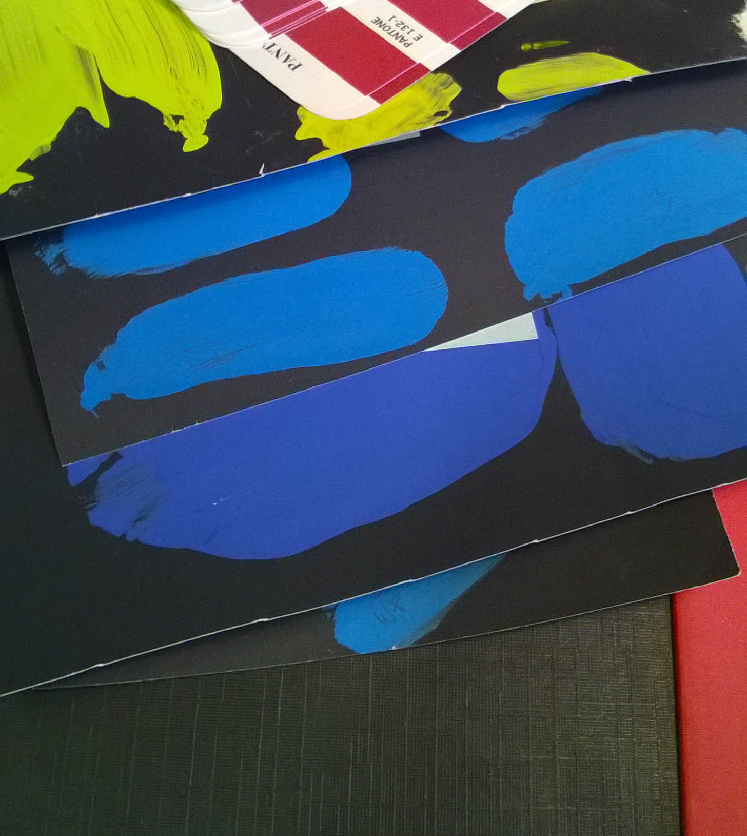
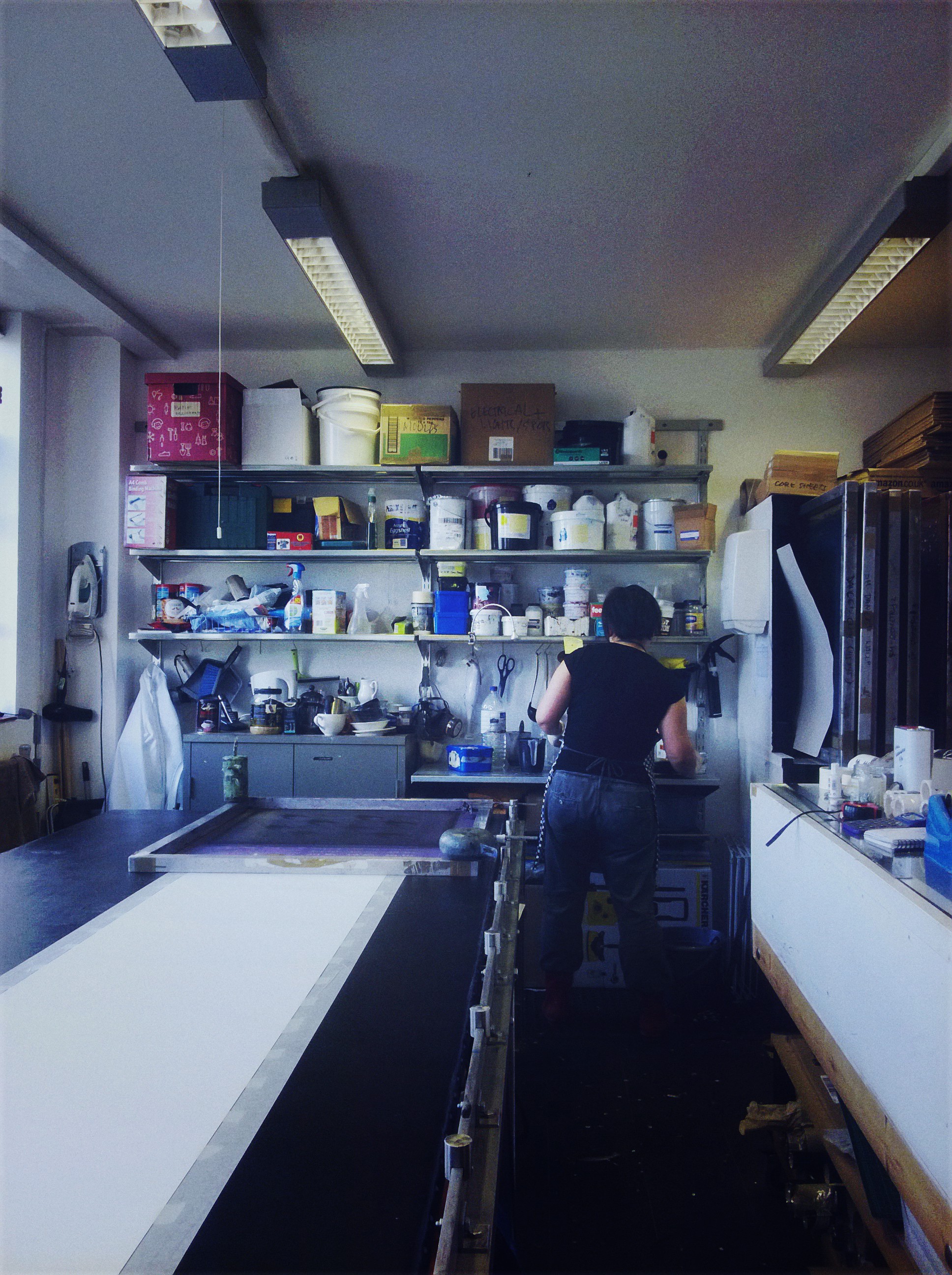
I take inspiration from practically anything that’s around me. As there are so many visual clues around you and you just need to be tuned in to what you see and how you feel about them. If something peaks my interest, I either start doodling or then start to photograph a series of shots to then draw from. Many drawings later, I then start having ideas of the design direction it’s heading. Sometimes I might even discover that there’s no chemistry there and I should just bin it and start over!
I mostly decide on an idea that either challenges me or challenges people’s common perception of them, that’s why a lot of them end up being quite subversive. Because it’s design, it needs to fulfil a purpose; surface pattern design tends to be about beautiful looking patterns, as it is meant to decorate a surface. So I make sure that the designs are beautiful and people can appreciate them even at the most superficial level. I don’t expect people to think too hard to work out their wallpaper or soft furnishings, I appreciate that it is difficult enough deciding on a colour scheme for a room. But, you do have the option of appreciating it beyond the pretty surface, if you want to. Hey, it can even be a conversation starter at a dinner party!
Who has been your greatest inspiration in choosing to orient yourself in contemporary design?
There are many inspiring contemporary designers and artists that I admire and am inspired by. I find that I am always learning and inspired by my fellow peers; from my more senior contemporaries and from the most unlikely people I meet along the way.
Two (or three even!) particular figures that I find resonates with me most throughout my creative journey though have to be Tim Burton and Timorous Beasties. I admire them for embracing the fact that they are different, that is who they are and they’re comfortable with that. They don’t try to be different, they just are.
Like everything else in life, being different or doing things differently will almost immediately attract objections at the beginning. But they persevered and look at them today; they are the leaders of their field.
I read once that Tim Burton’s drawing style was criticized as being ‘incorrect’ by one of his teachers in his much younger days, until another teacher came along at a later stage and advised the young frustrated Burton that he can draw however he likes to and that there isn’t a right or wrong way to draw. Today, he is known for his distinct style of drawing and his surreal animations and film work.
What is the next step in your career?
I aim for world domination – to cover the world with beauty and design!
Just kidding! Although covering the world with beauty isn’t such a bad goal.
Next step is to come up with a new collection of wallpaper and our first fabric collection; attend trade fairs and shows more regularly and to do more collaborative projects.