Posted on

Tactile Texture for Interior Walls

Walls don’t have to be flat or covered in paint to be attractive. So continuing the theme of using texture in interior design, in this blog post we have looked specifically at textured wall coverings. As with all unusual interior choices it’s best to keep the textured wall surface to a limited area, as not to over crowd the space by having all walls covered with the textured pattern.

As we mentioned in a previous post, texture can be either tactile or visual, creating the illusion of tactile texture. Naturally, wallcoverings follows these two styles as well. In this post we’re looking at tactile texture, and we start with a very exquisite example used on interior walls:

3D wall covering

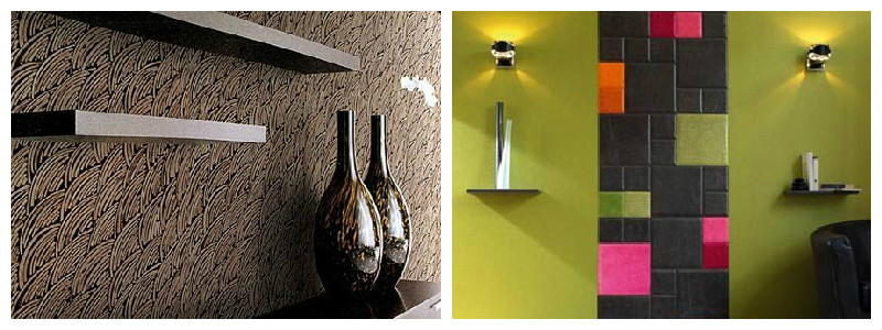
This is a creative use of ceramic tiles by David Pergier. We particularly like this wall as it conveys the power of 3D textures and the nice glossy surface of ceramic tiles. Also notice how the wall texture is broken into sections by the use of smooth vertical stripes. This further emphasizes the intricate areas, by creating a playful contrast and breaking the monotony of the wall.

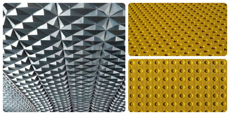
One other way of using tactile textured walls is by creating feature walls in an interior space – be it at home or in a shared space. Here are two interpretations, both created using clean, plain white materials:

Textured wall covering

While adding texture to the walls may be enough to create a highlight in the room without needing to add colour variations (as in the examples we’ve given so far), sometimes colour can help go the extra mile, and create a truly unique mysterious or playful atmosphere:

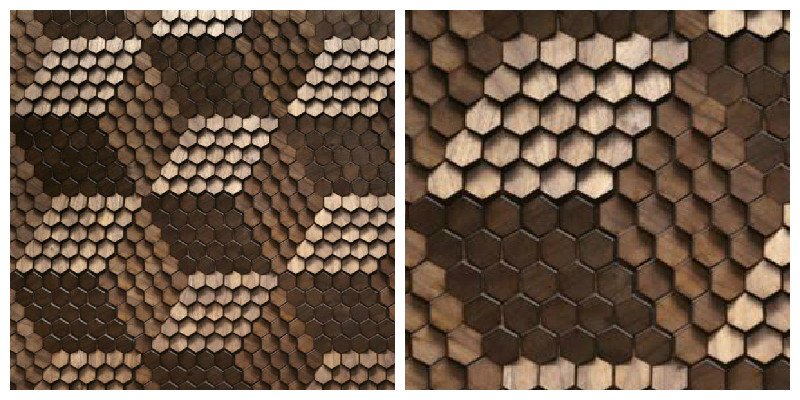
Tactile textured interior walls

These two examples add an extra dramatic effect to the spaces by using dark colours (left) and high contrast, bright colours (right). While both these examples create a powerful look for the interior, they need to be surrounded by contrasting surfaces, to help highlight them. As such, notice the plain green hue used in the example to the right, which naturally draws your eyes to the textured stripe in the middle.

Posted on

Autumn Colour Trends

We’re still quite a long way from autumn, but the season of nostalgia has its very special place in our hearts so in this blog post we’ve decided to share our views on autumn colour trends in interior design, with a Moody Monday spin.

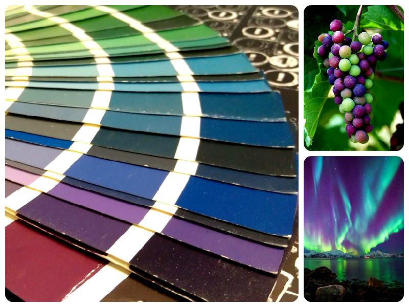
Trying to move away slightly from the cliché red-yellow-orange, we think the blue-green-purple palette to a modern interpretation of the fall season. Just think of half-ripe grapes in the vineyard, or the Northern lights, and you get the picture on what colours we envision:

blog-1-autumn-color-trends

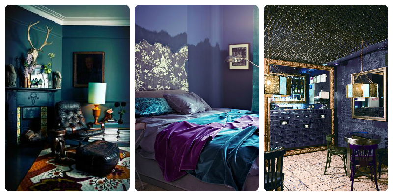
We think the mix of colours is a perfect match for the season: a mystical and wondrous representation of the autumn. In our view, interior designs incorporating these colours look brilliantly modern, exquisite and luxurious. But if you’re thinking dark colours are not as easy to fit into an interior, you’re not alone. However, if used creatively, we believe these tones can create a mysterious, contemporary and cosy atmosphere in any interior – be it a living room, bedroom or a café. Here are some of our favourite examples:

Blog-2-interior-design-northern-colours

What’s more, darker colours can also be used to add spatiality to small spaces – one more reason to love them! We believe these particular hues of blue-green-purple are a perfect match for the shadowy and mysterious autumn season and we highly recommend using them in modern interiors.

Posted on

Texture Variations in Interior Design

Texture in interior design is often used to add highlights to specific areas of the space. We also perceive texture in relation to the adjacent surfaces, the viewing distance and lightning of the area. For example, to highlight a rough surface, this is best placed next to a smooth surface. The roughness is emphasized when the surface is viewed up close and grazed with light (lit from the side), which highlights the texture through shadows and light spots. Moreover, changing the angle from which light hits the textured surface, and the view angle, creates a different visual effect. Here is an exemplification:

Blog-1

Textures in design can be of two different kinds, either tactile or visual. Tactile texture refers to the actual feeling of a surface – smooth, rough, soft, hard, etc., whereas visual texture appeals to our perception, what a texture might feel like. Oftentimes, through the use of visual texture, a surface can create the illusion of a specific tactile texture or an added depth. Here’s one great example, of how lighting is used to create a different visual effect when looking from a short or longer distance:

Blog-2

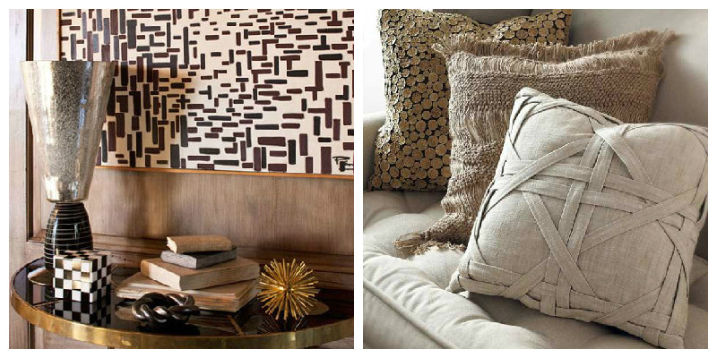
In practice, all these textures can be used in interior design to add distinctiveness to the room, and visual textures in particular can create a stunning effect. Some of our favourites (exemplified below) include the use of patterns (left) and tactile textures (right):

Blog-3

Adding textures to an interior is a sure fire way of creating a visually interesting space, but we also recommend using caution, as too much texture can create a cluttered and over stimulating appearance to the space.

Posted on

Using Pattern & Light In and Around Dining Areas

Exquisite dining – in your own home. Who’s to say you need to head downtown for a memorable, fine dining experience? While we will not be making dinner menu suggestions, we would like to give you a few tips on how to arrange your dining area to create an elegant and luxurious atmosphere.

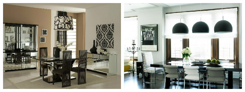
Low hanging light solutions over the dinner table really bring the area into emphasis, and we find them to be a great way of enhancing the dining experience. They also add a flare modernism to the space. Our favourite ones look like this:

light-textures-1

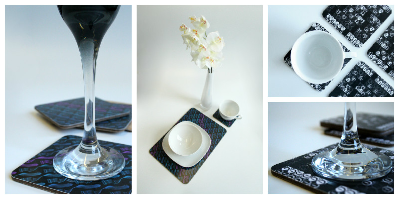
Pattern at the dinner table: to add a subtle yet outstanding note to your dining area, we recommend using high quality design place mats and coasters. These will serve a double purpose, protecting the surface of your dining table, and adding a dash of personality and an accent note to the table:

light-textures-2

If you would like to see our entire collection of tableware accessories, they are available on our website: coasters and placemats.

After-dinner relaxing

For the after-dinner lounging area, we prefer low intensity lighting and even candle light, depending on the context and guests you’re entertaining. This will help create a relaxed and intimate atmosphere. Add a glass of wine, and you are bound to be a fabulous evening in. Here are a few examples:

light-textures-3

Comfortable, visual textures as patterns: According to designer Abigail Ahern “soft furnishings are the five-minute face-lifts of the decorating world, instantly perking up your room with an array of different textures”. You can sue these either as stand-alone statement pieces, or bundled up to create contrast and play, using different visual textures. Recommended materials are silks and cotton, and our own collection offers luxurious cushions in daring patters and texture, ideal for adding a subtle yet outstanding note to your dining area:

light-textures-4

From top to bottom, cushions suggested are:

Posted on

Designing for Outdoor Spaces

When you’re looking to arrange an outdoors living space, sky is the limit, right? But this also means there are so many options, it may become daunting to choose the best ones for your space. In this blog post, we aim to show you a few of our favourite arrangements and decorations, and hopefully offer some inspiration to help you design your outdoor space – just the way you want it.

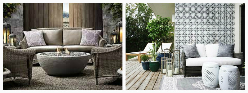
Furniture: The choices you make in picking the outdoor furniture will have a great impact on the feel of the space. For example, we recommend using a monochromatic colour palette adorned with sumptuous cushions and throws for a more glamorous look:

Outdoor-design-2

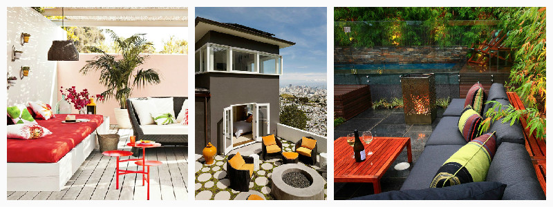
Alternatively, if you’re going for an urban style, choose contemporary designer & luxury outdoor furniture, which we recommend you enhance with bold accessories for a pop of colour:

Outdoor-design-3

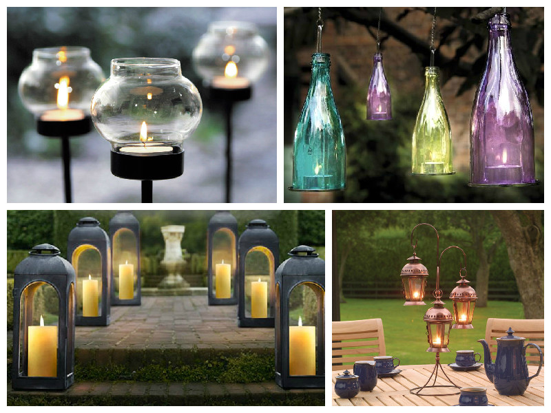
Lighting: Whether it’s still daytime or getting dark, we think the use of different levels of lighting adds a special ‘je ne sais quoi’ to the outdoors living space. In line with the overall style of your space, you may decide to go for more contemporary or sumptuous options – below are a few suggestions. As interior designer Shelly Riehl David says, “Nothing flickers like real flame in a gas lantern”. Looking at these pictures, we could not agree more:

Outdoor-design-1

Posted on

How to Decorate a Conservatory

If you live in a moody weathered country, but would still like to enjoy the blossoming season, we’ve prepared some tips for you in this blog post. We’re presenting our top two favourite tips for arranging a cosy, inviting conservatory into a delightful design, perfect for city or suburb residences:

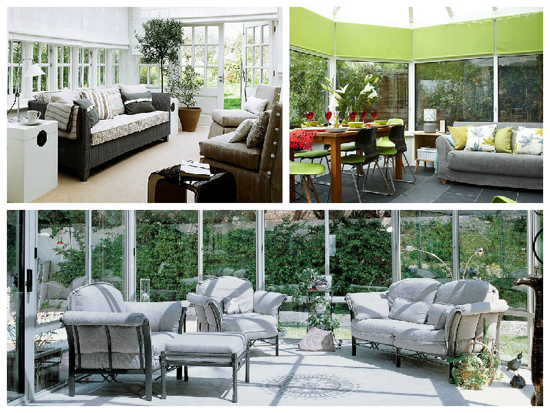
Tip #1: Base colours. The main purpose of a conservatory is to bridge that gap between indoor and outdoor living, and one way of doing this, is by allowing sufficient light into the space, and making the best use of it. To take full advantage of the glass walls and ceiling, use colours that reflect it back. Our favourites include a monochrome arrangement, a plain white design, or a naturalistic colour, such as green:

conservatory-1

Tip #2: Complete the look. While keeping the space neat and airy is essential, don’t let it turn too boring. One challenge for conservatories, is the lack of hard walls, which are generally the no. 1 choice for decoration. To compensate, we recommend using soft furniture as a great workaround. Use a few bold design cushions to add personality to the space and at the same time make is look more cosy and inviting. We recommend using colours and patterns that liven up the space, especially if you’re looking to add a contemporary twist to your conservatory space.  In the example below, we recommend three of our cushions that come in high contrast colours, to spice up the look of this conservatory:

Conservatory-2

From the top, the cushions recommended to complete this design are: ‘Black Keys’ Cotton Cushion, ‘O What Sweet Delights’ Turquoise Blue Silk Cushion or ‘Modulate’ Cotton Cushion. Our entire range is available here.

Posted on

Salone Del Mobile, Milano – Part 2: Glass Furniture

A couple of weeks ago we posted about the vibrant root vases we discovered thanks to Salone del Mobile in Milano. Today we’re looking at Patricia Urquiola’s work, also present in the Milano exhibition: and we were quite taken by her innovative approach!

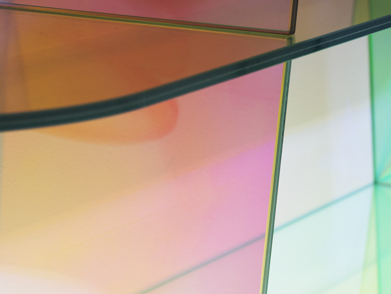
1-Blog-SHIMMER_PatriciaUrquiola

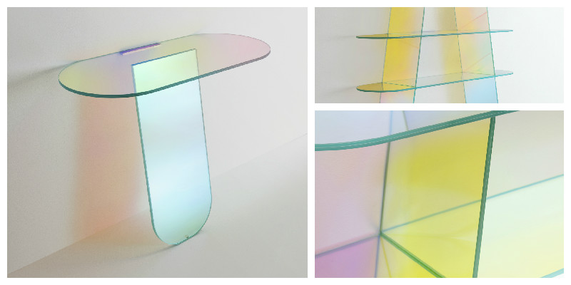
Are you as intrigued as we were? Entitled SHIMMER, the collection comprises low tables, consoles and shelves in laminated and glued glass, characterized by a special iridescent multi-chromatic finish:

2-Blog-SHIMMER_PatriciaUrquiola

The nuance varies according to the angle of the light source and the vantage point, giving the reflected objects a magical and ethereal appearance:

3-Blog-SHIMMER_PatriciaUrquiola

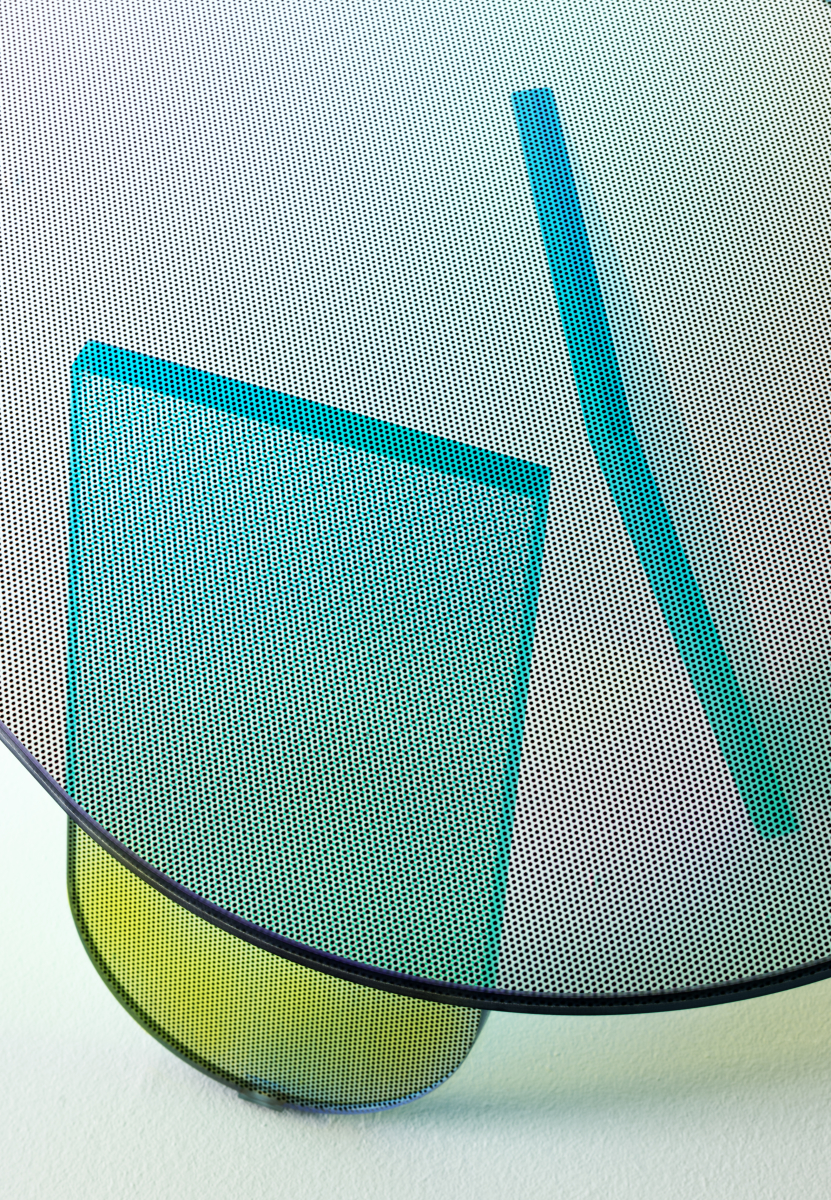
We learned from Glas Italia that the collection items come in opaque or transparent glass, or transparent glass with a special micro dot decoration. We this this one in particular is hypnotically elegant:

4-Blog-SHIMMER_PatriciaUrquiola

Posted on

Unusual Living Spaces

As humans, we tend to be wary of odd things around us, and the same applies to unconventional spaces. While these may sometimes be a bit more challenging to arrange, it can also be an opportunity to create a unique interior, with a very different feel.

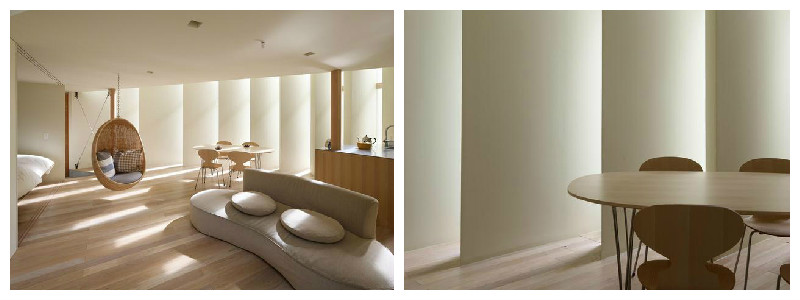
One great example to illustrate the creativity behind the design of an unusual living space this is the triangular house in Muko, a one of a kind design created by Fujiwara room Architects in Japan.

Triangular-house-1

From the outside, the building looks like an unusually geometrical shape, being wrapped in glass and tall vertical louver slabs. The advantage of this is that it allows light to both enter and exit the home, depending on the time of day, and the interior continues to receive sun light throughout the day, from different angles. This creates interesting patters of light and shadow in the interior, at the same time being an ingenious way of making the most out of natural light.

triangular-house-2

Once you step inside the Muko house, the experience changes completely, from the firmness of precise geometric lines and angles, to more fluid shapes that undulate throughout the interior.

Triangular-house-3

The ground floor is arrange as one open plan design, and the use of these, and all the furnishings in this interior are based on curvilinear formations, which give an interesting, flow sensation, making is easy to navigate from the dining are into the bedroom, without the use of any sharp dividers.

Fujiwara room Architects

Photography by: Toshiyuki Yano

Posted on

Big Ideas for Small Space Interiors

Continuing our post from a few days ago on decorating small spaces, we’re now looking at a few more tricks and accessories that can enhance the look of small interiors.

Dark colours. Although some people are intimidated by the use of dark wallcoverings, when used properly, they can add a dash of coziness, intimacy, and dramatism to the space. Moreover, a repeating pattern on all walls makes the lines between them blur, thus giving the impression of a less constrained space. Not to mention, it can transform a featureless room into a super exiting space. Here is our interpretation, using the Geometry of the Sound, Blues / Purple on Black wallcovering from our latest collection:

Geomtry_coloured3

Add a mirror. Probably the oldest trick in the book, and for good reasons too. A mirror will not only make the space feel bigger, but it will also reflect back some of the light – deal for slightly darker rooms, and it will add an extra dash of sophistication to the room, whether you make use of a stylish mirror, or a plain one:

1-small-spaces-mirrors

Round, not square. We agree with House and Garden on this one: a round coffee table creates the feeling of circular space, and also makes it easier to place other objects around, making it ideal tor small interiors:

2-small-spaces-round-coffee-table-2

Make use of vertical space. This one is our favourite! Often times, when we think square footage, we only consider the floor. But with a little bit of ingenuity, walls can easily turn into extra space! While it’s not always the best idea to overcrowd a room, it certainly works nicely with some small interiors. Use shelving units and make the most of the verticality of your room, in a nice and elegant way. Here are some ideas:

3-small-spaces-shelving

To prevent the room from looking too busy, one rule of thumb would be to have only one wall looking like this and something completely different with the other(s). Mirrors and stylish wallcoverings are definitely good places to start!

Posted on

Moody Monday Showcased in Shenzhen, China

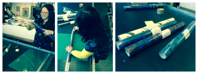
It seems as though just yesterday we were (carefully) packing our elegant and contemporary wallcoverings, and shipping them over all the way to Shenzhen, the UNESCO City of Design!

Blog-packing

Three weeks and almost 6000 miles later, there they are, being prepared for display in the Edinburgh Creative Industries taking place in Shenzhen, China. The incubator opens in a very short three days, on Friday 15th May and we’re very excited our work will be displayed in the venue for the upcoming three months.

“I’m really excited about the opportunity of sharing my wallcovering designs with the Chinese market, as Shenzhen is a vibrant and creative city, which falls in line with the designs I create. I’m looking forward to find out how my work will be received in this new market!” Eliza Kesuma, the designer behind Moody Monday.

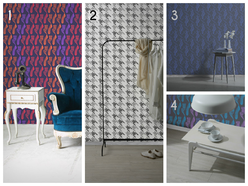
The designs that will be on display are part of our first luxury wallpaper collection inspired by the inner workings of a musical organ. Here’s what we’ve sent over:

Blog-Wallcoverings-numbers

1. Geometry of the Sound, Reds on Black | 2. Black Keys, Black on White | 3. The Dance, R. Blue on Black | 4. Geometry of the Sound, Blues / Purple on Black