Posted on

The Spirit of Summer Fair starts tomorrow

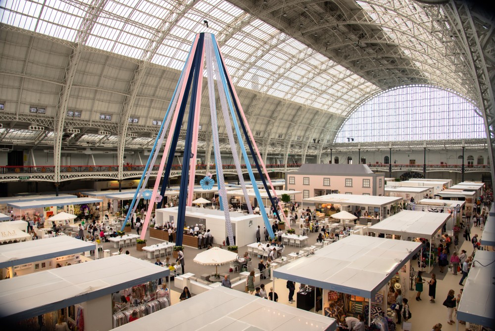
From 22 – 26 June 2016, a special design event will be taking place at Olympia in London. For four full days, guests of the Spirit of Summer fair will be invited to feast their eyes on product collections from over 450 independent designers and boutiques ranging from fashion, gifts, artisan food and drink.

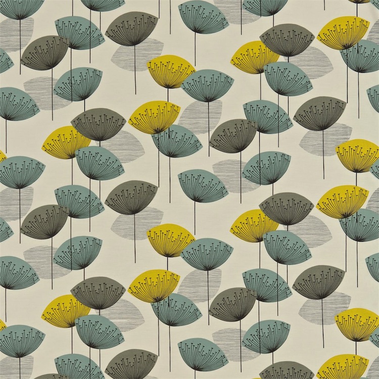
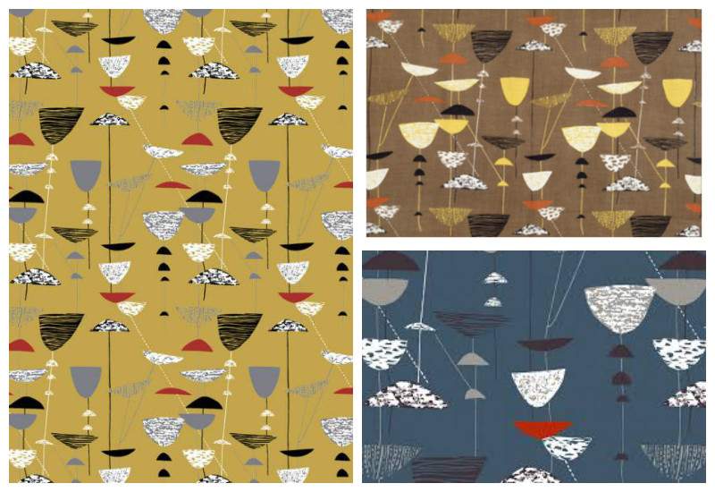
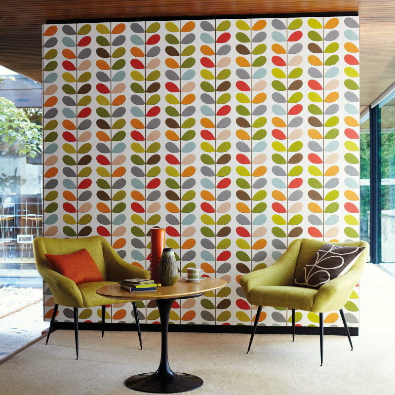
Organised in association with House and Garden, the House fair which is wholly dedicated to the home will be on too. With over 100 prestigious interiors brands cutting across furniture, lighting, soft furnishings, wall coverings, you’ll have so much design choices on offer.

Spirit of Summer fair Olympia

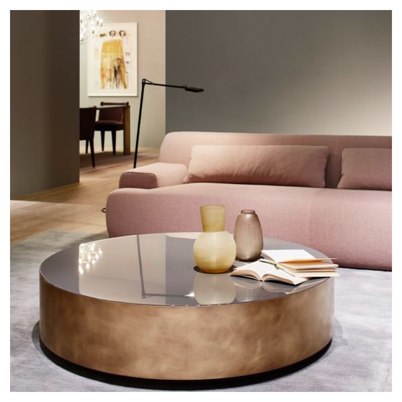
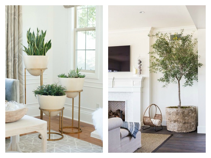
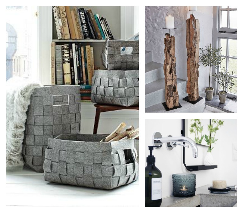
If you could do with new ideas and inspiration for all the rooms in your home, then this is the event for you. Quality British design will not only be in abundance but showing you how to enhance your interior space with beautiful products and furnishings is of utmost importance to the organisers.

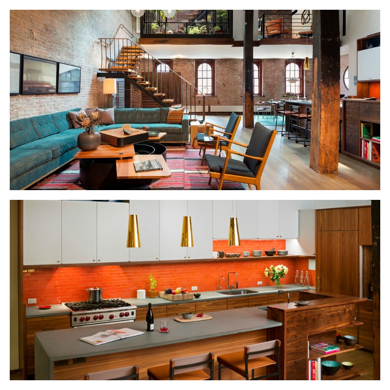
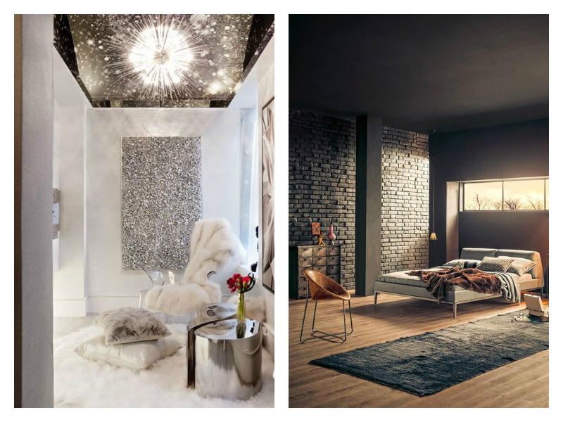
Event highlights will include ‘Decorated spaces’ by interior designs, Joanna Plant Interiors and Salvesen Graham. Another unique feature will be three styled rooms sets designed by three prolific interior bloggers. The bloggers involved include Martyn White, from Martyn White Designs, Grant from Interior Style Hunter and Gabriella Palumbo from Flat15.

So whether you’re looking to revamp your home or redo a new client project and are looking for some inspiration, look no further. It comes round once a year, you don’t want to miss it. Enjoy the spirit of summer.

Posted on

The Timeless Appeal of Mid-century Patterns


Chances are you would have come across mid-century patterns if you’re into interior design. Very popular in the 50s and 60s, minimalism and simple repetition ruled with this trend.

Even today, they’re still very much in vogue. You can understand the appeal for these designs. They’re striking, geometric, reminiscent of things we can all relate with and at times nostalgic. Nowadays, it is more common to find people seeking interesting modern interpretations.

What’s not to like about the sheer simplicity in the patterns used? The bold contrasting colours are a staple which means they’re nothing but bold and beautiful. A perfect match for anyone who likes full on colour.

One very popular design is the Dandelion clocks pattern which was designed by Fiona Howard for Sanderson in 2008.

Sanderson_dandelion_clocks
Dandelion clocks, Fiona Howard

Going down memory lane, a textile designer well known in her days for brilliant designs was Lucienne Day. The ‘Calyx’ which she designed for Heal’s in 1951 was the fabric that brought her fame.

blog5_midcenturypattern
Calyx, Lucienne Day

Orla Kiely is another lady whose name rings a bell when it comes to mid century patterns. Her designs are literally on everything.

blog1_midcenturypattern
Multi Stem wallpaper, Orla Kiely

Even some designs like this Aquila wallpaper design in our Stellar collection have been said to have mid-century feel to them too albeit a modern take. We sure didn’t see that coming but we’re more than happy to take the compliment.

Aquila wallpaper_sage and orange2
Aquila wallpaper, Moody Monday

With applications on wallpaper, fabric, wall art and even custom headboards, you’ll agree that these designs are very versatile. Inspired? Why not look to infuse this into your home?

Posted on

Spectacular warehouse conversions

Warehouse conversions offer more than just another building, they have unique character and the abundance of space many of us crave. Think of a spacious open plan kitchen and living area oozing bouts of character and industrial appeal. Sometimes a regular detached house just won’t do. However they do come with their challenges too.

Commercial properties have long been in demand for their potential to be transformed into new housing opportunities. In the UK, the areas popularly targeted are in established centres like London, Bristol and Southampton.These beautiful warehouse conversions caught our eye today.

blog1_warehouse conversions

The exposed brick offers the perfect canvas for a great industrial look. The use of warm colours and natural materials eases in a relaxed scheme. This is the perfect style for the urban city dweller who appreciates the outdoors.

Image source: Andrew Franz

blog2_ warehouse conversions

This luxury penthouse in London combines industrial elements with Art Deco touches. The soft neutral palette keeps the space fresh complementing the industrial chic look. The large  windows are great for allowing this bright and airy open plan layout to really come to life.

Image source: Decoist


Posted on

Destination Inspiration: AthensWas hotel inspired by Greek design

Located in the Plaka district of Athens, this hotel pays an ode to ancient Greek design and classic modernism. To continue our Destination inspiration series, we bring you AthensWas, a design-focused hotel bursting with style.

blog1_Destination-AthensWas-Hotel-Greek design

Designed by Stavros Papayiannis of Stage Design Office, the mission was to create a fresh approach to Greek design. Fully decked out in Greek marble and Greek walnut, the hotel’s overall aesthetic is defined by clean lines and an abundance of natural materials. What’s not to like about its understated luxury with playful elements making it easy for stylish guests to enjoy? The space exudes a contemporary approach to classic modernism in a way that celebrates Greek history and architecture.

blog2_Destination-AthensWas-Hotel-Greek design

Good things come in small packages. AthensWas hotel has just 21 guest rooms. Each room with its own outdoor space is filled to the brim with iconic furniture, light fittings and products from well-known designers. Even the artwork in the bedrooms immerse you into a world of culture and history. Some designs featured include the Canta and Viki armchairs by Toshiyuki Kita and lamps by French designers, Ronan and Erwan Bouroullec.

blog3_Destination-AthensWas-Hotel-Greek design

The in-house restaurant and rooftop bar located on the 6th floor of the hotel promise stunning views of the Acropolis, Parthenon, Temple of Olympian Zeus, and the old Olympic stadium. Who wouldn’t want to dine in style with such picturesque views?

blog4_Destination-AthensWas-Hotel-Greek design

Story and images via Design Milk

Related Articles

Design of the week: Colourful studio by Masquespacio

Japanese Interior Design inspiration

Posted on

Design of the week: Colourful studio by Masquespacio

It’s always a great feeling when we find inspiring colourful interiors. This office studio by Masquespacio has quickly become the highlight of our day. We won’t list all our favourite things about this design but we’ll share those that resonate with us most with you.

Colour is good and lots of it

For those of you who love colour, this design will appeal to you. Vivid colours in cheerful hues give the space a playful feel. Using these types of colours in working environments must be a good thing for creativity. Even pineapples manage to play a part. How clever is that?

blog1_masquespacio-colourful studio-interior-design

Trendy furniture makes a powerful statement

This was the first time we’ve come across the Toadstool collection. They are very impressive, don’t you think? Designed by Masquespacio, their debut furniture collection which launched in January 2016 is characterised by colourful fabrics and rounded shapes. Luxurious with extra glam factor, swooning over them is surely an understatement.

blog5_masquespacio-colourful studio-interior-design

You can never have too many plants

Perfectly perched at prime positions, the lush plants add that extra layer of texture and freshness. They’re literally in every corner around the studio. It makes us want to rush to the garden centre to fill our Moody Monday studio up.

blog4_masquespacio-colourful studio-interior-design

There is design inspiration everywhere. What has inspired you this week? Let us know.

Full story via Dezeen. Photography by Bruno Almela.

Related articles

Snowy mountainside inspires colourful retail store design

New art themes restaurant by Damien Hirst

Posted on

Japanese Interior Design inspiration

The Japanese are well known for incorporating rich cultural traditions into contemporary spaces. Simple lines and muted colours typically characterise their interior design.

Today on the blog, we share two Japanese interior designs which caught our eye. There are some key design elements in the designs to give particular attention to.

Introduce outdoor elements with natural materials and greenery

Low seating with the addition of large floor cushions creates an authentic Japanese feel in this restaurant. It also incorporates furniture made from natural materials which is popular in Japanese interior design. Wood, bamboo, silk are common for creating harmony and bringing in nature. You can’t go wrong with indoor plants too.

blog1_Japanese interior design

Japanese interior design embraces the use of soft lighting. Light is concealed if possible or dimmed. This restaurant design uses lighting which is dimmed or seeps through. We like the use of ambient lighting and task lighting focused on the display of Japanese-style bowls.

blog2_Japanese interior design

Another element of Japanese interior design is creating a sense of privacy even in an open plan space, Without doubt, most of us are familiar with the screens typically seen in traditional Japanese homes.

Say hello to minimalism for clean refreshing spaces

With the belief that all clutter is tossed aside in place of a simple life, Japanese interiors are usually simple and minimalist in nature.  It is refreshing to see how this Tokyo baby café uses this to its advantage.

blog3_Japanese interior design

White minimalism is the key feature in the interior of the cafe. The simplicity of the design provides a tranquil environment. Designed by Japanese designer, Nendo, the café’s absolutely huge and absolutely tiny furnishings give both adults and kids two different perspectives.

blog4_Japanese interior design

blog5_Japanese interior design

What elements of Japanese interior design could you infuse into your interior space?

Sources

Retail Design Blog

Design Boom

Posted on

Design Influence of the week: The Raimond Lamp

Our design influence for today is the Raimond lamp. Think starry skies and constellations and you have the embodiment of the Raimond lamp.  This is our tribute to the award winning designer, Raimond Puts who passed away in 2012. He combined his love for simplicity, mathematical prowess and metalwork expertise to create timeless design.

blog1_lighting designer_Raimond

Hidden beauty of starry nights

Designed as part of a collection for Moooi, this stylish creation is perfect for a contemporary interior setting. The Raymond Lamp has been described by Moooi as “a perfect sphere of mathematical ingredients punctuated by tiny LED lights. Looking at the lamp feels like staring into the soft glow of a starry night.”

blog2_lighting designer_Raimond

Closer to home with our Stellar Collection

We nod our heads in complete agreement here at Moody Monday. Our new collection, STELLAR is inspired by the boundless beauty of the sky and space. No wonder we have a heightened love for all things celestial. You’ll hear more about the launch of the new collection over the next few weeks.

blog3_lighting designer_Raimond

It is not difficult to understand why designers pay attention to beautiful lighting. The variety available in the industry is astounding. Be it over-sized pendant lamps or geometric shaped lamps, the options are limitless.

Share your design influence this week with us.

All images were sourced from www.moooi.com

Related Articles

Influence of the Week – Bauhaus Inspired Ceramics

Inspiring Designer – Marcel Wanders of Moooi

Design in Focus – Lighting Installations

Posted on

Decorating with Pantone Colour of the year 2016

If you have a keen interest in interior design, you would have seen the Pantone Colour of the year. It was announced last year. For the first time in Pantone’s history, the team decided on two colours – Rose Quartz and Serenity Blue. What a luxury. Instead of popularising one colour, they chose to present them as a combination.

These colours are reminiscent of baby gender reveal parties popular these days. They are soft and very easy on the eye. When paired together, they bring a sense of soothing freshness to an interior space.

blog_moodymonday_pantone 2016

According to Pantone, “Rose Quartz is a persuasive yet gentle tone that conveys compassion and a sense of composure. Serenity is weightless and airy, like the expanse of the blue sky above us, bringing feelings of respite and relaxation even in turbulent times.”

Today’s feature looks at one half of this beautiful Pantone colour duo – Rose Quartz.

Finding the right colours to allow this soft pink colour shine through is important. In today’s feature, we share two applications in a living room setting.

blog1_pantone colours 2016

For a bright and airy look, paint your walls in white or off-white. Pared back with minimal metallic accessories, the pink sofa pops is the centre of attention in this living room. The herringbone patterned flooring adds that extra touch of texture and interest to the room.

blog2_pantone colours 2016

For a look that is calm and sultry but isn’t too feminine, start off with darker walls. To add to the warm scheme, team with rich browns in the other furniture pieces and accessories. It is both simple and appealing.

If you’ve never decorated with this shade of pink before, this is your time to give it a try.

For more industry commentary on the Pantone Colour of the Year

Colour of the year 2016 – Pantone

The Painted History of Rose Quartz and Serenity – Huffington Post

How to decorate your home with Pantone’s Rose Quartz and Serenity – StyleCaster

Kitchens in Pantone’s Colours of the Year – The Kitchin

Image source: Style and Minimalism

Posted on

New Art themed Restaurant by Damien Hirst

Damien Hirst with some help from English chef Mark Hix has recently opened an art-themed restaurant in his new Newport Street Gallery in Vauxhall, London.

“Pharmacy 2 combines two of my greatest passions: art and food,” says Hirst of the new project.

blog2_damien hirst_pharmacy restaurant

As he did with the previous restaurant, he has fully expressed his love for pharmaceuticals in the design of the restaurant space. The design oozes his reputable creativity and attention to detail.

The multi-millionaire artist, Hirst’s art work decorates the interior walls of the restaurant. The rear wall also houses a large medicine cabinet with real items.

blog3_damien hirst_pharmacy restaurant

Large glass stained windows draw the eye in with a colour explosion of red and blue. We like how skilfully the pill motifs are used throughout.  The bar area, the floors, the chairs enjoy a bit of medicinal therapy. A great example of thoughtful design which is not clinical but uniquely tasteful.

blog1_damien hirst_pharmacy restaurant

His aim to revive the original Notting Hill restaurant, Pharmacy is incredibly commendable.

Story via Dezeen

Photography: Pudence Cuming Associates

Posted on

Easy ways to add texture to your decor

There’s just something about the colder months that makes us want to hibernate at home for months. We don’t have that luxury and need to get out and about to make a living. The least we can do is to make our homes as cosy as possible for those anticipated relaxing days. Adding texture in your décor is one way of doing it. We share three useful tips to get you motivated. They’re super simple.

Create an organic look

It is startling the difference plants and flowers can make to a living space. Perfect for a minimalist or cosy look, you can create a fresh, organic look in your home. Lush greenery teamed with woven textures is a natural combination bound to work. You can even go big and over-sized like this example here. Smaller plants are perfect accents for your coffee table or the top of a chest of drawers.

blog1_adding texture_plants

Add textiles for an instant update

We can’t talk about texture without mentioning our trusted favourites. Cushions, blankets, throws make it so easy to instantly create texture in your décor. Whether it’s a fluffy cushion or a cosy blanket, you can amp the cosy factor. You can introduce them in any room to give a relaxed look. Neutral coloured textiles work very well with most decorating schemes. For those who want added visual interest in a neutral scheme, use textiles with attention-grabbing designs.

blog1_adding texture_textiles

Keep it simple with accessories  

Thanks to the myriad of options available to us, accessorising our homes is so much easier. Providing function and beauty at the same time, wake up your room with textured pieces. Woven storage baskets for your throws in the lounge or towels in the bathroom. Mug warmers in the kitchen. Distressed wooden candle holders, you name it. Accessories are a sure-fire way to inject much needed texture into your home like a professional.

blog3_adding texture_accessories

What will you do to add texture to your home this week? Share your ideas with us.

Image sources

The Everygirl

Brown Design Inc

The Ultralinx

Live Love in the Home

Keep

Nordic House

Funksjonelt