Posted on

Salone Del Mobile, Milano – Part 2: Glass Furniture

A couple of weeks ago we posted about the vibrant root vases we discovered thanks to Salone del Mobile in Milano. Today we’re looking at Patricia Urquiola’s work, also present in the Milano exhibition: and we were quite taken by her innovative approach!

1-Blog-SHIMMER_PatriciaUrquiola

Are you as intrigued as we were? Entitled SHIMMER, the collection comprises low tables, consoles and shelves in laminated and glued glass, characterized by a special iridescent multi-chromatic finish:

2-Blog-SHIMMER_PatriciaUrquiola

The nuance varies according to the angle of the light source and the vantage point, giving the reflected objects a magical and ethereal appearance:

3-Blog-SHIMMER_PatriciaUrquiola

We learned from Glas Italia that the collection items come in opaque or transparent glass, or transparent glass with a special micro dot decoration. We this this one in particular is hypnotically elegant:

4-Blog-SHIMMER_PatriciaUrquiola

Posted on

Unusual Living Spaces

As humans, we tend to be wary of odd things around us, and the same applies to unconventional spaces. While these may sometimes be a bit more challenging to arrange, it can also be an opportunity to create a unique interior, with a very different feel.

One great example to illustrate the creativity behind the design of an unusual living space this is the triangular house in Muko, a one of a kind design created by Fujiwara room Architects in Japan.

Triangular-house-1

From the outside, the building looks like an unusually geometrical shape, being wrapped in glass and tall vertical louver slabs. The advantage of this is that it allows light to both enter and exit the home, depending on the time of day, and the interior continues to receive sun light throughout the day, from different angles. This creates interesting patters of light and shadow in the interior, at the same time being an ingenious way of making the most out of natural light.

triangular-house-2

Once you step inside the Muko house, the experience changes completely, from the firmness of precise geometric lines and angles, to more fluid shapes that undulate throughout the interior.

Triangular-house-3

The ground floor is arrange as one open plan design, and the use of these, and all the furnishings in this interior are based on curvilinear formations, which give an interesting, flow sensation, making is easy to navigate from the dining are into the bedroom, without the use of any sharp dividers.

Fujiwara room Architects

Photography by: Toshiyuki Yano

Posted on

Big Ideas for Small Space Interiors

Continuing our post from a few days ago on decorating small spaces, we’re now looking at a few more tricks and accessories that can enhance the look of small interiors.

Dark colours. Although some people are intimidated by the use of dark wallcoverings, when used properly, they can add a dash of coziness, intimacy, and dramatism to the space. Moreover, a repeating pattern on all walls makes the lines between them blur, thus giving the impression of a less constrained space. Not to mention, it can transform a featureless room into a super exiting space. Here is our interpretation, using the Geometry of the Sound, Blues / Purple on Black wallcovering from our latest collection:

Geomtry_coloured3

Add a mirror. Probably the oldest trick in the book, and for good reasons too. A mirror will not only make the space feel bigger, but it will also reflect back some of the light – deal for slightly darker rooms, and it will add an extra dash of sophistication to the room, whether you make use of a stylish mirror, or a plain one:

1-small-spaces-mirrors

Round, not square. We agree with House and Garden on this one: a round coffee table creates the feeling of circular space, and also makes it easier to place other objects around, making it ideal tor small interiors:

2-small-spaces-round-coffee-table-2

Make use of vertical space. This one is our favourite! Often times, when we think square footage, we only consider the floor. But with a little bit of ingenuity, walls can easily turn into extra space! While it’s not always the best idea to overcrowd a room, it certainly works nicely with some small interiors. Use shelving units and make the most of the verticality of your room, in a nice and elegant way. Here are some ideas:

3-small-spaces-shelving

To prevent the room from looking too busy, one rule of thumb would be to have only one wall looking like this and something completely different with the other(s). Mirrors and stylish wallcoverings are definitely good places to start!

Posted on

Here’s How to Turn Small Interiors Into Real Bijoux

They say small rooms can be a headache, but they can also be a blessing in disguise! If you are looking to make the most out of a tiny space – be it a living room, guest bedroom or second bathroom, here are our top tips on making the most of it.

Using a pale colour scheme can make the space look more airy and bright, and even a tiny single bedroom can look quite spacious:

Blog-small-spaces-1

To keep the room from becoming too bland though, we recommend adding some bold patters or textures, such as a feature wall, to give a point of visual interest to the room. Here’s our interpretation, using the Black Keys wallcovering:

Slides 01

Using a small room for multiple purposes can be quite the challenge ass well, so that’s the best time to bring the big creative guns out. For example, consider incorporating furniture that isn’t your typical ‘home office’, but rather something that will bend in with the rest of the room design. Here are two examples, first of a living-room & study area, and the second of a bedroom & home office:

blog-small-spaces-2

And finally, we’ve looked into small bathroom as well. We really dislike than feeling of being crowded and uncomfortable in a tiny restroom. Luckily, there’s a way around it, and we find that adding a dash of personality, with an accent call, can help to create the illusion of more space, even to the tiniest bathroom:

blog-small-spaces-3

Posted on

A Small Bite of Industrial Design

This week we’re taking Moody Monday out, and exploring industrial designs in restaurants. We’ve chosen two quite different ones, to get different perspectives on how industrial design can fit in with the eating experience.

The first is the PAT’S steakhouse in Melbourne Australia:

Blog-2

We particularly liked the uncommon mix of industrial look and cosiness of this space, created by the tangled lighting system on the ceiling build on pipes, and the warm, lively orange hues of the walls. It builds a balanced look for the place, both inviting and enigmatic.

On a more heavily industrial note, we like the Blue Butcher restaurant in central Hong Kong, China:Blog-1

The use of steel, reclaimed wood, leather and raw plaster gives this interior an amazing industrial yet funky feel. According to the restaurant’s own website, Blue Butcher is trying to recreate the atmosphere of the Prohibition era, using exposed light fittings and long steel metal staircases. We think they’ve done a good job, and we particularly like the heavy dark unrefined wood tables. The only question is… will their food be as amazing as the interior design? We hope so!

Posted on

Bringing the outside, inside: nature in interior design

With nature coming back to life, we’re continuing to look for inspiration in the lively world around us, and how creative nature elements can be used in interior designs, to add to the uniqueness of the room.

Screen shot 2012-02-04 at 16.45.24

We were particularly drawn by this idea of bringing nature with into your living room. Essentially, we live surrounded by nature, so why not invite it in our interior spaces as well? This particular example gives the impression of having a tree growing out of your walls, bringing you a cup of tea! Refreshing!

furniture-the-reindeer-chair-by-baita-design

This creative 2-in-1 chair and coat hanger is both functional and aesthetically pleasing; it saves space by incorporating a hanger into a chair, and it mimics a tree with growing branches. This is a whimsical take on the fact that traditionally, chairs used to be made out of wood from trees. And even though this one in particular is made of alternative materials – moulded plastic or a type of steel or metal frame, it still keeps the connection to nature, by taking the shape of a tree.

nest-chair-inspired-by-nature

If you’ve ever wondered what it feels like to be a bird, this chair might take you closer to finding out. Taking inspiration from the shape of a birds nest, we imagine this chair to be a very cosy space, and another whimsical incorporation of nature into the interior space.

Do you use elements of nature into your spaces? We’d love to read your ideas!

Posted on

Using 3D in interior design – news from the Moody Monday Studio

We’re excited to share news form Moody Monday’s studio, on a collaboration we’ve been working on over the past few months. As part of a project initiated by Design Factory, Eliza of Moody Monday has joint creativity with light and paper sculpture designer Sharyn Dunn.

In this fusion, Eliza and Sharyn are looking to combine 2D and 3D in an almost sculptural piece, that will allow both designers to experiment with new materials, and work in new media: Eliza is particularly interested in developing her work in 3D, while Sharyn is passionate of pursuing further work in colour.

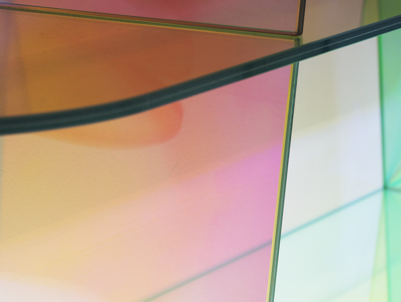
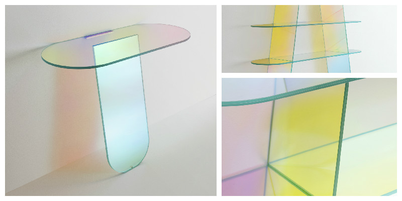
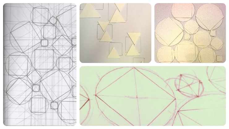
We’ve been keeping track of our progress on this exciting new project, and the photographs below were taken in the initial stage. The two designers have been sending designs, sketches and samples to each other, in order to agree on the direction to move forward with the project:

Drawings-3D

The work is challenging and exciting, as Eliza and Sharyn are working collaboratively with a fair physical distance between them too. This has definitely made it a challenge to meet and exchange ideas, especially in such visual and tangible forms of work. Luckily, that’s been bridged quite effectively by the use of modern technology, over the Internet, digital photography, emails, Skype and the more old school postal service.

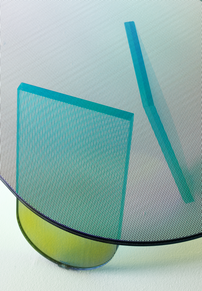
We’ve now moved further with the project, so alongside paper drawing, we’re doing a lot of print & pattern design and folding in our Edinburgh studio:

Work-in-progress-pic2

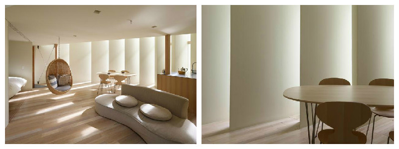
We’re hoping for an outcome that will materialize as an accessible form of art piece (wallcovering or lighting accessories), by creating innovative, stylish objects with a practical end-use. In our vision, this product will add an artistic edge and personality to any interior space that’s looking for a contemporary makeover.

Work-in-progress-pic3

The project, once finalized, will be displayed in an exhibition at the National Centre for Craft & Design’s Roof Gallery, between July – September 2015, with more details following soon!

Posted on

Shapes and geometry in interior design – some inspiration

In this blog post, we’ve turned our antennas to the playful use of shapes and geometry, in interior design. Here are our top three picks.

The first example stems from the tiny world of bees, as we think nature is a great source of exquisite inspiration. If bees had contemporary awareness and the ability to use and appreciate furniture, we’re sure they would have a lot to buzz about this stylish coffee table:

coffee table inspired by the look of beehives

And since we mentioned bees, we think this wall covering would make for a nice match inside their beehives as well. In fact, the vibrant color mix and geometric pattern of the wall covering looks pretty stylish in this contemporary living room as well:

bee inspired interior design

And in a more abstract composition, we like this particular feature wall that ties up in a contemporary, urban room. The play on various sizes and shades of gray rectangles creates a nice pattern on the accent wall, adding an extra coolness to the place:

geometric interior wall covering

Posted on

Patterns in Interiors

In this new blog post series, we look at creating patterns through the use of colour, in order to create unique and lively interiors. We take our inspiration from spring/ summer colours and explore how these can be mixed and matched to recreate the zing of the season.

We start with a bold, orange themed interior:

amazing-room-with-bright-bold-colors-design-590x393

What we particularly like about this interior is the mix of lively, bright colours and the predominance of curvy lines and organic shapes, reflected in the shape of the furniture and in the patterns on the wall coverings and coffee tables.

In a very different composition, we found this very contemporary blend of purple, lime green, black and white:

artistic-interior-design-with-bold-colors-design-590x442

The straight lines and sharp angles used in this interior help create the illusion of extra height in an otherwise low ceiling room. The use of lime gives a fresh, spring-like feel to the interior. While the general rule of thumb is to use only two colours (three, at most!) for large areas, such as a feature wall, we think this particular design has successfully pulled it off with all four hues it features. Bold to the bone!

All colours aside, you can create a striking design, using just black and white and a sneaky pink accent:

patterns-in-interior-design10

This seemingly simplistic design also adds height to the room. While black and white is not a colour mix you would expect to find in nature, the drips on this wall art gives a touch of authenticity, and the pink drip in particular is a nice surprise to break the monotony. All in all, it’s an inspiring way of pulling together the neutral flooring and the all-black chairs and lamp into a stunning and stylish interior design.