Posted on

See Different: Discovering the Power of Pattern

Today, we introduce you to Patternity. For something a little bit different, we’re looking at patterns. This is one of the first things you learn as a textile designer. A constant source of inspiration is key for your creations. You’re taught to look at things differently and develop a knack for looking beyond the obvious.

Musical instruments with tremendous detail. Sea creatures in sublime splendour. The galaxy with its hypnotic qualities. Look long enough and distinct patterns start to emerge, colours take a different turn and beauty awakens. The unexpected has a way of fuelling our inspiration.

blog1_PATTERNITY_water-beads-darrell-horner

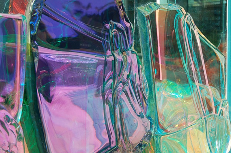
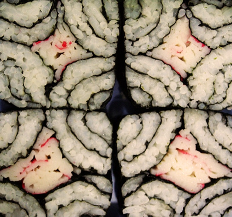
Stumbling on Patternity was like a child finding a treasure box of sweets.  Their photo archive is a fantastic source of inspiration. From water, hair to soap bubbles, they show you just how ubiquitous patterns are.

Patternity was founded on the belief that “a shared awareness of pattern has the power to positively shape our world”. Originally known for their extensive online pattern archive, they’ve expanded into research and consultancy and also have a creative studio.

blog3_Patternity_Luminescent-Glass

At Moody Monday, one of our core values is seeing hidden beauty and expressing it. We seek out hidden beauty and take out inspiration from unlikely places. So Patternity is a company after our own heart, they align well with our thinking.

blog2_Patternity_Kalaeidescope-Sushi

Our Secret Music collection was inspired by the internal parts of an abandoned organ. A trip to the beach birthed our ‘Gems on the beach’ silk cushion.  Wait till you see our next collection.

Take some time over the next couple of days to look around you for inspiration. You might not want to become a designer but you’ll appreciate your environment just a little better.

All images were sourced from Patternity

Posted on

Tactile Texture for Interior Walls

Walls don’t have to be flat or covered in paint to be attractive. So continuing the theme of using texture in interior design, in this blog post we have looked specifically at textured wall coverings. As with all unusual interior choices it’s best to keep the textured wall surface to a limited area, as not to over crowd the space by having all walls covered with the textured pattern.

As we mentioned in a previous post, texture can be either tactile or visual, creating the illusion of tactile texture. Naturally, wallcoverings follows these two styles as well. In this post we’re looking at tactile texture, and we start with a very exquisite example used on interior walls:

3D wall covering

This is a creative use of ceramic tiles by David Pergier. We particularly like this wall as it conveys the power of 3D textures and the nice glossy surface of ceramic tiles. Also notice how the wall texture is broken into sections by the use of smooth vertical stripes. This further emphasizes the intricate areas, by creating a playful contrast and breaking the monotony of the wall.

One other way of using tactile textured walls is by creating feature walls in an interior space – be it at home or in a shared space. Here are two interpretations, both created using clean, plain white materials:

Textured wall covering

While adding texture to the walls may be enough to create a highlight in the room without needing to add colour variations (as in the examples we’ve given so far), sometimes colour can help go the extra mile, and create a truly unique mysterious or playful atmosphere:

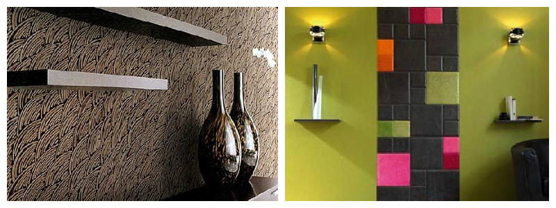
Tactile textured interior walls

These two examples add an extra dramatic effect to the spaces by using dark colours (left) and high contrast, bright colours (right). While both these examples create a powerful look for the interior, they need to be surrounded by contrasting surfaces, to help highlight them. As such, notice the plain green hue used in the example to the right, which naturally draws your eyes to the textured stripe in the middle.

Posted on

Using Pattern & Light In and Around Dining Areas

Exquisite dining – in your own home. Who’s to say you need to head downtown for a memorable, fine dining experience? While we will not be making dinner menu suggestions, we would like to give you a few tips on how to arrange your dining area to create an elegant and luxurious atmosphere.

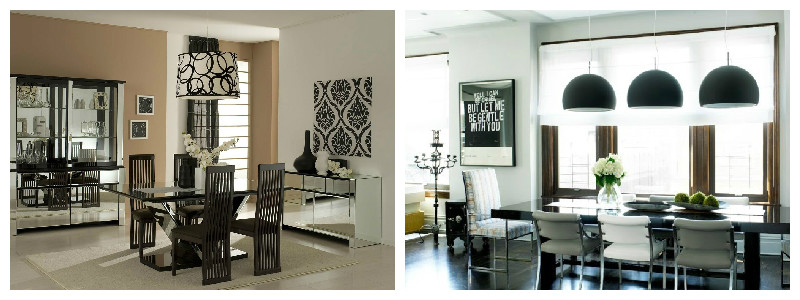
Low hanging light solutions over the dinner table really bring the area into emphasis, and we find them to be a great way of enhancing the dining experience. They also add a flare modernism to the space. Our favourite ones look like this:

light-textures-1

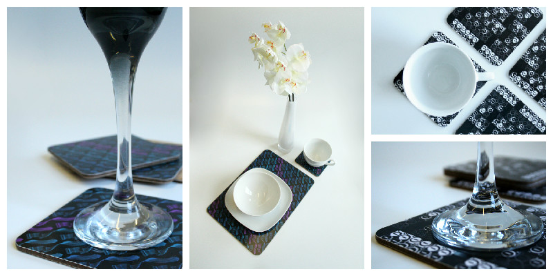
Pattern at the dinner table: to add a subtle yet outstanding note to your dining area, we recommend using high quality design place mats and coasters. These will serve a double purpose, protecting the surface of your dining table, and adding a dash of personality and an accent note to the table:

light-textures-2

If you would like to see our entire collection of tableware accessories, they are available on our website: coasters and placemats.

After-dinner relaxing

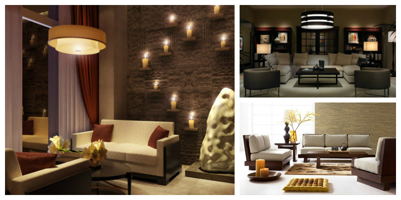
For the after-dinner lounging area, we prefer low intensity lighting and even candle light, depending on the context and guests you’re entertaining. This will help create a relaxed and intimate atmosphere. Add a glass of wine, and you are bound to be a fabulous evening in. Here are a few examples:

light-textures-3

Comfortable, visual textures as patterns: According to designer Abigail Ahern “soft furnishings are the five-minute face-lifts of the decorating world, instantly perking up your room with an array of different textures”. You can sue these either as stand-alone statement pieces, or bundled up to create contrast and play, using different visual textures. Recommended materials are silks and cotton, and our own collection offers luxurious cushions in daring patters and texture, ideal for adding a subtle yet outstanding note to your dining area:

light-textures-4

From top to bottom, cushions suggested are:

Posted on

Big Ideas for Small Space Interiors

Continuing our post from a few days ago on decorating small spaces, we’re now looking at a few more tricks and accessories that can enhance the look of small interiors.

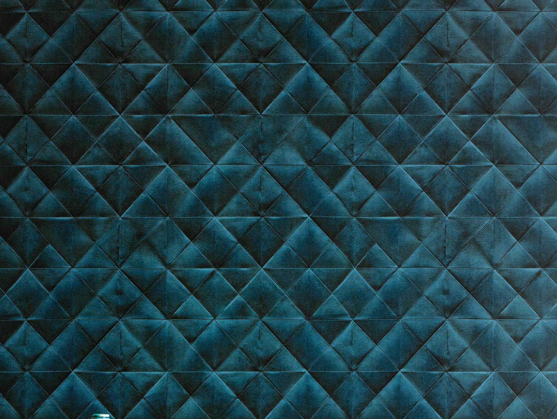
Dark colours. Although some people are intimidated by the use of dark wallcoverings, when used properly, they can add a dash of coziness, intimacy, and dramatism to the space. Moreover, a repeating pattern on all walls makes the lines between them blur, thus giving the impression of a less constrained space. Not to mention, it can transform a featureless room into a super exiting space. Here is our interpretation, using the Geometry of the Sound, Blues / Purple on Black wallcovering from our latest collection:

Geomtry_coloured3

Add a mirror. Probably the oldest trick in the book, and for good reasons too. A mirror will not only make the space feel bigger, but it will also reflect back some of the light – deal for slightly darker rooms, and it will add an extra dash of sophistication to the room, whether you make use of a stylish mirror, or a plain one:

1-small-spaces-mirrors

Round, not square. We agree with House and Garden on this one: a round coffee table creates the feeling of circular space, and also makes it easier to place other objects around, making it ideal tor small interiors:

2-small-spaces-round-coffee-table-2

Make use of vertical space. This one is our favourite! Often times, when we think square footage, we only consider the floor. But with a little bit of ingenuity, walls can easily turn into extra space! While it’s not always the best idea to overcrowd a room, it certainly works nicely with some small interiors. Use shelving units and make the most of the verticality of your room, in a nice and elegant way. Here are some ideas:

3-small-spaces-shelving

To prevent the room from looking too busy, one rule of thumb would be to have only one wall looking like this and something completely different with the other(s). Mirrors and stylish wallcoverings are definitely good places to start!

Posted on

Patterns in Interiors

In this new blog post series, we look at creating patterns through the use of colour, in order to create unique and lively interiors. We take our inspiration from spring/ summer colours and explore how these can be mixed and matched to recreate the zing of the season.

We start with a bold, orange themed interior:

amazing-room-with-bright-bold-colors-design-590x393

What we particularly like about this interior is the mix of lively, bright colours and the predominance of curvy lines and organic shapes, reflected in the shape of the furniture and in the patterns on the wall coverings and coffee tables.

In a very different composition, we found this very contemporary blend of purple, lime green, black and white:

artistic-interior-design-with-bold-colors-design-590x442

The straight lines and sharp angles used in this interior help create the illusion of extra height in an otherwise low ceiling room. The use of lime gives a fresh, spring-like feel to the interior. While the general rule of thumb is to use only two colours (three, at most!) for large areas, such as a feature wall, we think this particular design has successfully pulled it off with all four hues it features. Bold to the bone!

All colours aside, you can create a striking design, using just black and white and a sneaky pink accent:

patterns-in-interior-design10

This seemingly simplistic design also adds height to the room. While black and white is not a colour mix you would expect to find in nature, the drips on this wall art gives a touch of authenticity, and the pink drip in particular is a nice surprise to break the monotony. All in all, it’s an inspiring way of pulling together the neutral flooring and the all-black chairs and lamp into a stunning and stylish interior design.

Posted on

Meet Alexandra – our new social media and marketing intern

This week, we’ve had a new intern joining Moody Monday: Alexandra will be working alongside our Head Designer, Eliza Kesuma, to increase the company’s brand awareness and reach, through social media and marketing communication.

We’ve asked Alexandra to take the stage and introduce herself, talking about how she came to join Moody Monday, her previous experience, passions and ambitions for the future. This is her story:

Here I am, on one of my last evenings of a short road trip in Denmark, checking my email, when I excitedly read the following subject line: “Interview Invitation”. Sender: Eliza at Moody Monday. Oh boy!

When I first read about the internship opportunity one week before, it seemed a perfect match for my previous experience, skills and interests, so I applied immediately. After a closer look at Moody Monday’s website, blog and social media, I started to paint a picture in my mind of this highly creative, closely-knit, vibrant and friendly organization – and I wasn’t mistaken.

Meeting Eliza and Sara for the interview was a truly pleasant experience, as I genuinely felt we ‘clicked’ both personally and professionally. I left the venue happy, knowing that regardless which way this will go, we’ve had a productive encounter and a nice exchange of ideas. I was even leaving with a recommendation for a new book to add on my ‘must read’ list!

A few days later, I got the call from Eliza offering me the position, which I gladly accepted. And so here I am now, three days into the job, taking the lead of Moody Monday’s social media and marketing communication. I do have a few years of work experience in the field, so I’m confidently looking forward to use and improve these skills here, and to help drive Moody Monday on its path to reaching and engaging the right audience. I expect this to be a challenging and rewarding job. I can’t wait!

As for my other passions and hobbies, I occasionally participate in long distance running events, in support of various NGOs, and try to keep my personal blog up to date with random thoughts. That aside, I’m a naturally curious person, so I often drift into new projects:  graphic and web design, photography, painting, crafts, etc. While I don’t see myself going into business with this like Eliza has, I do enjoy spending some of my free time on these hobbies. I like being around creative work, so I joined Moody Monday with a strong desire to immerse myself in all things beautiful. So far so good 🙂

Photo: ©Alexandra Haret 2015

On top of the internship, I’m currently finalizing my Master’s thesis remotely, and will be graduating from Aalborg University in Denmark this summer, with my degree in Market and Consumption.

As for the future, I’m looking to advance into marketing and communication, promoting businesses in various fields, so this field will continue to be my main focus for the upcoming years. However, I’ve always been a ‘Jane of all trades’, so I want to continue adding new skills to my ‘portfolio’. In the near future, I’ll be looking to develop my web design experience, which at the moment is at an early hobby stage.

But all things in good time. In the meantime, I’ll be sharpening my creativity and marketing skills on Moody Monday’s social media space, so be sure to keep an eye on these!”


Posted on

Alternative Interiors, Part Three

This week we’re looking at Textured wallpaper as an interior alternative. Using texture(s) in your wallcoverings can be a tricky technique to get right, but when it’s done well textured walls can be mesmerising.


1874810575_l


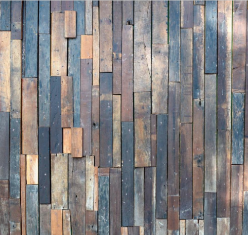
We love designs that play around with surface textures, so for us textured wallpaper is really exciting. It can be quite a bold statement if used in a residential space: bare brick or stone, wooden panels, even more plush surfaces like the one featured below.


Screen Shot 2015-02-11 at 17.38.11


Textured wallpaper is particularly useful for adding an extra dimension to a room, or bringing it out of its more traditional context. How would you use textured wallpaper?


prodotti-79694-rel2c65aea6fa23430e9f3a064fcda7c716

Posted on

Alternative Interiors, Part Two

In this week’s alternative interiors blog we’re looking at Abstract designs.


1124475428_l


Abstract patterns are always compelling, not least for their unusual quality. They’re also a good way of incorporating an artistic edge to an interior space.


s6-bitmap


We like these featured designs which make use of various colours, hues, and shapes to create diverse surface textures. The result is very alluring – you can’t help but be taken in by the complexity of each image.


02991e9cd20523299dd503d6e42113b9


Like Geometrics, Abstract designs lend themselves to many different styles, making them a versatile interior tool. Surface designers often make use of Abstract patterns as they add depth to 2D spaces (as in the above image).

Posted on

Alternative Interiors

Part of our ethos here at Moody Monday is to create designs that challenge traditional style concepts. Florals can be lovely, but they have a tendency to look twee and have been recycled again and again by various designers and artists. In this blog series we’ll be looking for alternative prints and patterns that can be incorporated into interior spaces to create a more original, striking, contemporary look.

To get things started, we’re looking at Geometrics.

2032068174_l


Geometric patterns are a great way to add a point of interest to a room in the form of a feature wall. They can also be used with accessories to jazz up block colours.


Screen Shot 2015-02-11 at 15.20.30


Geometrics are rather versatile too – they can make a room look contemporary and chic or provide a retro feel, depending on how they’re used. Making use of prints and patterns is also a good way to incorporate more colour into a space.


69197493_l


A word of advice about geometrics: be careful not to overuse these kinds of patterns in one space. Though the arrangement of various shapes and colours can look stunning, overcrowding a space will make it look confused and disordered.


2535_l

Posted on

Inspiring Designers, Part Five

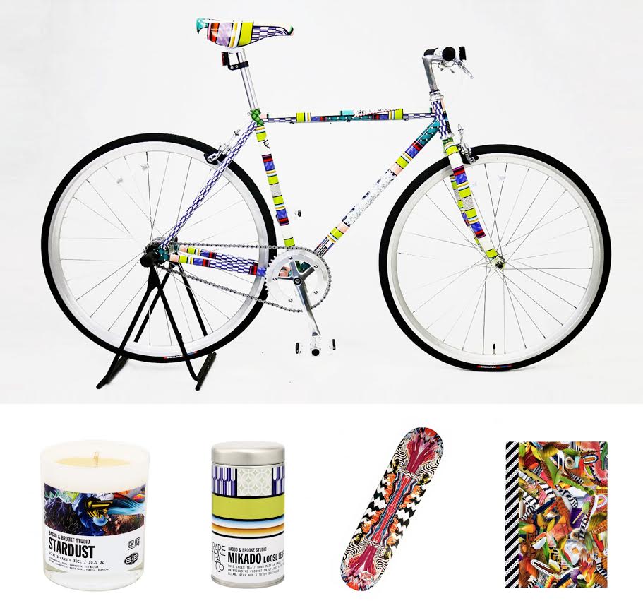
This week we’re keeping it bright and bold with Basso & Brooke!

Revered for their digital prints, fashion and textile designers Bruno Basso and Christopher Brooke have collaborated with many major corporations where they have produced cutting-edge work that never fails to express a strong sense of personality. If you like making a statement then Basso & Brooke are for you.

Photo: ©Basso & Brooke Studio 2015.

We really adore the diversity of their prints, which are often busy with a geometric, artsy style. The designs are inspiring for their bold, surreal style that sometimes borders on ‘trippy’. We’re also impressed by their ability to match their prints to such a range of products: clothing, accessories, homewares, even skateboards!