


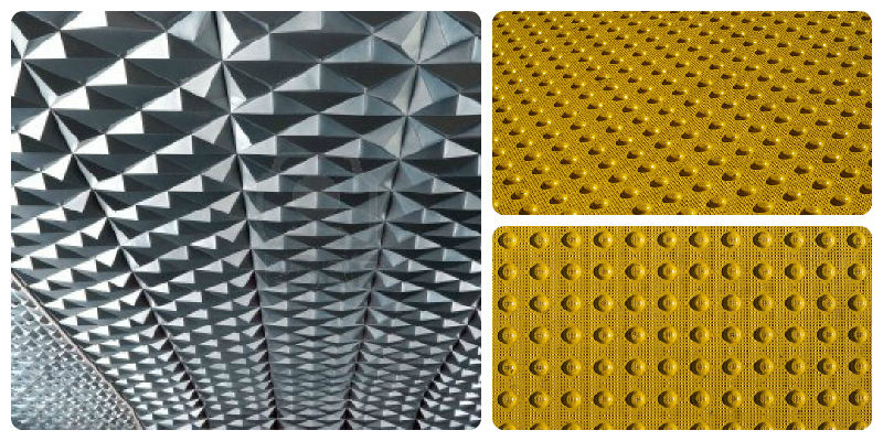
Texture in interior design is often used to add highlights to specific areas of the space. We also perceive texture in relation to the adjacent surfaces, the viewing distance and lightning of the area. For example, to highlight a rough surface, this is best placed next to a smooth surface. The roughness is emphasized when the surface is viewed up close and grazed with light (lit from the side), which highlights the texture through shadows and light spots. Moreover, changing the angle from which light hits the textured surface, and the view angle, creates a different visual effect. Here is an exemplification:
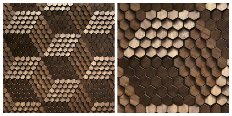
Textures in design can be of two different kinds, either tactile or visual. Tactile texture refers to the actual feeling of a surface – smooth, rough, soft, hard, etc., whereas visual texture appeals to our perception, what a texture might feel like. Oftentimes, through the use of visual texture, a surface can create the illusion of a specific tactile texture or an added depth. Here’s one great example, of how lighting is used to create a different visual effect when looking from a short or longer distance:
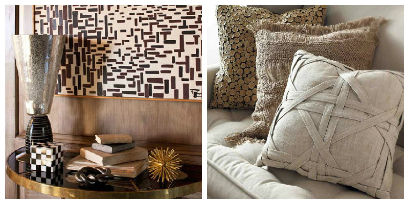
In practice, all these textures can be used in interior design to add distinctiveness to the room, and visual textures in particular can create a stunning effect. Some of our favourites (exemplified below) include the use of patterns (left) and tactile textures (right):
Adding textures to an interior is a sure fire way of creating a visually interesting space, but we also recommend using caution, as too much texture can create a cluttered and over stimulating appearance to the space.
