Posted on

A Small Bite of Industrial Design

This week we’re taking Moody Monday out, and exploring industrial designs in restaurants. We’ve chosen two quite different ones, to get different perspectives on how industrial design can fit in with the eating experience.

The first is the PAT’S steakhouse in Melbourne Australia:

Blog-2

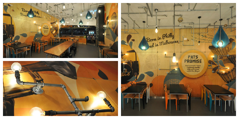
We particularly liked the uncommon mix of industrial look and cosiness of this space, created by the tangled lighting system on the ceiling build on pipes, and the warm, lively orange hues of the walls. It builds a balanced look for the place, both inviting and enigmatic.

On a more heavily industrial note, we like the Blue Butcher restaurant in central Hong Kong, China:Blog-1

The use of steel, reclaimed wood, leather and raw plaster gives this interior an amazing industrial yet funky feel. According to the restaurant’s own website, Blue Butcher is trying to recreate the atmosphere of the Prohibition era, using exposed light fittings and long steel metal staircases. We think they’ve done a good job, and we particularly like the heavy dark unrefined wood tables. The only question is… will their food be as amazing as the interior design? We hope so!

Posted on

Patterns in Interiors

In this new blog post series, we look at creating patterns through the use of colour, in order to create unique and lively interiors. We take our inspiration from spring/ summer colours and explore how these can be mixed and matched to recreate the zing of the season.

We start with a bold, orange themed interior:

amazing-room-with-bright-bold-colors-design-590x393

What we particularly like about this interior is the mix of lively, bright colours and the predominance of curvy lines and organic shapes, reflected in the shape of the furniture and in the patterns on the wall coverings and coffee tables.

In a very different composition, we found this very contemporary blend of purple, lime green, black and white:

artistic-interior-design-with-bold-colors-design-590x442

The straight lines and sharp angles used in this interior help create the illusion of extra height in an otherwise low ceiling room. The use of lime gives a fresh, spring-like feel to the interior. While the general rule of thumb is to use only two colours (three, at most!) for large areas, such as a feature wall, we think this particular design has successfully pulled it off with all four hues it features. Bold to the bone!

All colours aside, you can create a striking design, using just black and white and a sneaky pink accent:

patterns-in-interior-design10

This seemingly simplistic design also adds height to the room. While black and white is not a colour mix you would expect to find in nature, the drips on this wall art gives a touch of authenticity, and the pink drip in particular is a nice surprise to break the monotony. All in all, it’s an inspiring way of pulling together the neutral flooring and the all-black chairs and lamp into a stunning and stylish interior design.

Posted on

Alternative Interiors, Part Three

This week we’re looking at Textured wallpaper as an interior alternative. Using texture(s) in your wallcoverings can be a tricky technique to get right, but when it’s done well textured walls can be mesmerising.


1874810575_l


We love designs that play around with surface textures, so for us textured wallpaper is really exciting. It can be quite a bold statement if used in a residential space: bare brick or stone, wooden panels, even more plush surfaces like the one featured below.


Screen Shot 2015-02-11 at 17.38.11


Textured wallpaper is particularly useful for adding an extra dimension to a room, or bringing it out of its more traditional context. How would you use textured wallpaper?


prodotti-79694-rel2c65aea6fa23430e9f3a064fcda7c716

Posted on

Alternative Interiors, Part Two

In this week’s alternative interiors blog we’re looking at Abstract designs.


1124475428_l


Abstract patterns are always compelling, not least for their unusual quality. They’re also a good way of incorporating an artistic edge to an interior space.


s6-bitmap


We like these featured designs which make use of various colours, hues, and shapes to create diverse surface textures. The result is very alluring – you can’t help but be taken in by the complexity of each image.


02991e9cd20523299dd503d6e42113b9


Like Geometrics, Abstract designs lend themselves to many different styles, making them a versatile interior tool. Surface designers often make use of Abstract patterns as they add depth to 2D spaces (as in the above image).