Posted on

The Timeless Appeal of Mid-century Patterns


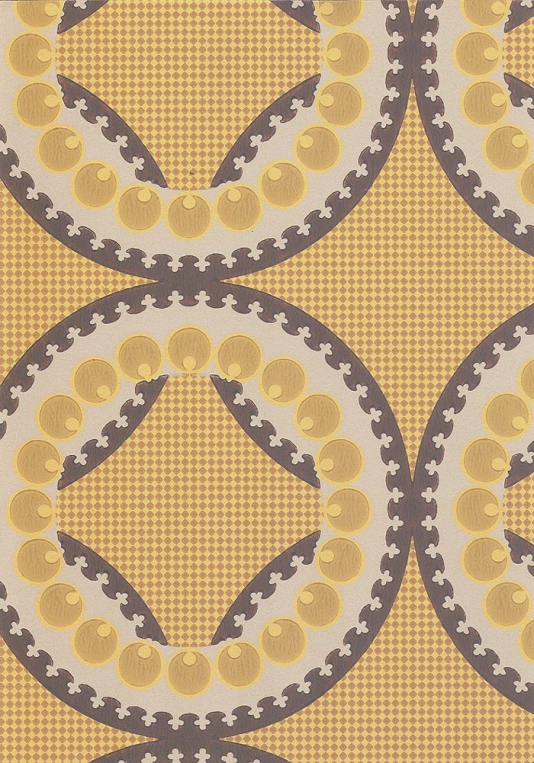
Chances are you would have come across mid-century patterns if you’re into interior design. Very popular in the 50s and 60s, minimalism and simple repetition ruled with this trend.

Even today, they’re still very much in vogue. You can understand the appeal for these designs. They’re striking, geometric, reminiscent of things we can all relate with and at times nostalgic. Nowadays, it is more common to find people seeking interesting modern interpretations.

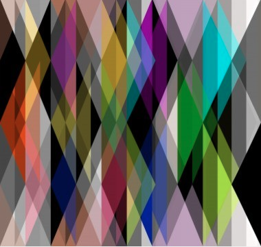
What’s not to like about the sheer simplicity in the patterns used? The bold contrasting colours are a staple which means they’re nothing but bold and beautiful. A perfect match for anyone who likes full on colour.

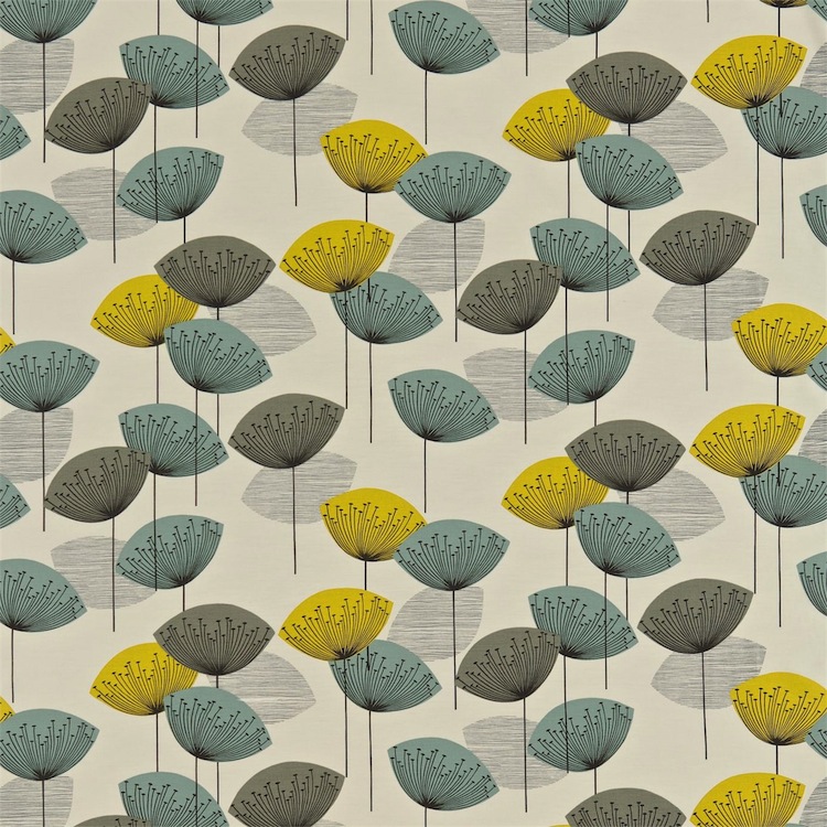
One very popular design is the Dandelion clocks pattern which was designed by Fiona Howard for Sanderson in 2008.

Sanderson_dandelion_clocks
Dandelion clocks, Fiona Howard

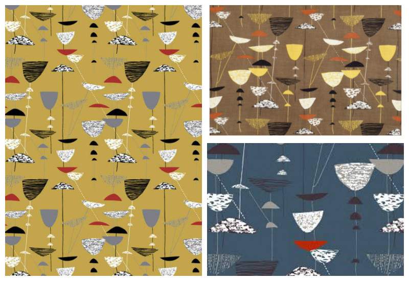
Going down memory lane, a textile designer well known in her days for brilliant designs was Lucienne Day. The ‘Calyx’ which she designed for Heal’s in 1951 was the fabric that brought her fame.

blog5_midcenturypattern
Calyx, Lucienne Day

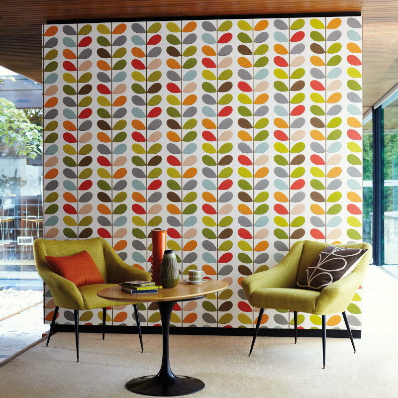
Orla Kiely is another lady whose name rings a bell when it comes to mid century patterns. Her designs are literally on everything.

blog1_midcenturypattern
Multi Stem wallpaper, Orla Kiely

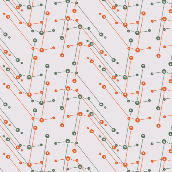
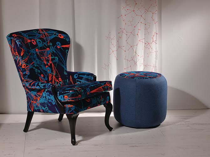
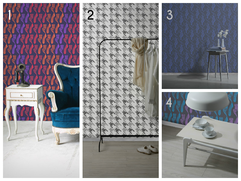
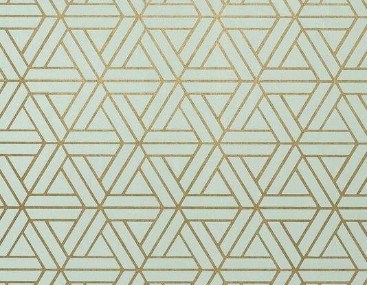
Even some designs like this Aquila wallpaper design in our Stellar collection have been said to have mid-century feel to them too albeit a modern take. We sure didn’t see that coming but we’re more than happy to take the compliment.

Aquila wallpaper_sage and orange2
Aquila wallpaper, Moody Monday

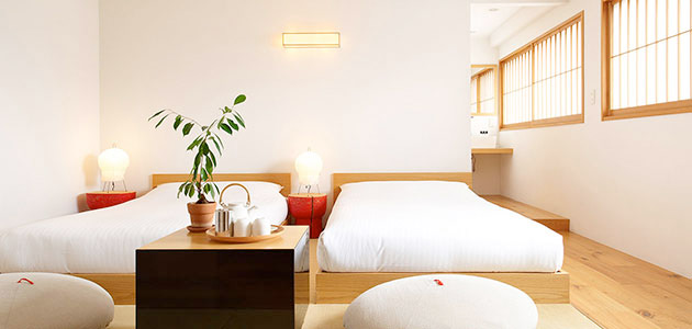
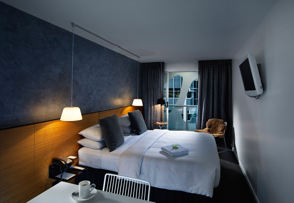
With applications on wallpaper, fabric, wall art and even custom headboards, you’ll agree that these designs are very versatile. Inspired? Why not look to infuse this into your home?

Posted on

Our Stellar Collection is debuting at ICFF New York 2016

Moody Monday_Stellar_Nebulae chair footstool_ICFF 2016

“Stellar is a luxurious, contemporary design collection inspired by the boundless beauty of the sky and space.”

Debuting at the International Contemporary Furniture Fair (ICFF)  in May 2016, our new collection ‘STELLAR’ is inspired by the boundless hidden beauty of the sky and space. This luxurious, contemporary collection of designs captures the dualistic nature of the skies with a colour palette evoking both dawn and dusk.

The ‘STELLAR’ collection consists of four wallpaper designs in varying colour ways, three fabric patterns, two cushion designs, four coasters and a set of matching fabric, coaster and placemat designs.

Moody Monday will be launching STELLAR  at ICFF.

Level 1, Booth 2503
Jacob K. Javits Center, New York
14 – 17 May 2016
For more details, visit our exhibitor profile at ICFF. Come and say hello. We look forward to seeing you.
Posted on

Stockist Profile: Introducing WALPA Japan

Over the last few weeks we’ve been doing spotlights on some of the amazing businesses we work with. Today we’re off to our stockist in the Asian Continent – WALPA.

They are a Japan-based wallpaper specialty store dedicated to bringing happiness and comfort to people through wallpaper. Their mission is to bring a new love for patterned walls to Japan. Their five stores are beautifully designed and presented as you can see (pictured below). Customers literally get a piece of ‘wallpaper heaven’.

Blog1_walpafukuoka1

WALPA’s collections range from modern, classic, shabby chic to vintage, Moroccan, you name it. You’ll find they have a vast plethora of styles available to meet everyone’s needs. They stock a wide array of brands from various parts of the world including well-known UK based ones such as Moody Monday, Liberty, Graham and Brown, Cole and Son.

Blog3_walpaginza1.jpg

You can view our profile on the WALPA website here. We want to spread wallpaper love as far and wide as possible so feel free to spread the word to other wallpaper lovers you know in that part of the world.

Images sourced from WALPA’s website.

Posted on

We have a new stockist – Wallpaper Antics

We love wallpaper here at Moody Monday, we can’t hide it. It’s our staple product and it is our goal to make our creations accessible to as many customers as possible. So we’re always on the hunt for stockists to collaborate with to make this happen.

We’re pleased to announce that we now have our very first stockist in Australia – Wallpaper Antics.

wallpapers-antics-logo

With the simple aim of offering customers high quality bespoke wall coverings for their homes that are unique investment pieces, Wallpaper Antics concentrates on featuring wallpaper from skilled designers across the globe.

The wide array of wallpapers, many of which are screen printed present plenty of choice for customers looking to decorate their homes. From hand screen printed wallpaper to digitally printed wallpaper and murals, they have all you need to create a striking look in your home. They also offer a bespoke printing service which caters to clients working on a one of a kind project.

The full range of Moody Monday’s wall coverings are stocked by Wallpaper Antics. Check out our profile on their website.

blog_MM collageSecret Music collection by Moody Monday – The Dance ,  Black Keys,  Geometry of the Sound

Here are a few others from their assortment of wallpapers.

blog1_wallpaper collage1. Etoile wallpaper by Sian Elin | 2. Culcita wallpaper from Blackpop | 3. Muscat Small wallpaper by MissPrint

Founder, Andrea Renting adds that “Wallpaper Antics was created because of a passion to kindle a new love for wallpaper in Australia like there is in the UK and US. Wallpapers are like a piece of art and we want everyone to enjoy them by investing in something special not just any mass-produced run-of-the-mill wall coverings. The vision is to bring together designers and small boutique labels in one hub for the Australian market.”

To peruse their online store, go to http://wallpaperantics.com.au/

Images sourced from Wallpaper Antics website.

Posted on

Big Ideas for Small Space Interiors

Continuing our post from a few days ago on decorating small spaces, we’re now looking at a few more tricks and accessories that can enhance the look of small interiors.

Dark colours. Although some people are intimidated by the use of dark wallcoverings, when used properly, they can add a dash of coziness, intimacy, and dramatism to the space. Moreover, a repeating pattern on all walls makes the lines between them blur, thus giving the impression of a less constrained space. Not to mention, it can transform a featureless room into a super exiting space. Here is our interpretation, using the Geometry of the Sound, Blues / Purple on Black wallcovering from our latest collection:

Geomtry_coloured3

Add a mirror. Probably the oldest trick in the book, and for good reasons too. A mirror will not only make the space feel bigger, but it will also reflect back some of the light – deal for slightly darker rooms, and it will add an extra dash of sophistication to the room, whether you make use of a stylish mirror, or a plain one:

1-small-spaces-mirrors

Round, not square. We agree with House and Garden on this one: a round coffee table creates the feeling of circular space, and also makes it easier to place other objects around, making it ideal tor small interiors:

2-small-spaces-round-coffee-table-2

Make use of vertical space. This one is our favourite! Often times, when we think square footage, we only consider the floor. But with a little bit of ingenuity, walls can easily turn into extra space! While it’s not always the best idea to overcrowd a room, it certainly works nicely with some small interiors. Use shelving units and make the most of the verticality of your room, in a nice and elegant way. Here are some ideas:

3-small-spaces-shelving

To prevent the room from looking too busy, one rule of thumb would be to have only one wall looking like this and something completely different with the other(s). Mirrors and stylish wallcoverings are definitely good places to start!

Posted on

Moody Monday Showcased in Shenzhen, China

It seems as though just yesterday we were (carefully) packing our elegant and contemporary wallcoverings, and shipping them over all the way to Shenzhen, the UNESCO City of Design!

Blog-packing

Three weeks and almost 6000 miles later, there they are, being prepared for display in the Edinburgh Creative Industries taking place in Shenzhen, China. The incubator opens in a very short three days, on Friday 15th May and we’re very excited our work will be displayed in the venue for the upcoming three months.

“I’m really excited about the opportunity of sharing my wallcovering designs with the Chinese market, as Shenzhen is a vibrant and creative city, which falls in line with the designs I create. I’m looking forward to find out how my work will be received in this new market!” Eliza Kesuma, the designer behind Moody Monday.

The designs that will be on display are part of our first luxury wallpaper collection inspired by the inner workings of a musical organ. Here’s what we’ve sent over:

Blog-Wallcoverings-numbers

1. Geometry of the Sound, Reds on Black | 2. Black Keys, Black on White | 3. The Dance, R. Blue on Black | 4. Geometry of the Sound, Blues / Purple on Black

Posted on

Here’s How to Turn Small Interiors Into Real Bijoux

They say small rooms can be a headache, but they can also be a blessing in disguise! If you are looking to make the most out of a tiny space – be it a living room, guest bedroom or second bathroom, here are our top tips on making the most of it.

Using a pale colour scheme can make the space look more airy and bright, and even a tiny single bedroom can look quite spacious:

Blog-small-spaces-1

To keep the room from becoming too bland though, we recommend adding some bold patters or textures, such as a feature wall, to give a point of visual interest to the room. Here’s our interpretation, using the Black Keys wallcovering:

Slides 01

Using a small room for multiple purposes can be quite the challenge ass well, so that’s the best time to bring the big creative guns out. For example, consider incorporating furniture that isn’t your typical ‘home office’, but rather something that will bend in with the rest of the room design. Here are two examples, first of a living-room & study area, and the second of a bedroom & home office:

blog-small-spaces-2

And finally, we’ve looked into small bathroom as well. We really dislike than feeling of being crowded and uncomfortable in a tiny restroom. Luckily, there’s a way around it, and we find that adding a dash of personality, with an accent call, can help to create the illusion of more space, even to the tiniest bathroom:

blog-small-spaces-3

Posted on

Alternative Interiors

Part of our ethos here at Moody Monday is to create designs that challenge traditional style concepts. Florals can be lovely, but they have a tendency to look twee and have been recycled again and again by various designers and artists. In this blog series we’ll be looking for alternative prints and patterns that can be incorporated into interior spaces to create a more original, striking, contemporary look.

To get things started, we’re looking at Geometrics.

2032068174_l


Geometric patterns are a great way to add a point of interest to a room in the form of a feature wall. They can also be used with accessories to jazz up block colours.


Screen Shot 2015-02-11 at 15.20.30


Geometrics are rather versatile too – they can make a room look contemporary and chic or provide a retro feel, depending on how they’re used. Making use of prints and patterns is also a good way to incorporate more colour into a space.


69197493_l


A word of advice about geometrics: be careful not to overuse these kinds of patterns in one space. Though the arrangement of various shapes and colours can look stunning, overcrowding a space will make it look confused and disordered.


2535_l

Posted on

Boutique Hotels Inspiration, Part Ten

The final instalment of our hotels inspiration feature takes us to Japan and the Claska Hotel.

Being primarily concerned with design innovation, the hotel divides rooms into thematic categories: ‘Japanese Modern’, ‘Contemporary’, ‘Tatami’, and ‘Weekly Residence’. These various design concepts present guests with contrasting spaces which range from traditional Japanese, wider Asian influences, welcoming comfort, East-West fusion, and even to more conceptual artistic spaces.

Photo: one of the ‘Weekly Residence’ rooms. ©Claska 2015.

We feel most inspired by the imaginative décor which, though contemporary, still maintains the Japanese style and sensibility. The interesting exterior also makes this hotel a visually engaging space which emits a vibe of creativity. They also have a shop to spoil design fans rotten; fantastic focus on detail!

Photo: one of the Tatami rooms available at Claska. ©Claska 2015.

We hope you’ve enjoyed the hotels we’ve shared with you over the past few weeks. Check out our other blog features where you can see which designers we can’t get enough of!

Follow us on social media:
Facebook
Twitter

Posted on

Boutique Hotels Inspiration, Part Nine

We’re staying further afield again this week with the Limes Hotel, Brisbane.

First opened in 2008, this hotel actually forms part of a group of hospitality and entertainment establishments made up of bars and restaurants.

Photo: Contrasting textures lend subtle intrigue to this understated guest room.
Photo: Contrasting textures lend subtle intrigue to this understated guest room. ©Damian Griffiths, Limes Hotel 2015.

Though the interiors, designed by Derlot, deliver exceptional contemporary style, what we really admire is building’s façade (pictured below) which presents a large-scale graphic pattern that also doubles as a feature for the windows of the guest rooms. This statement architecture lets you know upon first glance that the building is a design hotel.

Inside, patterns are more subtle with contrasting surfaces and a mixture of different materials. It seems the design subverts expectations by reversing the usual order of things: bolder prints as a pattern for the exterior, and a more architectural approach to the interior.

Photo: the hotel's impressive exterior. ©Damian Griffiths, Limes Hotel 2015.
Photo: the hotel’s impressive exterior. ©Damian Griffiths, Limes Hotel 2015.