If you have a keen interest in interior design, you would have seen the Pantone Colour of the year. It was announced last year. For the first time in Pantone’s history, the team decided on two colours – Rose Quartz and Serenity Blue. What a luxury. Instead of popularising one colour, they chose to present them as a combination.
These colours are reminiscent of baby gender reveal parties popular these days. They are soft and very easy on the eye. When paired together, they bring a sense of soothing freshness to an interior space.
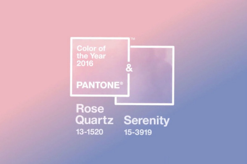
According to Pantone, “Rose Quartz is a persuasive yet gentle tone that conveys compassion and a sense of composure. Serenity is weightless and airy, like the expanse of the blue sky above us, bringing feelings of respite and relaxation even in turbulent times.”
Today’s feature looks at one half of this beautiful Pantone colour duo – Rose Quartz.
Finding the right colours to allow this soft pink colour shine through is important. In today’s feature, we share two applications in a living room setting.
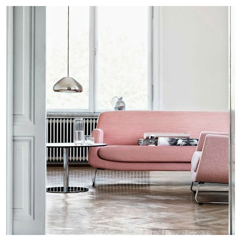
For a bright and airy look, paint your walls in white or off-white. Pared back with minimal metallic accessories, the pink sofa pops is the centre of attention in this living room. The herringbone patterned flooring adds that extra touch of texture and interest to the room.
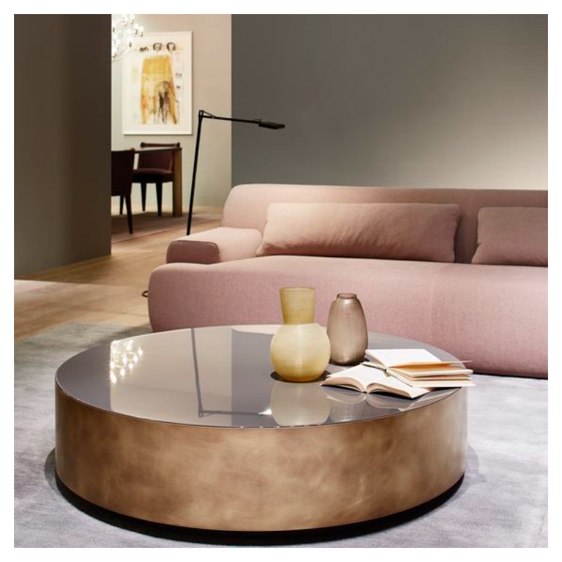
For a look that is calm and sultry but isn’t too feminine, start off with darker walls. To add to the warm scheme, team with rich browns in the other furniture pieces and accessories. It is both simple and appealing.
If you’ve never decorated with this shade of pink before, this is your time to give it a try.
For more industry commentary on the Pantone Colour of the Year
Colour of the year 2016 – Pantone
The Painted History of Rose Quartz and Serenity – Huffington Post
How to decorate your home with Pantone’s Rose Quartz and Serenity – StyleCaster
Kitchens in Pantone’s Colours of the Year – The Kitchin
Image source: Style and Minimalism