Posted on

Design of the Week: The Restaurant by Tom Dixon and Caesarstone

It’s been over 2 weeks since the Milan Design Week 2016. We weren’t there but we kept our ears pealed to the ground. One of the notable highlights was the impressive pop up restaurant designed by Tom Dixon in collaboration with leading quartz manufacturer, Caesarstone.

The interactive installation called “The Restaurant” was based at the Milan Children’s Museum (MUBA) in the historical Rotonda della Besana in Milan. It was made of four conceptual kitchens. With inspiration from the four elements – Earth, Air, Water and Fire, each kitchen creates a multi-sensory experience for guests.

blog2_tom dixon_milan design week

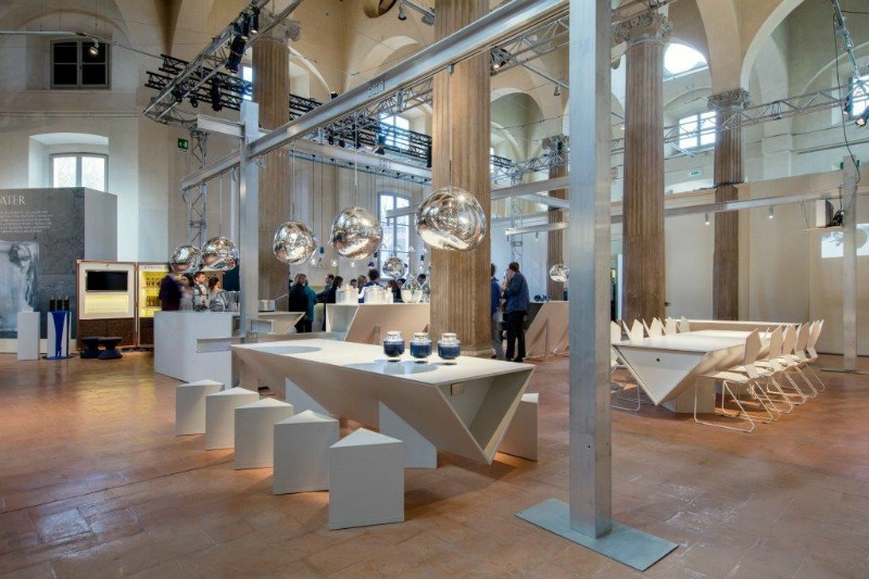
The British designer, Tom Dixon designed each dining area to feature colours and materials based on each element whilst showcasing Caesarstone’s designs. Tom’s product design also features albeit with secondary prominence. We definitely have a soft spot for his lighting ranges. They are so exquisite.

blog1_tom dixon_milan design week

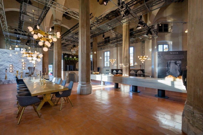
“In Milan this year, we wanted to collaborate with Caesarstone to inspire architects and designers through a radical interpretation of how food and surfaces can interact in different ways, delivering a food experience that challenges all the senses in an exercise of materiality, luminosity and texture. Reflecting on the four medieval elements, we have created totally distinctive smells, tastes and visual experiences within each room.” Tom Dixon.​

blog3_tom dixon_milan design week

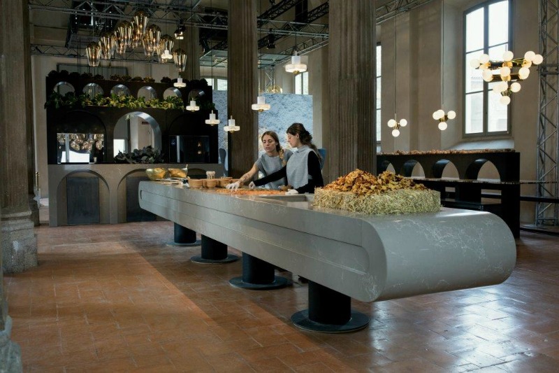
Image credit: www.tomdixon.net

Related articles

Design of the week: Colourful studio by Masquespacio

Design Influence of the week: The Raimond Lamp

New Art themed Restaurant by Damien Hirst

Posted on

Japanese Interior Design inspiration

The Japanese are well known for incorporating rich cultural traditions into contemporary spaces. Simple lines and muted colours typically characterise their interior design.

Today on the blog, we share two Japanese interior designs which caught our eye. There are some key design elements in the designs to give particular attention to.

Introduce outdoor elements with natural materials and greenery

Low seating with the addition of large floor cushions creates an authentic Japanese feel in this restaurant. It also incorporates furniture made from natural materials which is popular in Japanese interior design. Wood, bamboo, silk are common for creating harmony and bringing in nature. You can’t go wrong with indoor plants too.

blog1_Japanese interior design

Japanese interior design embraces the use of soft lighting. Light is concealed if possible or dimmed. This restaurant design uses lighting which is dimmed or seeps through. We like the use of ambient lighting and task lighting focused on the display of Japanese-style bowls.

blog2_Japanese interior design

Another element of Japanese interior design is creating a sense of privacy even in an open plan space, Without doubt, most of us are familiar with the screens typically seen in traditional Japanese homes.

Say hello to minimalism for clean refreshing spaces

With the belief that all clutter is tossed aside in place of a simple life, Japanese interiors are usually simple and minimalist in nature.  It is refreshing to see how this Tokyo baby café uses this to its advantage.

blog3_Japanese interior design

White minimalism is the key feature in the interior of the cafe. The simplicity of the design provides a tranquil environment. Designed by Japanese designer, Nendo, the café’s absolutely huge and absolutely tiny furnishings give both adults and kids two different perspectives.

blog4_Japanese interior design

blog5_Japanese interior design

What elements of Japanese interior design could you infuse into your interior space?

Sources

Retail Design Blog

Design Boom

Posted on

Design in Focus: Lighting Installations

Lighting can be more than an accent to a space, it can also be the main feature piece by allowing the light’s design and colour to really stand out from the rest of the space. Ceilings often provide an excellent platform to display unique lighting installations especially in commercial interiors as seen in these restaurants.

blog3_ceiling installations

We also came across these examples where the lights match the colour palette of the space complementing the overall colour scheme beautifully.

blog4_hanging illustrations

One of the things that stand out about the next set of designs is the way they show off geometry. By being paired with rather neutral tones and muted hues, the eye is easily drawn to the intricate line patterns. It is practicality perfectly balanced with aesthetics.

blog2_geometry lighting

Great lighting and bridges are usually a beauty to behold. Two great examples are The Solvesborg Bridge in Sweden and the High Trestle Trail Bridge. The Solvesborg Bridge which uses colour-changing luminaries was awarded one of the ten most interesting bridges in the world in 2013. The blue lights at the High Trestle trail bridge in Madrid are certainly mesmerising at night.

blog1_bridge lighting

There certainly is no limit to using lighting to make a bold statement in design.

Images sourced via

1. Canyon News | 2. All Seasons Home Improvement   |3. SarahSarna | 4. The Style Saloniste | 5. Archiproducts | 6. Flickr | 7. 1x | 8. Flickr | 9. My Fancy House | 10. Design Boom | 11. Creativitea