Posted on

Destination Inspiration: Creative Office Designs

Long gone are the days when office spaces were clinical and lacked personality. Thankfully we’ve moved on from multitudes of white cubicles and stark boring set ups. These days, companies are paying more attention to the design and quality of their workspaces. The usual suspects like Google, Pixar, Skype get top marks in this department. But they’re not the only ones making a change. We share two other examples that show creativity and character in office design.

1) Nuon Amsterdam office

Architects: Heyligers Design + Projects

blog1_nuon amsterdam_office design blog2_nuon amsterdam_office design blog3_nuon amsterdam_office design

Image source: Contemporist

2) Axiom New York office

Architects: BHDM Design, Photography by Adam Macchia.

blog1_axiom law new york_office design blog2_axiom law new york_office design blog3_axiom law new york_office design

Image source: InteriorDesign

Share your own remarkable office designs with us.

Related Articles

Top 10 trends influencing workplace design

3 Office Designs to love

Posted on

Spectacular warehouse conversions

Warehouse conversions offer more than just another building, they have unique character and the abundance of space many of us crave. Think of a spacious open plan kitchen and living area oozing bouts of character and industrial appeal. Sometimes a regular detached house just won’t do. However they do come with their challenges too.

Commercial properties have long been in demand for their potential to be transformed into new housing opportunities. In the UK, the areas popularly targeted are in established centres like London, Bristol and Southampton.These beautiful warehouse conversions caught our eye today.

blog1_warehouse conversions

The exposed brick offers the perfect canvas for a great industrial look. The use of warm colours and natural materials eases in a relaxed scheme. This is the perfect style for the urban city dweller who appreciates the outdoors.

Image source: Andrew Franz

blog2_ warehouse conversions

This luxury penthouse in London combines industrial elements with Art Deco touches. The soft neutral palette keeps the space fresh complementing the industrial chic look. The large  windows are great for allowing this bright and airy open plan layout to really come to life.

Image source: Decoist


Posted on

Destination Inspiration: AthensWas hotel inspired by Greek design

Located in the Plaka district of Athens, this hotel pays an ode to ancient Greek design and classic modernism. To continue our Destination inspiration series, we bring you AthensWas, a design-focused hotel bursting with style.

blog1_Destination-AthensWas-Hotel-Greek design

Designed by Stavros Papayiannis of Stage Design Office, the mission was to create a fresh approach to Greek design. Fully decked out in Greek marble and Greek walnut, the hotel’s overall aesthetic is defined by clean lines and an abundance of natural materials. What’s not to like about its understated luxury with playful elements making it easy for stylish guests to enjoy? The space exudes a contemporary approach to classic modernism in a way that celebrates Greek history and architecture.

blog2_Destination-AthensWas-Hotel-Greek design

Good things come in small packages. AthensWas hotel has just 21 guest rooms. Each room with its own outdoor space is filled to the brim with iconic furniture, light fittings and products from well-known designers. Even the artwork in the bedrooms immerse you into a world of culture and history. Some designs featured include the Canta and Viki armchairs by Toshiyuki Kita and lamps by French designers, Ronan and Erwan Bouroullec.

blog3_Destination-AthensWas-Hotel-Greek design

The in-house restaurant and rooftop bar located on the 6th floor of the hotel promise stunning views of the Acropolis, Parthenon, Temple of Olympian Zeus, and the old Olympic stadium. Who wouldn’t want to dine in style with such picturesque views?

blog4_Destination-AthensWas-Hotel-Greek design

Story and images via Design Milk

Related Articles

Design of the week: Colourful studio by Masquespacio

Japanese Interior Design inspiration

Posted on

How to use Emerald Green in Interior Design

Colour has a way of creating a certain mood. With many shades and tones to choose from, green is versatile and ideal for creating an energetic interior. Seen vastly in nature, it has a way of rejuvenating a space and evoking a sense of peace and harmony.

If you’re looking for a colour which communicates elegance and luxury, a rich emerald green is perfect. To celebrate St Patrick’s Day, we’ll take a look at a few rooms for inspiration.

blog1_emerald green interiors

The beauty of using emerald green is the way it works so well with other colours. Here the jewel toned wall colour and armchair are paired with Dixon’s gold pendants. Introducing natural materials in brown is the perfect addition to warm up this earthy scheme.

Source: Dwell

blog2_emerald green interiors

When combined with other neutral colours like grey, emerald green creates a sophisticated environment. I like how the plants and furniture add subtle yet classy pops of colour to the overall look.

Source: Casa Vogue

blog3_emerald green interiors

This wild card showcases a luxurious green feature piece juxtaposed with interesting patterns to complement. The natural theme continues with the accessories well positioned on the shelf. If you like to mix patterns, why not go all out?

Source: Arts and Classy

Like the look of emerald green? How can you inject this beautiful colour into your decorating this spring? Let us know.

Posted on

10 Inspirational Design Quotes you should know

blog1_designquotes3

Quotes make us think. You nod in agreement when we read one that strikes a chord, don’t you?

Hearing someone else say something is all you need to reinforce the beliefs you already have. Many creatives have said a lot about design and creativity. So for a bit of wisdom sharing today, we collated some of our favourite inspirational design quotes.  Be inspired.

“Design creates culture. Culture shapes values. Values determine the future.” Robert L. Peters

“Color does not add a pleasant quality to design – it reinforces it.” Pierre Bonnard

“Simplicity, carried to an extreme, becomes elegance.” Jon Franklin

“When you’re curious, you find lots of interesting things to do.” Walt Disney

“You can’t depend on your eyes when your imagination is out of focus.” Mark Twain

“Only those who attempt the absurd will achieve the impossible.” M.C. Escher

“The details are not the details. They make the design.” Charles Eames

“Design is everything. Everything!” Paul Rand

“Learn the rules like a pro, so you can break them like an artist.” Pablo Picasso

“Design is where science and art break even.” Robin Matthew

Do you have some favourite design quotes you’d like us to include? Why not let us know and we’ll be happy to add them in.

Posted on

Design of the week: Colourful studio by Masquespacio

It’s always a great feeling when we find inspiring colourful interiors. This office studio by Masquespacio has quickly become the highlight of our day. We won’t list all our favourite things about this design but we’ll share those that resonate with us most with you.

Colour is good and lots of it

For those of you who love colour, this design will appeal to you. Vivid colours in cheerful hues give the space a playful feel. Using these types of colours in working environments must be a good thing for creativity. Even pineapples manage to play a part. How clever is that?

blog1_masquespacio-colourful studio-interior-design

Trendy furniture makes a powerful statement

This was the first time we’ve come across the Toadstool collection. They are very impressive, don’t you think? Designed by Masquespacio, their debut furniture collection which launched in January 2016 is characterised by colourful fabrics and rounded shapes. Luxurious with extra glam factor, swooning over them is surely an understatement.

blog5_masquespacio-colourful studio-interior-design

You can never have too many plants

Perfectly perched at prime positions, the lush plants add that extra layer of texture and freshness. They’re literally in every corner around the studio. It makes us want to rush to the garden centre to fill our Moody Monday studio up.

blog4_masquespacio-colourful studio-interior-design

There is design inspiration everywhere. What has inspired you this week? Let us know.

Full story via Dezeen. Photography by Bruno Almela.

Related articles

Snowy mountainside inspires colourful retail store design

New art themes restaurant by Damien Hirst

Posted on

Japanese Interior Design inspiration

The Japanese are well known for incorporating rich cultural traditions into contemporary spaces. Simple lines and muted colours typically characterise their interior design.

Today on the blog, we share two Japanese interior designs which caught our eye. There are some key design elements in the designs to give particular attention to.

Introduce outdoor elements with natural materials and greenery

Low seating with the addition of large floor cushions creates an authentic Japanese feel in this restaurant. It also incorporates furniture made from natural materials which is popular in Japanese interior design. Wood, bamboo, silk are common for creating harmony and bringing in nature. You can’t go wrong with indoor plants too.

blog1_Japanese interior design

Japanese interior design embraces the use of soft lighting. Light is concealed if possible or dimmed. This restaurant design uses lighting which is dimmed or seeps through. We like the use of ambient lighting and task lighting focused on the display of Japanese-style bowls.

blog2_Japanese interior design

Another element of Japanese interior design is creating a sense of privacy even in an open plan space, Without doubt, most of us are familiar with the screens typically seen in traditional Japanese homes.

Say hello to minimalism for clean refreshing spaces

With the belief that all clutter is tossed aside in place of a simple life, Japanese interiors are usually simple and minimalist in nature.  It is refreshing to see how this Tokyo baby café uses this to its advantage.

blog3_Japanese interior design

White minimalism is the key feature in the interior of the cafe. The simplicity of the design provides a tranquil environment. Designed by Japanese designer, Nendo, the café’s absolutely huge and absolutely tiny furnishings give both adults and kids two different perspectives.

blog4_Japanese interior design

blog5_Japanese interior design

What elements of Japanese interior design could you infuse into your interior space?

Sources

Retail Design Blog

Design Boom

Posted on

Design Influence of the week: The Raimond Lamp

Our design influence for today is the Raimond lamp. Think starry skies and constellations and you have the embodiment of the Raimond lamp.  This is our tribute to the award winning designer, Raimond Puts who passed away in 2012. He combined his love for simplicity, mathematical prowess and metalwork expertise to create timeless design.

blog1_lighting designer_Raimond

Hidden beauty of starry nights

Designed as part of a collection for Moooi, this stylish creation is perfect for a contemporary interior setting. The Raymond Lamp has been described by Moooi as “a perfect sphere of mathematical ingredients punctuated by tiny LED lights. Looking at the lamp feels like staring into the soft glow of a starry night.”

blog2_lighting designer_Raimond

Closer to home with our Stellar Collection

We nod our heads in complete agreement here at Moody Monday. Our new collection, STELLAR is inspired by the boundless beauty of the sky and space. No wonder we have a heightened love for all things celestial. You’ll hear more about the launch of the new collection over the next few weeks.

blog3_lighting designer_Raimond

It is not difficult to understand why designers pay attention to beautiful lighting. The variety available in the industry is astounding. Be it over-sized pendant lamps or geometric shaped lamps, the options are limitless.

Share your design influence this week with us.

All images were sourced from www.moooi.com

Related Articles

Influence of the Week – Bauhaus Inspired Ceramics

Inspiring Designer – Marcel Wanders of Moooi

Design in Focus – Lighting Installations

Posted on

New Season Alert: Find your Spring Style

It’s March 1. With a spring in our steps, we bring you style inspiration for the new season.

Without doubt, spring has to be one of our favourite seasons. Days are getting brighter and we have stepped nicely into the month of March. New colours, textures and patterns in the stores show it’s out with the old and in with the new. You might still hold on to your blankets and cosy fluffy robes for a little longer. Give it a few more weeks and the decor swap can begin. From simple pastels to refined neutrals, find inspiration for your spring style in our round up.

Stay trendy with soft pastels

Pastels are probably the most common colours used in springtime. They are the go-to favourites for updating many a décor. We can’t talk of them without mentioning the Pantone colours of the year. Why not incorporate rose quartz and serenity into your home? A good idea is to dress up dining chairs with fabric in these gorgeous hues. Last week, we shared ways to decorate with rose quartz

spring style_soft pastels

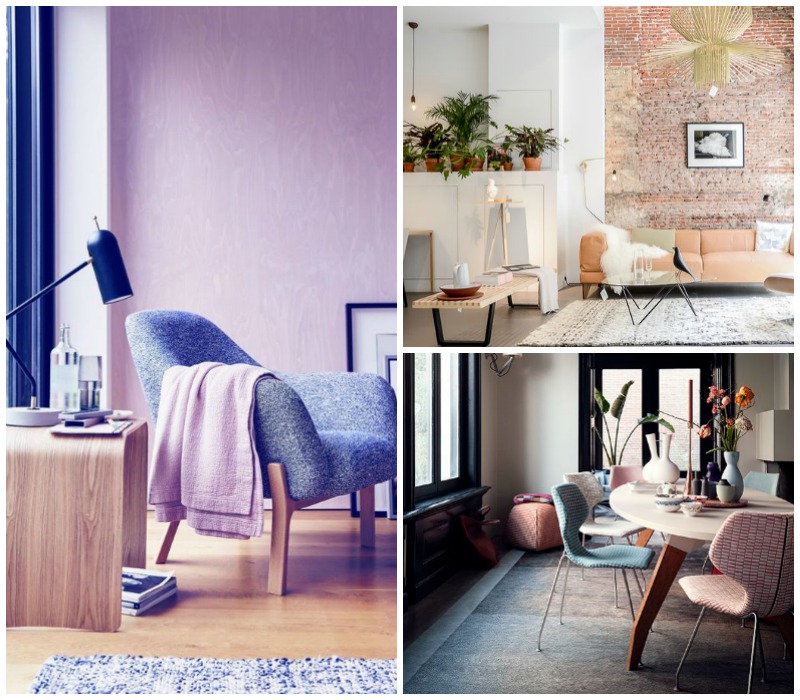
Image sources: Binti home blog | Decoholic | Telegraph

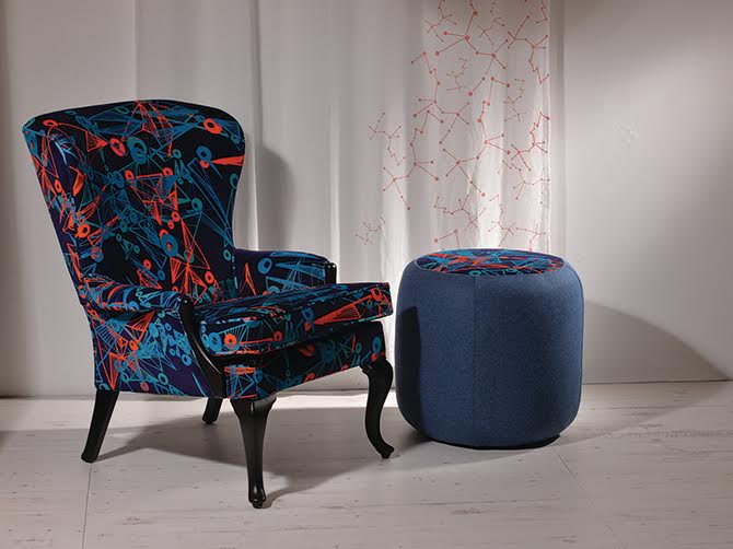
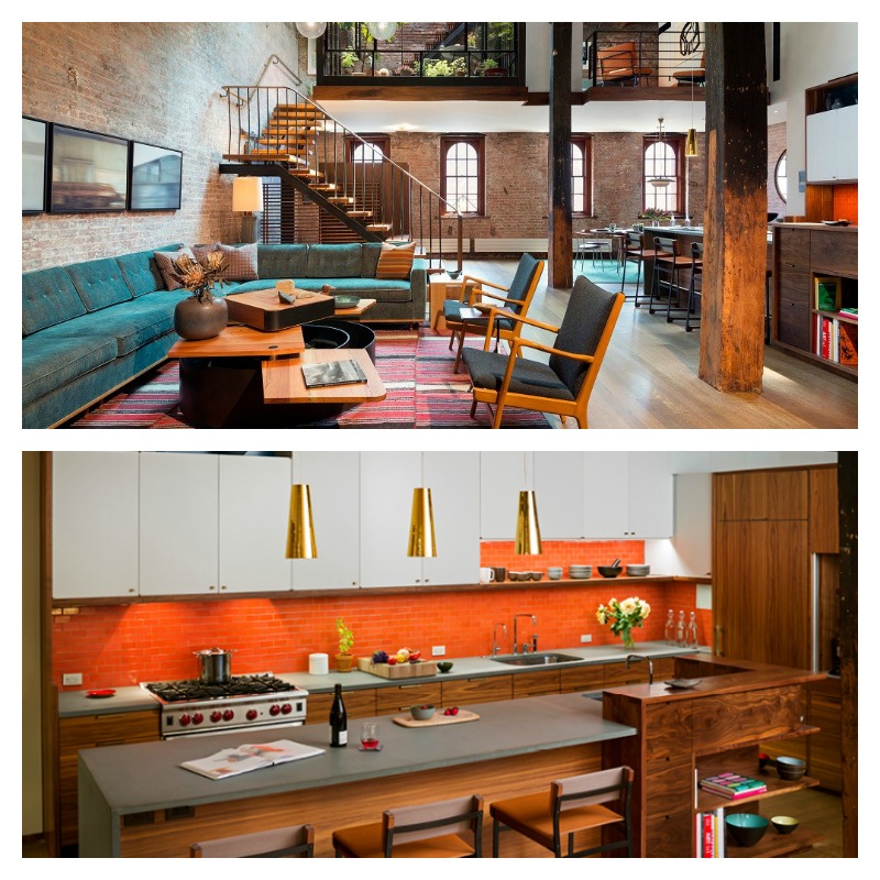
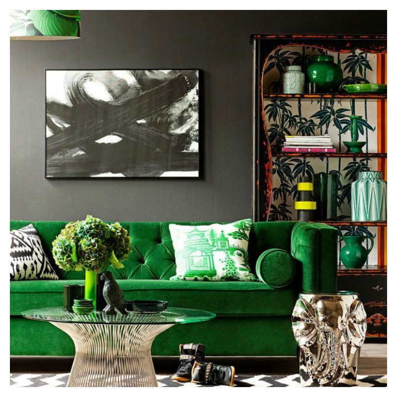
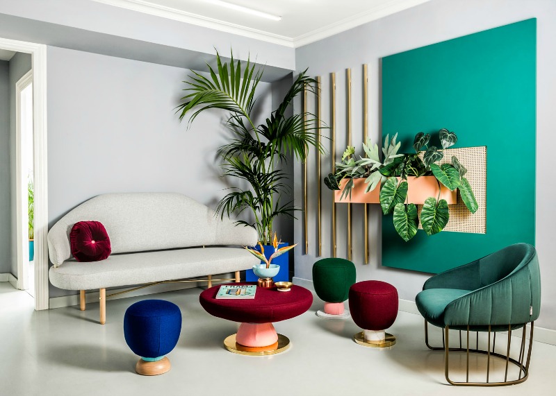
Make a statement with bold hues

Don’t be shy to go for an eye-popping colourful look. Go for bright colours like orange, red and magenta for your throws, vases and cushions. A popular combination this season is indigo blue and yellow. Be sure to choose colourful designs like the Aztec Rug in this living room.

blog2_springstyle_boldhues

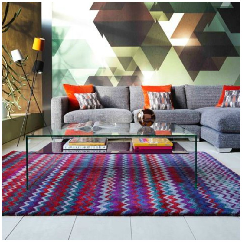
Image source: Barker and Stonehouse

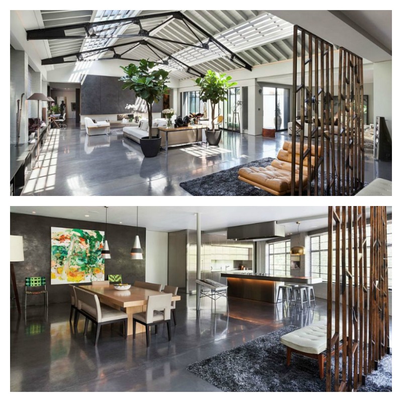
Classic style with refined neutrals

Not everyone likes lots of colour so neutrals have a special attraction. Be careful though. Neutrals all over can look boring, so create character with patterned textures. The stylish combination of whites and browns has a sophisticated feel for this season with interesting textures and striking patterns.

blog3_springstyle_neutrals

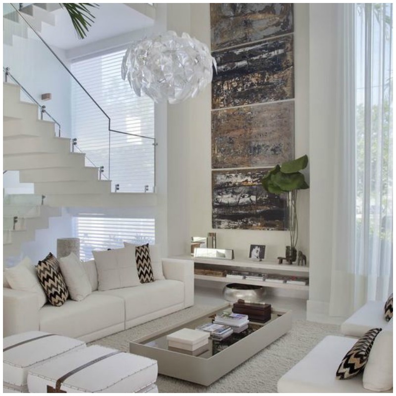
Image source: Decorsalteado

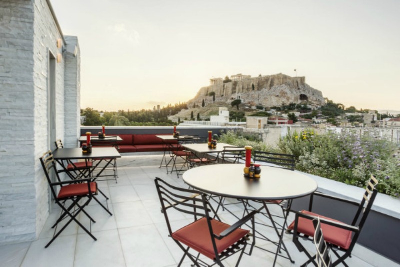
Whatever you do, welcome the fresh feeling of the great outdoors with flowers to amp up your spring style. Enjoy the abundance of pretty colours we get at this time of year.

Which of these three is your preferred style? We would love to know how you decorate this spring.

Related Articles

5 Swoon Worthy Designer Chairs for your spring style

Patterns in Interiors

Posted on

Decorating with Pantone Colour of the year 2016

If you have a keen interest in interior design, you would have seen the Pantone Colour of the year. It was announced last year. For the first time in Pantone’s history, the team decided on two colours – Rose Quartz and Serenity Blue. What a luxury. Instead of popularising one colour, they chose to present them as a combination.

These colours are reminiscent of baby gender reveal parties popular these days. They are soft and very easy on the eye. When paired together, they bring a sense of soothing freshness to an interior space.

blog_moodymonday_pantone 2016

According to Pantone, “Rose Quartz is a persuasive yet gentle tone that conveys compassion and a sense of composure. Serenity is weightless and airy, like the expanse of the blue sky above us, bringing feelings of respite and relaxation even in turbulent times.”

Today’s feature looks at one half of this beautiful Pantone colour duo – Rose Quartz.

Finding the right colours to allow this soft pink colour shine through is important. In today’s feature, we share two applications in a living room setting.

blog1_pantone colours 2016

For a bright and airy look, paint your walls in white or off-white. Pared back with minimal metallic accessories, the pink sofa pops is the centre of attention in this living room. The herringbone patterned flooring adds that extra touch of texture and interest to the room.

blog2_pantone colours 2016

For a look that is calm and sultry but isn’t too feminine, start off with darker walls. To add to the warm scheme, team with rich browns in the other furniture pieces and accessories. It is both simple and appealing.

If you’ve never decorated with this shade of pink before, this is your time to give it a try.

For more industry commentary on the Pantone Colour of the Year

Colour of the year 2016 – Pantone

The Painted History of Rose Quartz and Serenity – Huffington Post

How to decorate your home with Pantone’s Rose Quartz and Serenity – StyleCaster

Kitchens in Pantone’s Colours of the Year – The Kitchin

Image source: Style and Minimalism