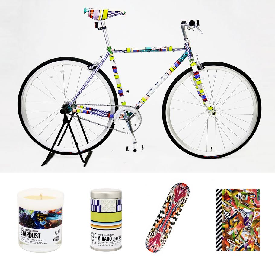
This week we’re keeping it bright and bold with Basso & Brooke!
Revered for their digital prints, fashion and textile designers Bruno Basso and Christopher Brooke have collaborated with many major corporations where they have produced cutting-edge work that never fails to express a strong sense of personality. If you like making a statement then Basso & Brooke are for you.
We really adore the diversity of their prints, which are often busy with a geometric, artsy style. The designs are inspiring for their bold, surreal style that sometimes borders on ‘trippy’. We’re also impressed by their ability to match their prints to such a range of products: clothing, accessories, homewares, even skateboards!
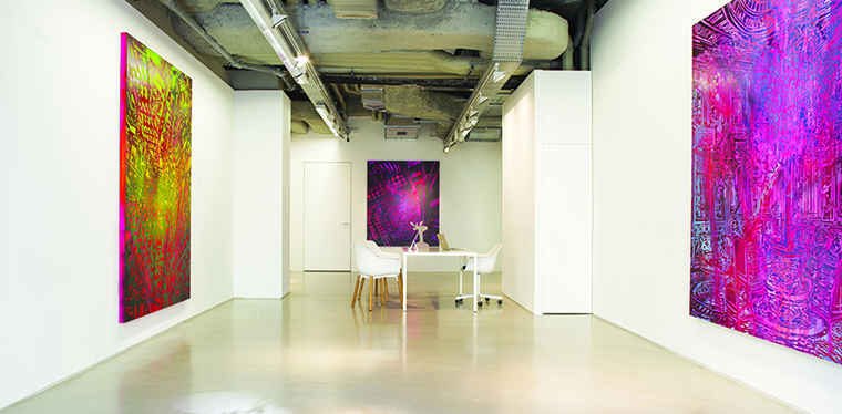
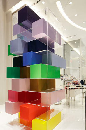
This week’s inspiration comes fromLe Royal Monceau, Paris; a beautiful hotel with a true passion for the arts.
Part of the Raffles Hotels and Resorts group, Le Royal Monceau boasts divine opulence at every turn. Much of the interior inspiration comes from 1940s and 50s period style, the influence of which can certainly be seen in the classic glamour of both the Prestige and Signature Suites. Another design treasure is the Presidential Suite 241 which is the epitome of classic Parisian style: sophisticated, understated, just plain beautiful.
The conservative glamour found throughout the hotel is brought into contrast by the Art District, the hotel’s own in-house art gallery (pictured). The work which features in the gallery showcases the contemporary artistic culture of Paris, adding an extra dimension to this otherwise understated decorous space.
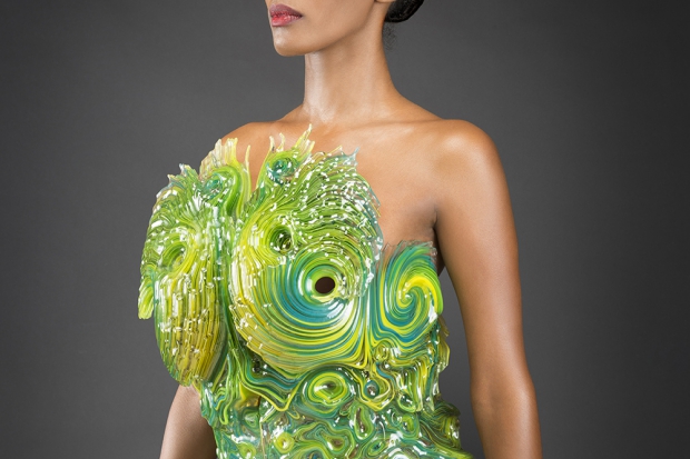
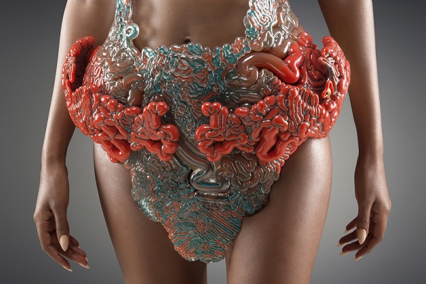
Today we’re looking to the futuristic work of architect and designer Neri Oxman for inspiration!
Oxman’s designs are particularly striking, incorporating digital and computational design with materials science and synthetic biology to explore the relationship between the natural world and the artificial components that we build into it.
We find the ‘Wanderers’ collection particularly compelling, not least for Oxman’s stunning use of colour, materials, and surface textures. This project is a collaboration with Stratasys, a 3D printing company, and ties in with their collection ‘The Sixth Element: Exploring the Natural Beauty of 3D Printing’. The designs are tailored to the various environments of the planets within our solar system, and the concept behind each design is to aid humanity’s survival within that landscape through absorption and production of biomatter.
What we find so inspiring about Oxman’s designs is their tactile quality; you can’t help but be drawn in by the diverse textures and materials. Though beautiful, the designs are also subversive and surreal – a unique blend of science, technology, and design innovation that we can’t resist.
Over the past few months Andrea has been working alongside our Chief Designer, Eliza, as an intern. Andrea is currently studying Styling and Design with Academy Artemis in the Netherlands, though she has been working with Moody Monday for the past six months. As she’s nearing the end of her time in Edinburgh, we wanted to catch up with Andrea and ask about her experiences.
What three words would best describe your experience of Edinburgh and Moody Monday? Worldly
Reality
Magnificent
How has interning for Moody Monday compared to your expectations before you arrived in Edinburgh? Before I came I knew Moody Monday was re-branding as a company. What I did not expect was that I could help with literally everything. A great challenge!
What aspect(s) of the internship have you enjoyed most? I loved working on the styling projects, so being highly creative. This involves setting up the photo shoots but creating the look book as well. Besides working, meeting the people at St. Margaret’s House made me happy too.
What advice would you give to other design interns?
For a long time I was quite shy about showing my designs to other people, until I noticed people actually enjoyed seeing my work. Don’t be shy – show your work to others. You will see when you do; people are supporting you., always.
How will you use your experience of this internship in the future? Well, I always said I want to freelance or start my own business. Working at Moody Monday showed me a lot different aspects of having your own business.
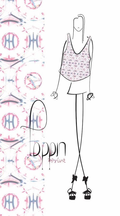
What do you think is the most challenging part of getting into the design industry? Everything should be challenging. Then you move forward and that’s something you need in life, although that is my opinion. I think the most challenging part would be to keep surprising the people who are enjoying following my blog, Poppin, over and over again with my designs and eventually my products.
Which designers do you idolise/get inspiration from? One of my idols is Iris van Herpen, an amazing Dutch fashion designer. I recently discovered Blackpop, a designer from the United Kingdom. I think her print designs are quite amazing. And, of course, I love the work of Antoni Gaudi, especially how he found his inspiration and looked at things differently. Well, I can talk about this the whole day because there are a lot more great designers who I idolise!
What would be your dream design job? E.g. the interior of a famous building. For me, working with prints is everything. That’s why I started my own blog about 3 months ago – Poppin. So, working with print design could be my dream job, especially if I create products with my prints.
Tell us about Poppin! Poppin is my blog about prints, patterns, structure, and texture in fashion, interior, and exterior design. But that is not everything: for example, nature is something that can be really interesting with regards to patterns as well. We are surrounded by beauty itself – I filter everything that inspires me, to inspire you. At the moment I’m working on a first product but this takes time. When I’m ready, you will see it appear on my blog.
What has been your favourite experience in Edinburgh? Wow, really hard question. Living abroad in general is quite an experience. There are a lot experiences and adventures I had the past five months. For example, my journey to the Isle of Skye was more than amazing. Scotland is absolutely beautiful. I tried haggis, surprisingly I really liked it! Although, black pudding not so much. During my time in Edinburgh I met great people and I’m thankful for that.
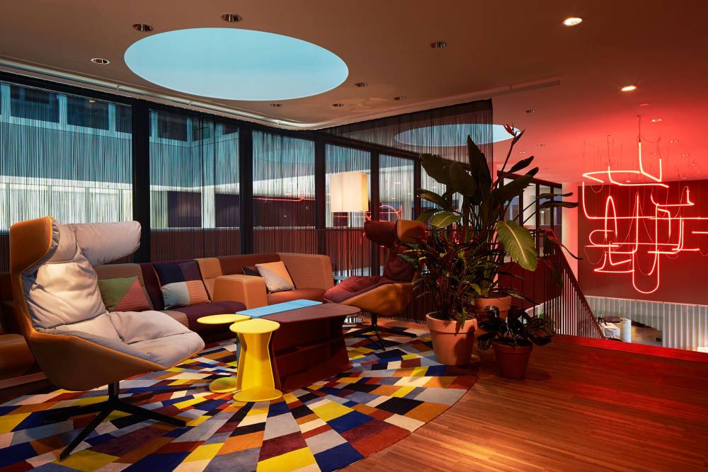
This week we’re in Switzerland at the 25Hours Hotel, Zurich (West).
Designed by Alfredo Häberli, the interior of the 25Hours Hotel is bursting with colourful graphics that combine to make a delicious treat for the eyes. Inspired by the city’s artistic culture, the space is coloured by intricate prints, details that echo urban graffiti art, and dashes of bold furnishings.
Häberli’s design concept makes for an overall experience of wonderment and vibrancy which showcases the spirit of Zurich’s creative district.
We adore the continuation of graphic shapes and bold colours which form the surface patterns of the Living Room (pictured). The use of colour to accent particular furnishings is also a great touch.
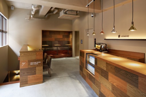
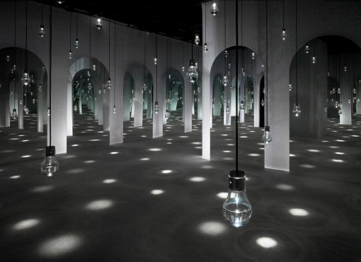
A change in pace this week for our inspiring designers series, we’re looking at Ryo Matsui, of Ryo Matsui Architects Inc.
Matsui’s work is undeniably elegant, clean, and stylish, with a real architectural edge. His use of contrasting surface patterns and muted, natural colours means his design concepts remain at the forefront of contemporary trends.
What we find most inspiring about Matsui’s work is its ability to present complex design ideas in a simplistic, minimalist form. His use of lighting is also something to be marvelled at; these finishes are often delicate but make such a difference to creative spaces.
Recently, MoodyMonday underwent a re-branding so that the company’s ethos and values were better represented. To this end, the brand’s logo was also re-designed:
For us, part of our ethos is about finding beauty in hidden or non-obvious places and bringing this secret treasure to light. The name ‘Moody Monday’ encapsulates this as we tend to think of Mondays as negative – it’s the start of the working week and everyone would sooner be at home relaxing. We aim to subvert this expectation, however, and demonstrate that there is joy to be found in even the most unlikely places.
Our new logo equally reflects this value. The design is based on an oyster – an object that, at first glance, is not particularly pleasing to the eye. However, when opened, oysters contain precious treasures that are beautiful, valuable, even sought-after.
Our designer, Eliza, aims to identify sources of hidden beauty and express this quality in her work to bring pleasure to our clients from a most unexpected place.
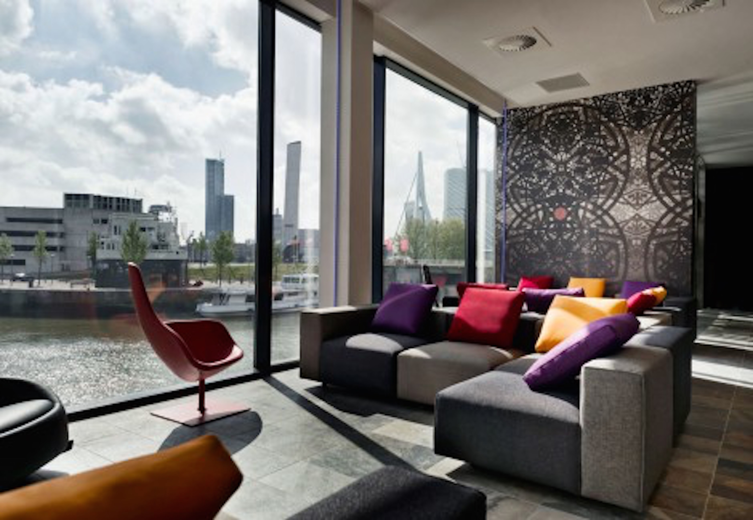
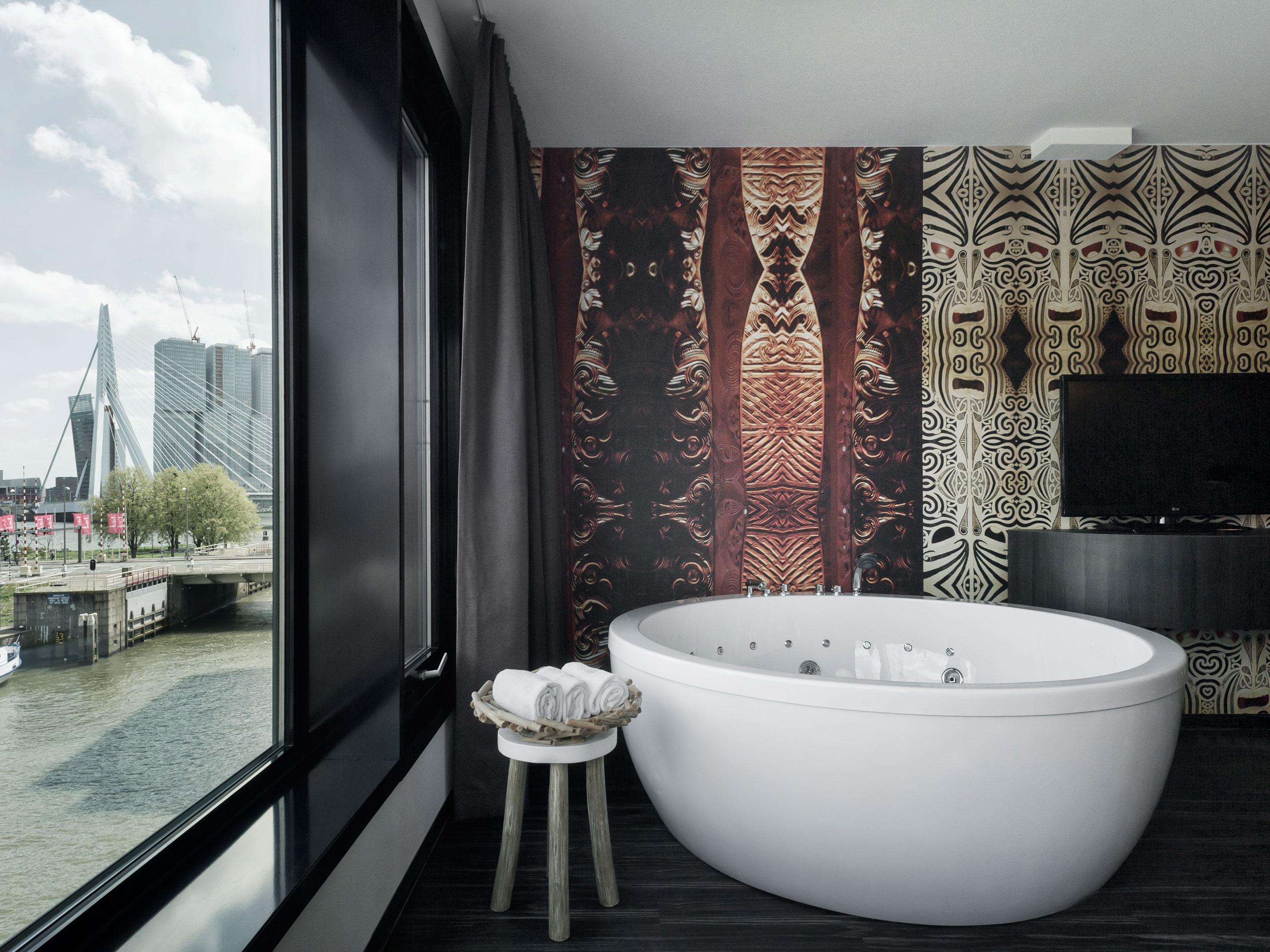
Mainport Hotel is presented as the epitome of modern luxury. Designer Feran Thomassenwas keen to produce interiors which showcase an international influence yet maintain notes of traditional Dutch styling.
Credited with a five star rating, Mainport combines stylish interiors with intricate prints and colourful accessories to create a space which is at once elegant and inviting.
As fans of patterns, we really enjoy the contrast between simplicity and outbursts of patterns and textures strategically placed around the space. The mixture of surface textures is also compelling: smooth and uneven, natural and artificial, polished and rugged finishes. This touch really highlights the designer’s focus on contrast, and brings opposing elements together in a pleasing way.
Our Inspiring Designers blog continues this week with French architect and designer, Emmanuelle Moureaux.
Moureaux resides in Tokyo, Japan, where she has been living and working since 1996. For Moureaux, colour is key. She prefers to use colours as a way of structuring rooms, rather than as a finishing touch or complement to the physical design. This concept, created by Moureaux, is called ‘Shikiri‘ which, literally translated, means ‘dividing space with colours’.
We find Moureaux’s work particularly inspiring for its fresh, contemporary vibrancy. If Pantone had gone down the architecture route, we feel, it would look something like this.
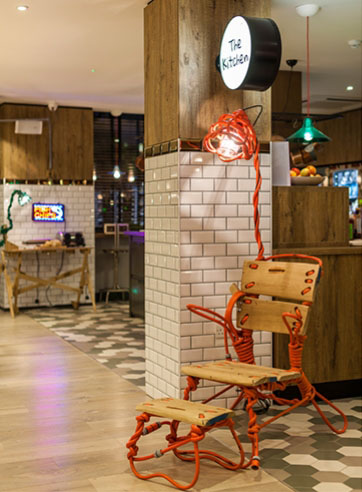
We continue with our selection of boutique hotels inspiration with the Qbic Hotel, London.
A sister hotel to Qbic Amsterdam, Qbic London’s interior flair is the work of Blacksheep design company. This eclectic space is intended as a kind of ‘urban oasis’ which provides its guests with a place of respite from the bustling surroundings of Brick Lane and trendy Shoreditch.
The design concept seeks to create a feeling of welcoming and comfort, in addition to delightfully quirky communal areas which invite guests to interact and socialise at ease.
Here, Blacksheep have managed to defy convention by creating an edgy yet warm interior that is bursting with imagination. Their use of colour alongside natural surfaces helps to achieve this unique blend, and the playful, vibrant atmosphere mirrors the creative community that surrounds the hotel. To us, the space feels like a hybrid of industrial design, postmodern design, and surrealism; contrasting elements which, in this case, come together to produce something very special. We especially like the use of accessories, such as the chair-lamp entangled in wire (pictured).