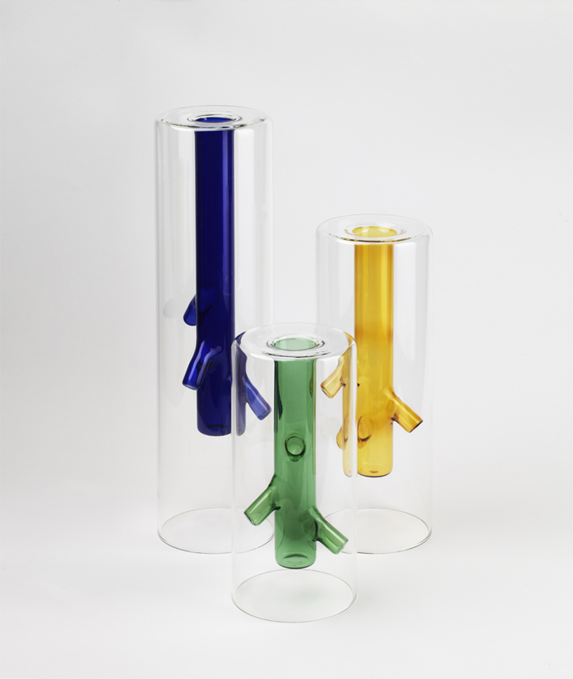
The Salone Del Mobile di Milano has recently finished, so we took a sneak peak to see what the latest trends in furniture design are. The first piece that grabbed our attention and won us over, are the root vases, created by Milanese designer Giorgio Bonaguro and produced by DRIADE.
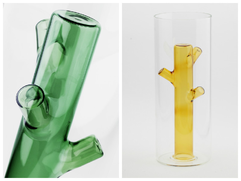
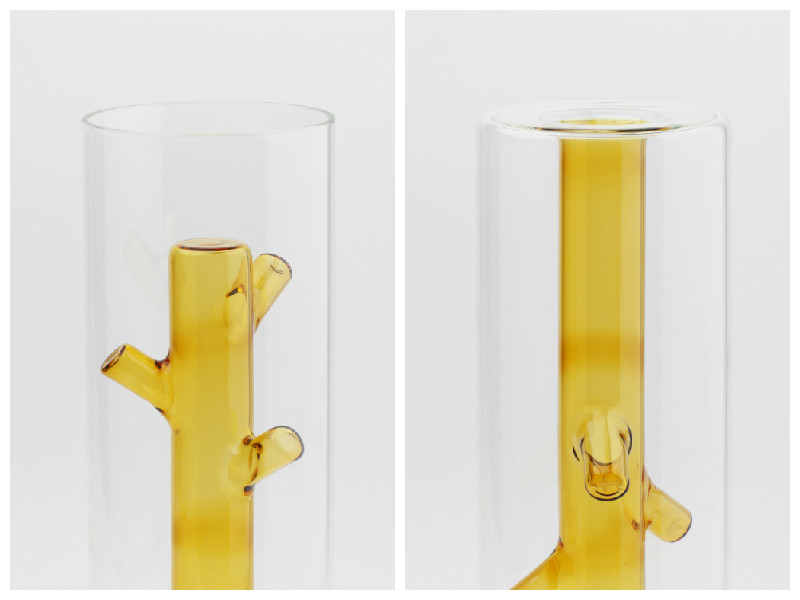
We think these are a brilliant execution of an ambivalent object: they combine a simple, clear glass cylinder on the outside, with an internal element of coloured glass imitating the roots of a flower:
The creative vase is both appealing in design, and functionality as it can be turned and used either to hold one single flower, or flipped over, to hold a colourful bunch:
The vases are made in blown borosilicate glass, and come in three lovely hues: yellow, green and blue, the central colours of nature, representing the sun, grass and skies. What a lovely touch!
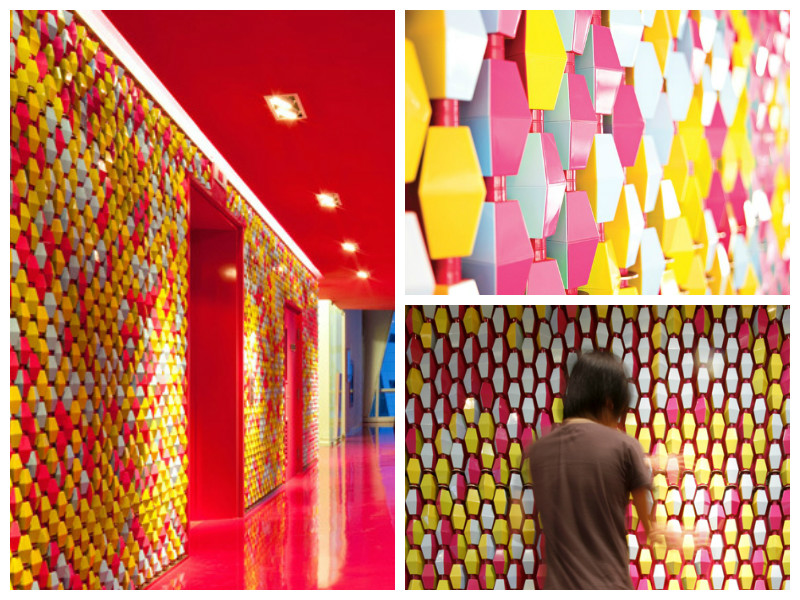
We found this gem online, and simply fell in love with it! The two floors of the Bangkok University Creative Centre (BUCC) designed by Supermachine’s architects Pitupong Chaowakul, Nuntawat Tassanasangsoon, Suchart Ouypornchaisakul, and Worawit Hongwiang are a mesmerising journey of colour, shape, light and texture. We love the way this large space design fosters creativity, in every one of its rooms and halls. The BUCC includes a workshop, library, exhibition space, viewing room and offices:
Bangkok University Creative Center is a perfect example of large space design to foster creativity
The entire large space design is centred around the 180 square-meter wall – “Lo-Fi pixel wall”, an installation of 10,000 custom-made rotating four-sided plastic pieces in pink, blue, green and yellow, that students can play around with, to create colour patterns or write messages:
The “Lo-Fi pixel wall” – one of the main attractions in the BUCC
We really like the feel of this place, as it seems to perfectly exemplify the type of oasis where creative ideas are born. In fact, just looking at these pictures is getting our creative juices flowing! What’s you favorite creative space?
This week we’re taking Moody Monday out, and exploring industrial designs in restaurants. We’ve chosen two quite different ones, to get different perspectives on how industrial design can fit in with the eating experience.
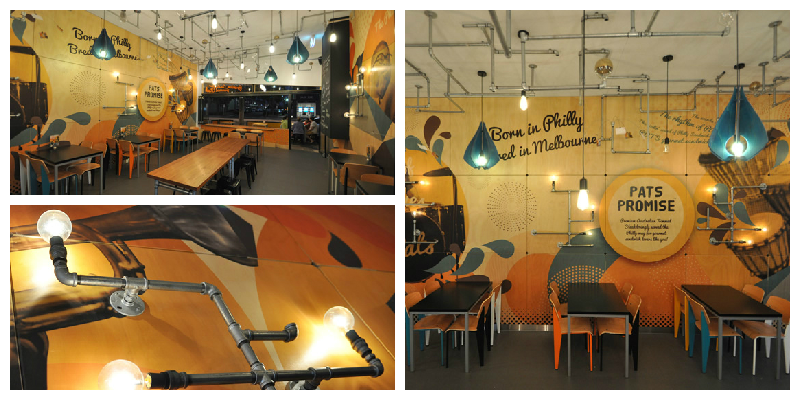
The first is the PAT’S steakhouse in Melbourne Australia:
We particularly liked the uncommon mix of industrial look and cosiness of this space, created by the tangled lighting system on the ceiling build on pipes, and the warm, lively orange hues of the walls. It builds a balanced look for the place, both inviting and enigmatic.
On a more heavily industrial note, we like the Blue Butcher restaurant in central Hong Kong, China:
The use of steel, reclaimed wood, leather and raw plaster gives this interior an amazing industrial yet funky feel. According to the restaurant’s own website, Blue Butcher is trying to recreate the atmosphere of the Prohibition era, using exposed light fittings and long steel metal staircases. We think they’ve done a good job, and we particularly like the heavy dark unrefined wood tables. The only question is… will their food be as amazing as the interior design? We hope so!
In this blog post, we’ve turned our antennas to the playful use of shapes and geometry, in interior design. Here are our top three picks.
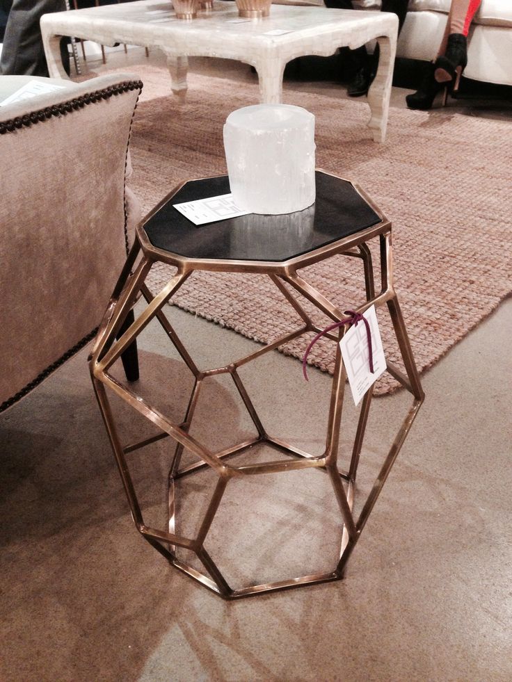
The first example stems from the tiny world of bees, as we think nature is a great source of exquisite inspiration. If bees had contemporary awareness and the ability to use and appreciate furniture, we’re sure they would have a lot to buzz about this stylish coffee table:
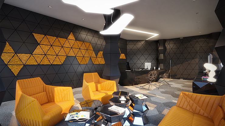
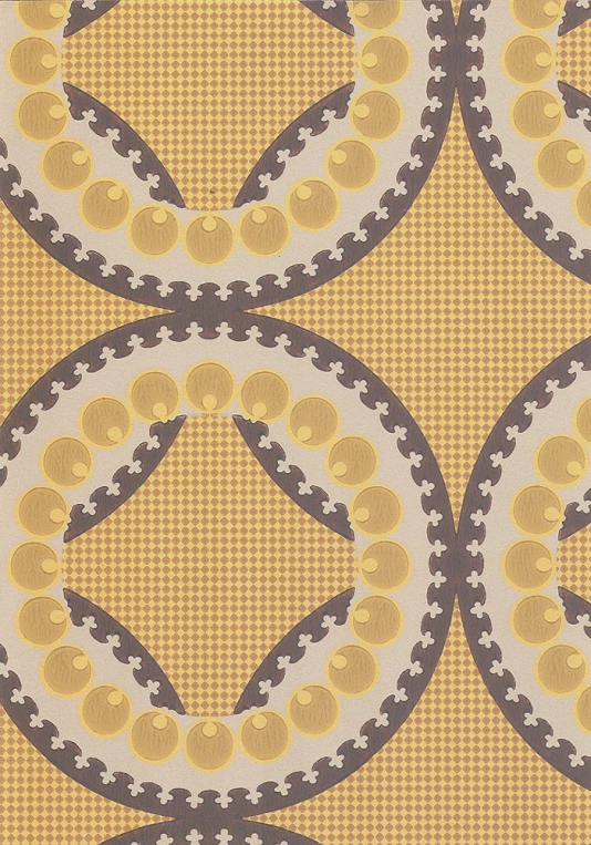
And since we mentioned bees, we think this wall covering would make for a nice match inside their beehives as well. In fact, the vibrant color mix and geometric pattern of the wall covering looks pretty stylish in this contemporary living room as well:
And in a more abstract composition, we like this particular feature wall that ties up in a contemporary, urban room. The play on various sizes and shades of gray rectangles creates a nice pattern on the accent wall, adding an extra coolness to the place:
In this new blog post series, we look at creating patterns through the use of colour, in order to create unique and lively interiors. We take our inspiration from spring/ summer colours and explore how these can be mixed and matched to recreate the zing of the season.
We start with a bold, orange themed interior:
What we particularly like about this interior is the mix of lively, bright colours and the predominance of curvy lines and organic shapes, reflected in the shape of the furniture and in the patterns on the wall coverings and coffee tables.
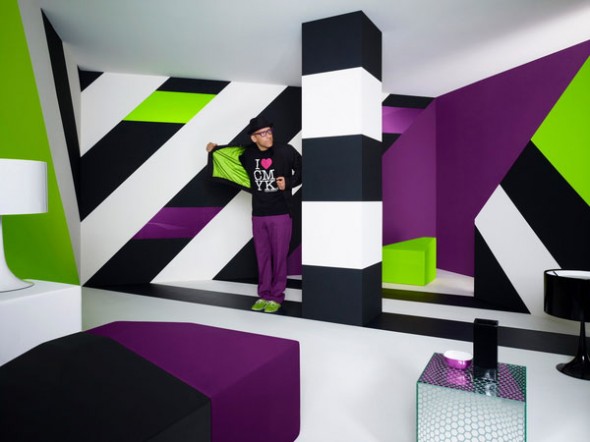
In a very different composition, we found this very contemporary blend of purple, lime green, black and white:
The straight lines and sharp angles used in this interior help create the illusion of extra height in an otherwise low ceiling room. The use of lime gives a fresh, spring-like feel to the interior. While the general rule of thumb is to use only two colours (three, at most!) for large areas, such as a feature wall, we think this particular design has successfully pulled it off with all four hues it features. Bold to the bone!
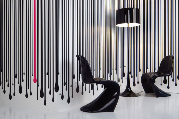
All colours aside, you can create a striking design, using just black and white and a sneaky pink accent:
This seemingly simplistic design also adds height to the room. While black and white is not a colour mix you would expect to find in nature, the drips on this wall art gives a touch of authenticity, and the pink drip in particular is a nice surprise to break the monotony. All in all, it’s an inspiring way of pulling together the neutral flooring and the all-black chairs and lamp into a stunning and stylish interior design.
This week, we’ve had a new intern joining Moody Monday: Alexandra will be working alongside our Head Designer, Eliza Kesuma, to increase the company’s brand awareness and reach, through social media and marketing communication.
We’ve asked Alexandra to take the stage and introduce herself, talking about how she came to join Moody Monday, her previous experience, passions and ambitions for the future. This is her story:
“Here I am, on one of my last evenings of a short road trip in Denmark, checking my email, when I excitedly read the following subject line: “Interview Invitation”. Sender: Eliza at Moody Monday. Oh boy!
When I first read about the internship opportunity one week before, it seemed a perfect match for my previous experience, skills and interests, so I applied immediately. After a closer look at Moody Monday’s website, blog and social media, I started to paint a picture in my mind of this highly creative, closely-knit, vibrant and friendly organization – and I wasn’t mistaken.
Meeting Eliza and Sara for the interview was a truly pleasant experience, as I genuinely felt we ‘clicked’ both personally and professionally. I left the venue happy, knowing that regardless which way this will go, we’ve had a productive encounter and a nice exchange of ideas. I was even leaving with a recommendation for a new book to add on my ‘must read’ list!
A few days later, I got the call from Eliza offering me the position, which I gladly accepted. And so here I am now, three days into the job, taking the lead of Moody Monday’s social media and marketing communication. I do have a few years of work experience in the field, so I’m confidently looking forward to use and improve these skills here, and to help drive Moody Monday on its path to reaching and engaging the right audience. I expect this to be a challenging and rewarding job. I can’t wait!
As for my other passions and hobbies, I occasionally participate in long distance running events, in support of various NGOs, and try to keep my personal blog up to date with random thoughts. That aside, I’m a naturally curious person, so I often drift into new projects: graphic and web design, photography, painting, crafts, etc. While I don’t see myself going into business with this like Eliza has, I do enjoy spending some of my free time on these hobbies. I like being around creative work, so I joined Moody Monday with a strong desire to immerse myself in all things beautiful. So far so good 🙂
On top of the internship, I’m currently finalizing my Master’s thesis remotely, and will be graduating from Aalborg University in Denmark this summer, with my degree in Market and Consumption.
As for the future, I’m looking to advance into marketing and communication, promoting businesses in various fields, so this field will continue to be my main focus for the upcoming years. However, I’ve always been a ‘Jane of all trades’, so I want to continue adding new skills to my ‘portfolio’. In the near future, I’ll be looking to develop my web design experience, which at the moment is at an early hobby stage.
But all things in good time. In the meantime, I’ll be sharpening my creativity and marketing skills on Moody Monday’s social media space, so be sure to keep an eye on these!”
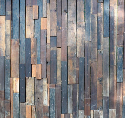
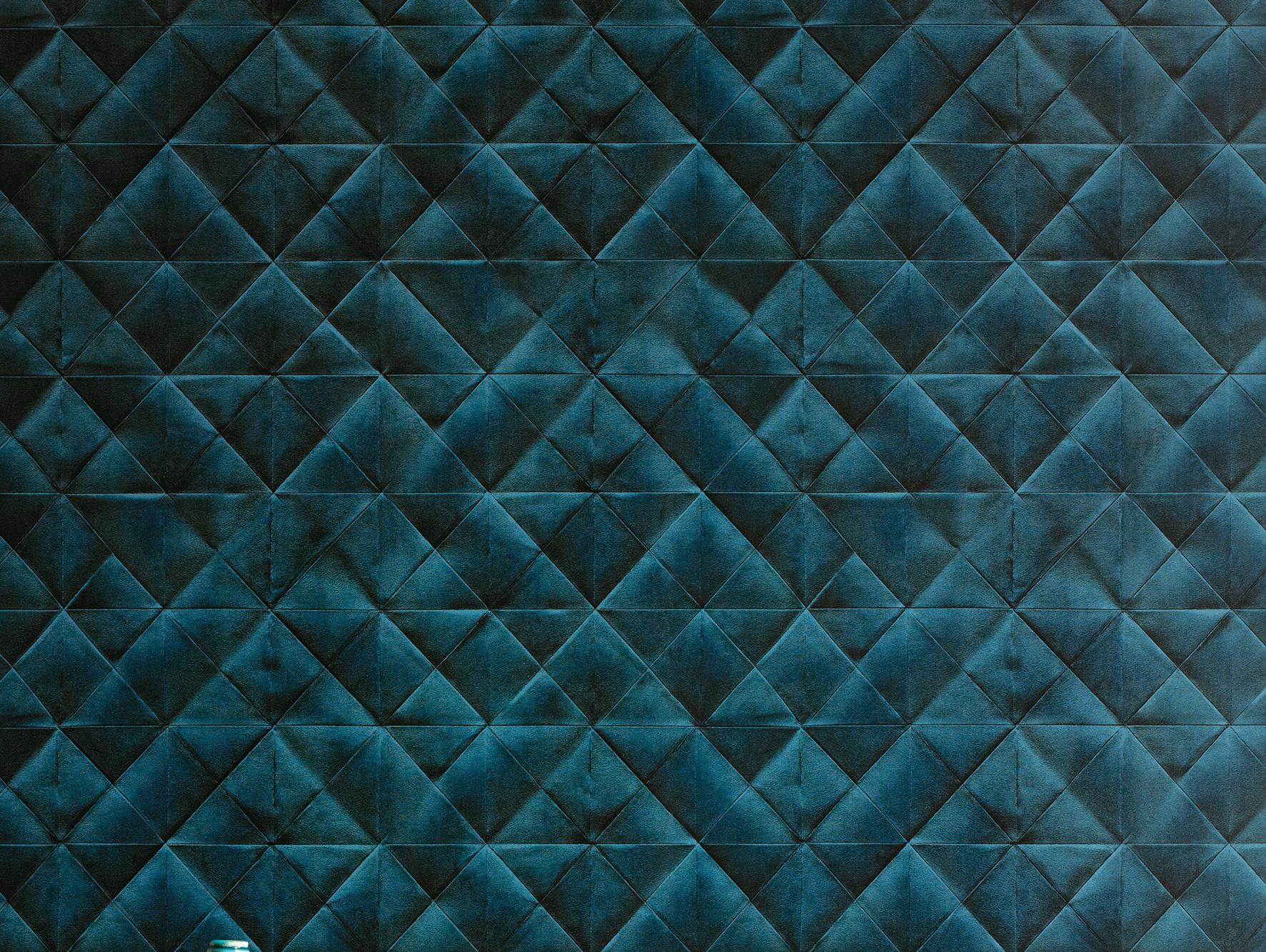
This week we’re looking at Textured wallpaper as an interior alternative. Using texture(s) in your wallcoverings can be a tricky technique to get right, but when it’s done well textured walls can be mesmerising.
We love designs that play around with surface textures, so for us textured wallpaper is really exciting. It can be quite a bold statement if used in a residential space: bare brick or stone, wooden panels, even more plush surfaces like the one featured below.
Textured wallpaper is particularly useful for adding an extra dimension to a room, or bringing it out of its more traditional context. How would you use textured wallpaper?
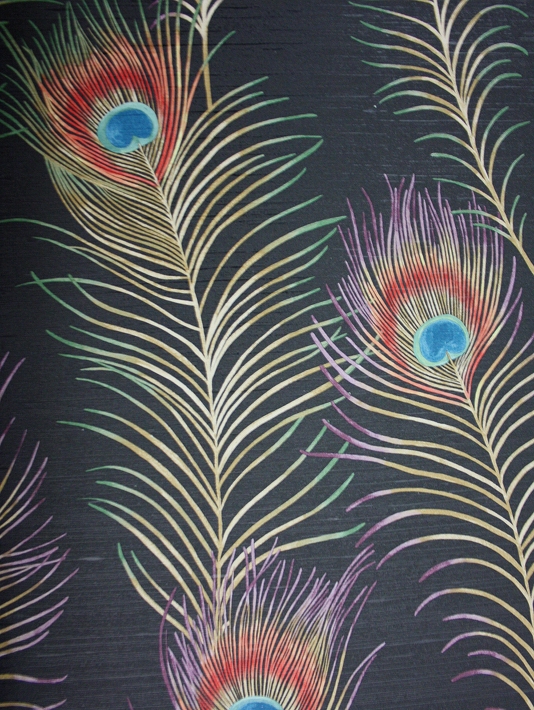
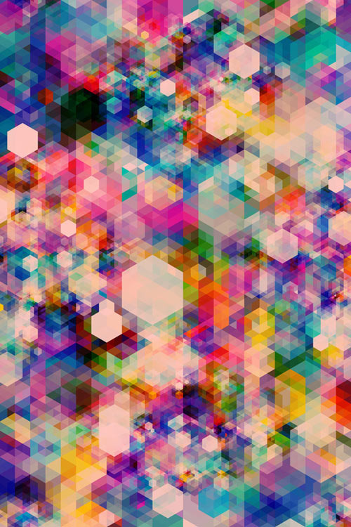
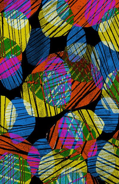
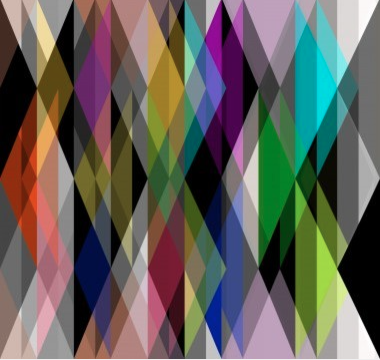
In this week’s alternative interiors blog we’re looking at Abstract designs.
Abstract patterns are always compelling, not least for their unusual quality. They’re also a good way of incorporating an artistic edge to an interior space.
We like these featured designs which make use of various colours, hues, and shapes to create diverse surface textures. The result is very alluring – you can’t help but be taken in by the complexity of each image.
Like Geometrics, Abstract designs lend themselves to many different styles, making them a versatile interior tool. Surface designers often make use of Abstract patterns as they add depth to 2D spaces (as in the above image).
Part of our ethos here at Moody Monday is to create designs that challenge traditional style concepts. Florals can be lovely, but they have a tendency to look twee and have been recycled again and again by various designers and artists. In this blog series we’ll be looking for alternative prints and patterns that can be incorporated into interior spaces to create a more original, striking, contemporary look.
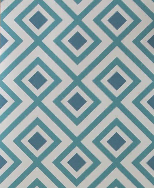
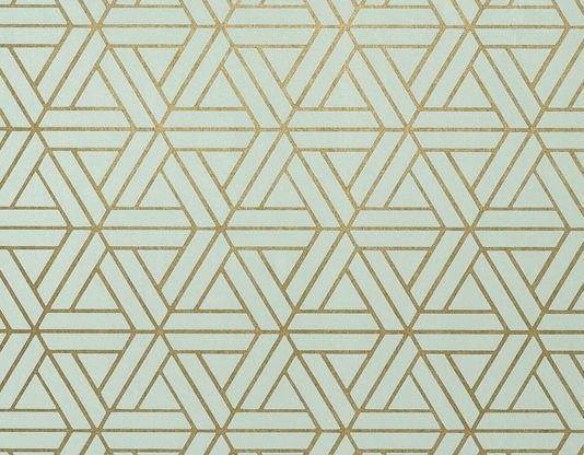
To get things started, we’re looking at Geometrics.
Geometric patterns are a great way to add a point of interest to a room in the form of a feature wall. They can also be used with accessories to jazz up block colours.
Geometrics are rather versatile too – they can make a room look contemporary and chic or provide a retro feel, depending on how they’re used. Making use of prints and patterns is also a good way to incorporate more colour into a space.
A word of advice about geometrics: be careful not to overuse these kinds of patterns in one space. Though the arrangement of various shapes and colours can look stunning, overcrowding a space will make it look confused and disordered.
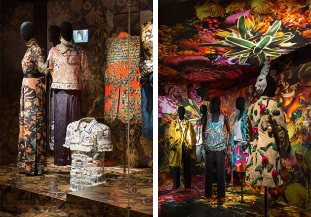
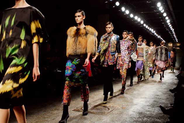
The finale post in our inspiring designers series looks at a figure whose family history is rooted in the fashion and textile industry – Dries Van Noten.
Browsing the summer 2015 collection is a real treat for the eyes – bright, bold colours, and lots of contrasting prints and patterns. This vivacity is juxtaposed by the materials used to create the garments – the use of silk and light, floaty materials softens the impact of the statement colours and patterns.
Noten’s ability to combine such busy prints and patterns whilst avoiding the trap of overkill is what we (as print enthusiasts) find most inspiring. Noten’s designs are alive with artistic flair and beauty.