They say small rooms can be a headache, but they can also be a blessing in disguise! If you are looking to make the most out of a tiny space – be it a living room, guest bedroom or second bathroom, here are our top tips on making the most of it.
Using a pale colour scheme can make the space look more airy and bright, and even a tiny single bedroom can look quite spacious:
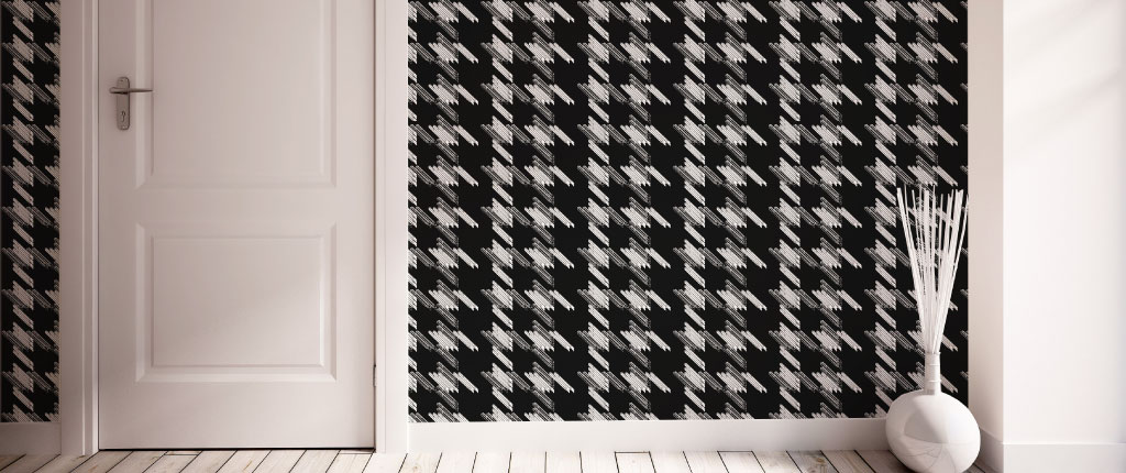
To keep the room from becoming too bland though, we recommend adding some bold patters or textures, such as a feature wall, to give a point of visual interest to the room. Here’s our interpretation, using the Black Keys wallcovering:
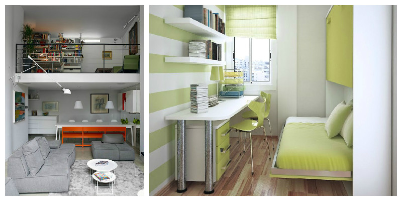
Using a small room for multiple purposes can be quite the challenge ass well, so that’s the best time to bring the big creative guns out. For example, consider incorporating furniture that isn’t your typical ‘home office’, but rather something that will bend in with the rest of the room design. Here are two examples, first of a living-room & study area, and the second of a bedroom & home office:
And finally, we’ve looked into small bathroom as well. We really dislike than feeling of being crowded and uncomfortable in a tiny restroom. Luckily, there’s a way around it, and we find that adding a dash of personality, with an accent call, can help to create the illusion of more space, even to the tiniest bathroom:
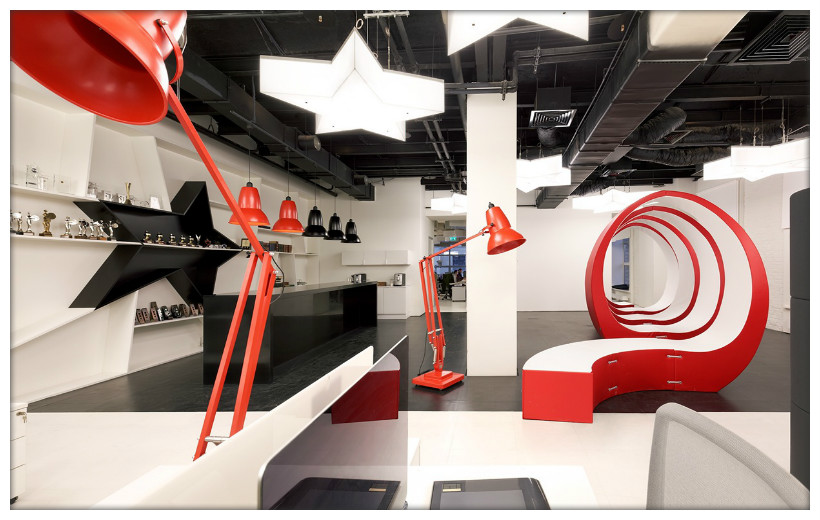
Have you seen Leo Burnett’s new office in Moscow? We have – well, virtually a least, and we think it’s a splendid large interior design! But as with most things in life, it’s all a matter of perspective. And with this giant pair of spectacles literally overseeing Leo Burnett’s open-office plan, you can’t help but see the very creative and stunning appearance of the place:
Created by Nefa Architects, and with with additional credit going to Dmitry Ovcharov, Maria Yasko, Daria Turkina and Maria Boyko, the space brilliantly combines a minimalist two-colour design, with the enormous pair of thick, black-framed glasses:
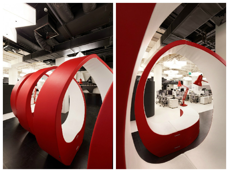
And to add yet another twist to the place, there space features a red coil of seating weaves, along other red accessories in the space; we particularly like the scaled-up red desk lamps that are placed around the large office space:
Looking at these pictures once more, we can’t help but read the underlying message the Leo Burnett is possibly passing on to their creatives: THINK BIG!
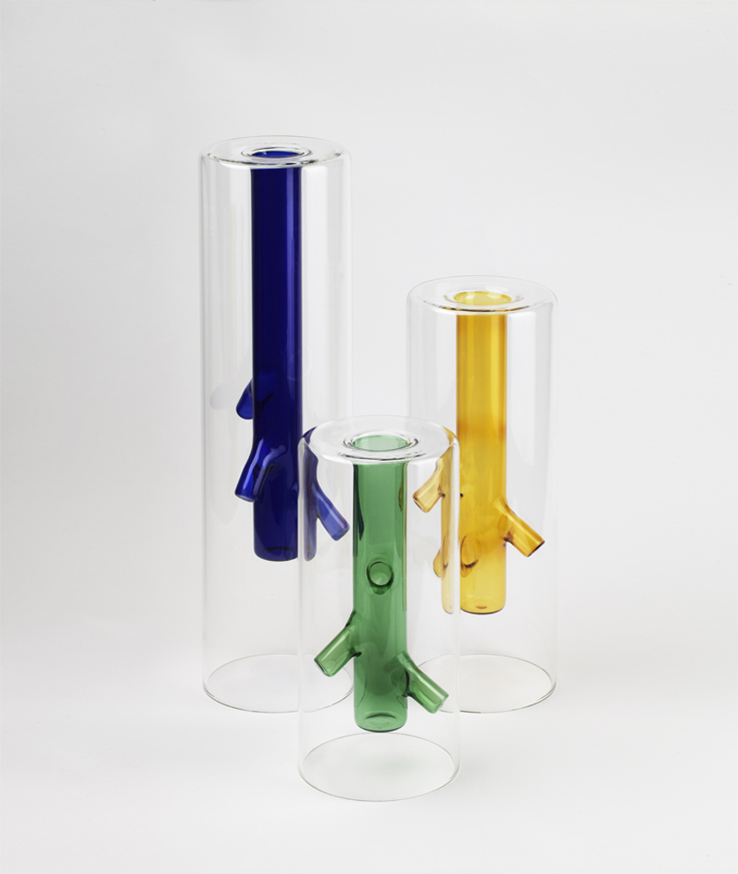
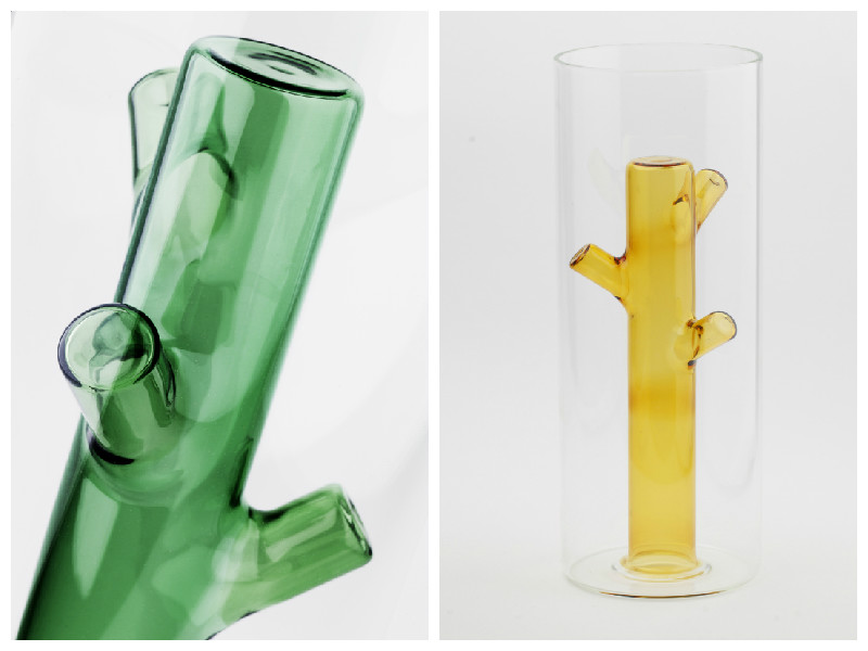
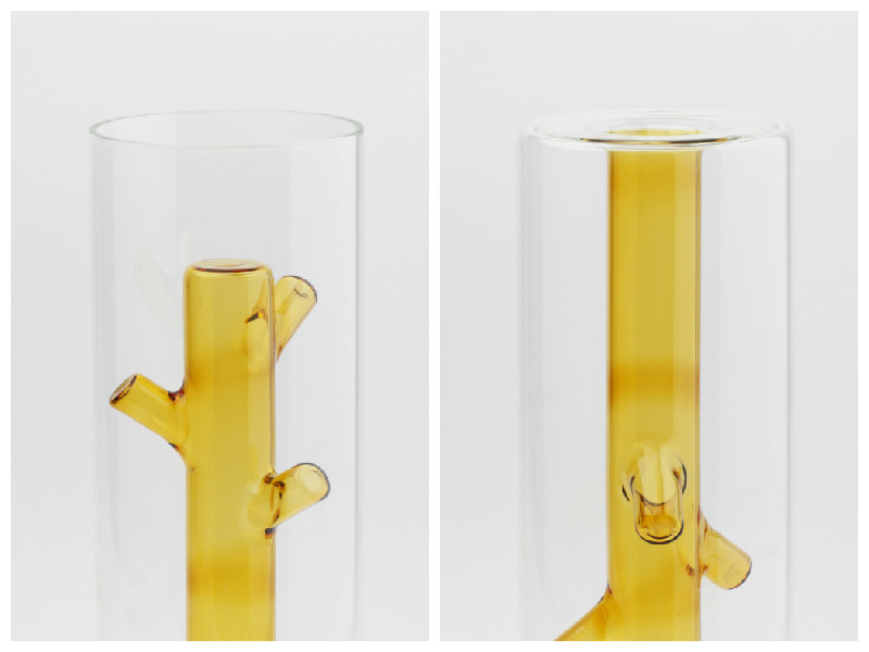
The Salone Del Mobile di Milano has recently finished, so we took a sneak peak to see what the latest trends in furniture design are. The first piece that grabbed our attention and won us over, are the root vases, created by Milanese designer Giorgio Bonaguro and produced by DRIADE.
We think these are a brilliant execution of an ambivalent object: they combine a simple, clear glass cylinder on the outside, with an internal element of coloured glass imitating the roots of a flower:
The creative vase is both appealing in design, and functionality as it can be turned and used either to hold one single flower, or flipped over, to hold a colourful bunch:
The vases are made in blown borosilicate glass, and come in three lovely hues: yellow, green and blue, the central colours of nature, representing the sun, grass and skies. What a lovely touch!
We found this gem online, and simply fell in love with it! The two floors of the Bangkok University Creative Centre (BUCC) designed by Supermachine’s architects Pitupong Chaowakul, Nuntawat Tassanasangsoon, Suchart Ouypornchaisakul, and Worawit Hongwiang are a mesmerising journey of colour, shape, light and texture. We love the way this large space design fosters creativity, in every one of its rooms and halls. The BUCC includes a workshop, library, exhibition space, viewing room and offices:
Bangkok University Creative Center is a perfect example of large space design to foster creativity
The entire large space design is centred around the 180 square-meter wall – “Lo-Fi pixel wall”, an installation of 10,000 custom-made rotating four-sided plastic pieces in pink, blue, green and yellow, that students can play around with, to create colour patterns or write messages:
The “Lo-Fi pixel wall” – one of the main attractions in the BUCC
We really like the feel of this place, as it seems to perfectly exemplify the type of oasis where creative ideas are born. In fact, just looking at these pictures is getting our creative juices flowing! What’s you favorite creative space?
With nature coming back to life, we’re continuing to look for inspiration in the lively world around us, and how creative nature elements can be used in interior designs, to add to the uniqueness of the room.
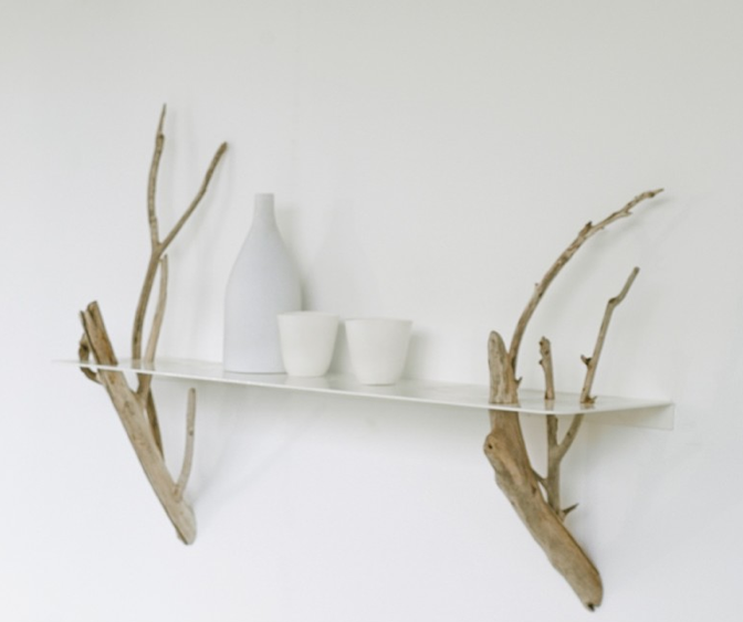
We were particularly drawn by this idea of bringing nature with into your living room. Essentially, we live surrounded by nature, so why not invite it in our interior spaces as well? This particular example gives the impression of having a tree growing out of your walls, bringing you a cup of tea! Refreshing!
This creative 2-in-1 chair and coat hanger is both functional and aesthetically pleasing; it saves space by incorporating a hanger into a chair, and it mimics a tree with growing branches. This is a whimsical take on the fact that traditionally, chairs used to be made out of wood from trees. And even though this one in particular is made of alternative materials – moulded plastic or a type of steel or metal frame, it still keeps the connection to nature, by taking the shape of a tree.
If you’ve ever wondered what it feels like to be a bird, this chair might take you closer to finding out. Taking inspiration from the shape of a birds nest, we imagine this chair to be a very cosy space, and another whimsical incorporation of nature into the interior space.
Do you use elements of nature into your spaces? We’d love to read your ideas!
We’re excited to share news form Moody Monday’s studio, on a collaboration we’ve been working on over the past few months. As part of a project initiated by Design Factory, Eliza of Moody Monday has joint creativity with light and paper sculpture designer Sharyn Dunn.
In this fusion, Eliza and Sharyn are looking to combine 2D and 3D in an almost sculptural piece, that will allow both designers to experiment with new materials, and work in new media: Eliza is particularly interested in developing her work in 3D, while Sharyn is passionate of pursuing further work in colour.
We’ve been keeping track of our progress on this exciting new project, and the photographs below were taken in the initial stage. The two designers have been sending designs, sketches and samples to each other, in order to agree on the direction to move forward with the project:
The work is challenging and exciting, as Eliza and Sharyn are working collaboratively with a fair physical distance between them too. This has definitely made it a challenge to meet and exchange ideas, especially in such visual and tangible forms of work. Luckily, that’s been bridged quite effectively by the use of modern technology, over the Internet, digital photography, emails, Skype and the more old school postal service.
We’ve now moved further with the project, so alongside paper drawing, we’re doing a lot of print & pattern design and folding in our Edinburgh studio:
We’re hoping for an outcome that will materialize as an accessible form of art piece (wallcovering or lighting accessories), by creating innovative, stylish objects with a practical end-use. In our vision, this product will add an artistic edge and personality to any interior space that’s looking for a contemporary makeover.
The project, once finalized, will be displayed in an exhibition at the National Centre for Craft & Design’s Roof Gallery, between July – September 2015, with more details following soon!
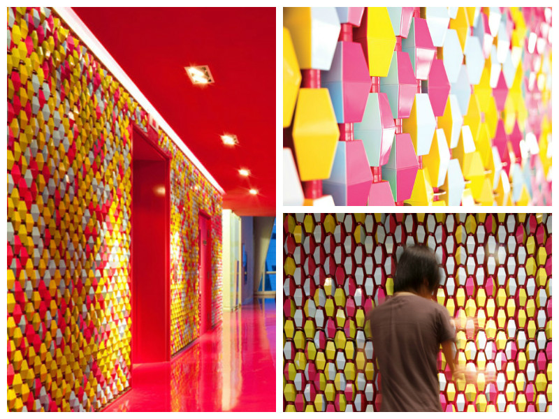
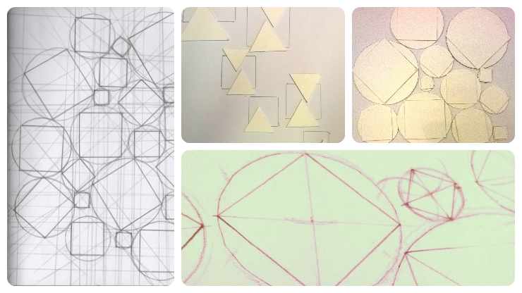
In this blog post, we’ve turned our antennas to the playful use of shapes and geometry, in interior design. Here are our top three picks.
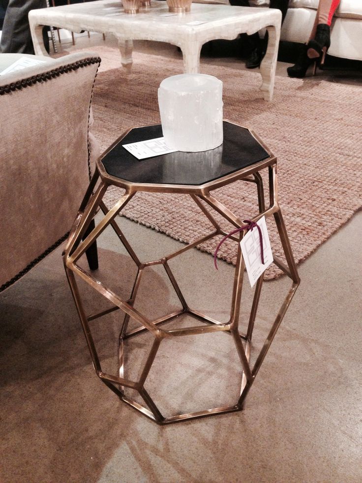
The first example stems from the tiny world of bees, as we think nature is a great source of exquisite inspiration. If bees had contemporary awareness and the ability to use and appreciate furniture, we’re sure they would have a lot to buzz about this stylish coffee table:
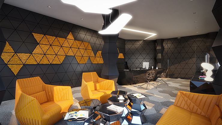
And since we mentioned bees, we think this wall covering would make for a nice match inside their beehives as well. In fact, the vibrant color mix and geometric pattern of the wall covering looks pretty stylish in this contemporary living room as well:
And in a more abstract composition, we like this particular feature wall that ties up in a contemporary, urban room. The play on various sizes and shades of gray rectangles creates a nice pattern on the accent wall, adding an extra coolness to the place:
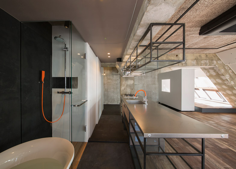
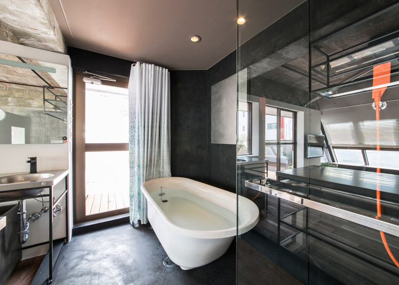
Sometimes, novelty comes in unexpected forms, or in this case – designs. G Studio has created a surprising interior in a loft apartment in Tokyo, with a truly unique feel:
Unlike the usual finished look of many modern trend interiors, dominated by polished surfaces and finishes, this very industrial design embraces the opposite of the sleek and smooth.
According to architects Teruya Kido and Suma-Saga-Fudosan, the intention was to reflect the real culture of Tokyo, especially as this particular living space is intended for tourists in search of alternatives to the classical hotel accommodation.
We think G Studio’s approach to this build is a reminiscent of Wabi-Sabi, creating a space that shines beautifully through its imperfect, impermanent and incomplete look.
In this new blog post series, we look at creating patterns through the use of colour, in order to create unique and lively interiors. We take our inspiration from spring/ summer colours and explore how these can be mixed and matched to recreate the zing of the season.
We start with a bold, orange themed interior:
What we particularly like about this interior is the mix of lively, bright colours and the predominance of curvy lines and organic shapes, reflected in the shape of the furniture and in the patterns on the wall coverings and coffee tables.
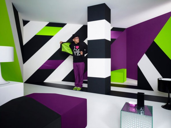
In a very different composition, we found this very contemporary blend of purple, lime green, black and white:
The straight lines and sharp angles used in this interior help create the illusion of extra height in an otherwise low ceiling room. The use of lime gives a fresh, spring-like feel to the interior. While the general rule of thumb is to use only two colours (three, at most!) for large areas, such as a feature wall, we think this particular design has successfully pulled it off with all four hues it features. Bold to the bone!
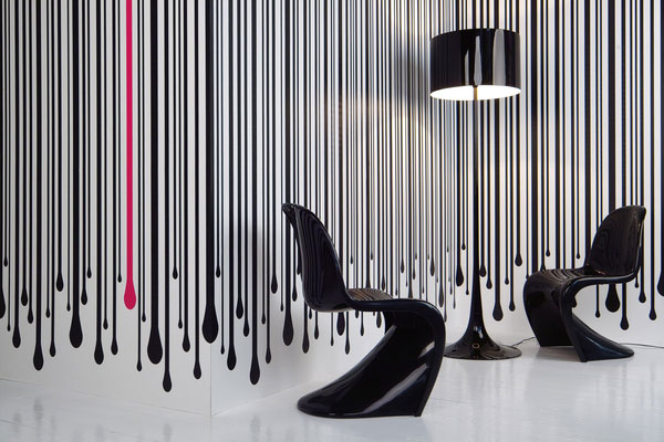
All colours aside, you can create a striking design, using just black and white and a sneaky pink accent:
This seemingly simplistic design also adds height to the room. While black and white is not a colour mix you would expect to find in nature, the drips on this wall art gives a touch of authenticity, and the pink drip in particular is a nice surprise to break the monotony. All in all, it’s an inspiring way of pulling together the neutral flooring and the all-black chairs and lamp into a stunning and stylish interior design.
This week, we’ve had a new intern joining Moody Monday: Alexandra will be working alongside our Head Designer, Eliza Kesuma, to increase the company’s brand awareness and reach, through social media and marketing communication.
We’ve asked Alexandra to take the stage and introduce herself, talking about how she came to join Moody Monday, her previous experience, passions and ambitions for the future. This is her story:
“Here I am, on one of my last evenings of a short road trip in Denmark, checking my email, when I excitedly read the following subject line: “Interview Invitation”. Sender: Eliza at Moody Monday. Oh boy!
When I first read about the internship opportunity one week before, it seemed a perfect match for my previous experience, skills and interests, so I applied immediately. After a closer look at Moody Monday’s website, blog and social media, I started to paint a picture in my mind of this highly creative, closely-knit, vibrant and friendly organization – and I wasn’t mistaken.
Meeting Eliza and Sara for the interview was a truly pleasant experience, as I genuinely felt we ‘clicked’ both personally and professionally. I left the venue happy, knowing that regardless which way this will go, we’ve had a productive encounter and a nice exchange of ideas. I was even leaving with a recommendation for a new book to add on my ‘must read’ list!
A few days later, I got the call from Eliza offering me the position, which I gladly accepted. And so here I am now, three days into the job, taking the lead of Moody Monday’s social media and marketing communication. I do have a few years of work experience in the field, so I’m confidently looking forward to use and improve these skills here, and to help drive Moody Monday on its path to reaching and engaging the right audience. I expect this to be a challenging and rewarding job. I can’t wait!
As for my other passions and hobbies, I occasionally participate in long distance running events, in support of various NGOs, and try to keep my personal blog up to date with random thoughts. That aside, I’m a naturally curious person, so I often drift into new projects: graphic and web design, photography, painting, crafts, etc. While I don’t see myself going into business with this like Eliza has, I do enjoy spending some of my free time on these hobbies. I like being around creative work, so I joined Moody Monday with a strong desire to immerse myself in all things beautiful. So far so good 🙂
On top of the internship, I’m currently finalizing my Master’s thesis remotely, and will be graduating from Aalborg University in Denmark this summer, with my degree in Market and Consumption.
As for the future, I’m looking to advance into marketing and communication, promoting businesses in various fields, so this field will continue to be my main focus for the upcoming years. However, I’ve always been a ‘Jane of all trades’, so I want to continue adding new skills to my ‘portfolio’. In the near future, I’ll be looking to develop my web design experience, which at the moment is at an early hobby stage.
But all things in good time. In the meantime, I’ll be sharpening my creativity and marketing skills on Moody Monday’s social media space, so be sure to keep an eye on these!”
We use cookies to enhance your browsing experience, and analyze our traffic. By clicking "Accept", you consent to our use of cookies.
Functional
Always active
The technical storage or access is strictly necessary for the legitimate purpose of enabling the use of a specific service explicitly requested by the subscriber or user, or for the sole purpose of carrying out the transmission of a communication over an electronic communications network.
Preferences
The technical storage or access is necessary for the legitimate purpose of storing preferences that are not requested by the subscriber or user.
Statistics
The technical storage or access that is used exclusively for statistical purposes.The technical storage or access that is used exclusively for anonymous statistical purposes. Without a subpoena, voluntary compliance on the part of your Internet Service Provider, or additional records from a third party, information stored or retrieved for this purpose alone cannot usually be used to identify you.
Marketing
The technical storage or access is required to create user profiles to send advertising, or to track the user on a website or across several websites for similar marketing purposes.