


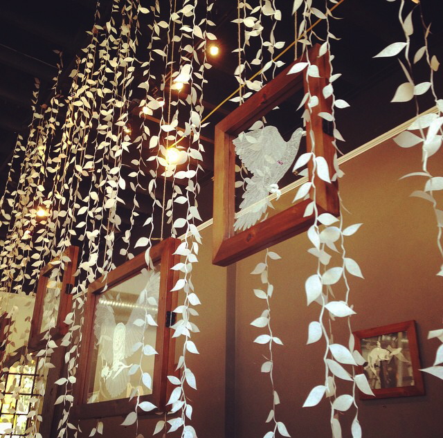
Many creative designers have a knack for exploring elements of their environments to motivate and inspire them in their creative journey. The brand we’re featuring today takes you right into nature with their exquisite lamp collection.
For their very first collection, Temple and Ivy were inspired by the flamboyance and beauty of birds they encountered on their African travels in Kenya and Zimbabwe. They are also captivated by the Georgian era which was heavily characterised by the use of feet in furniture design.
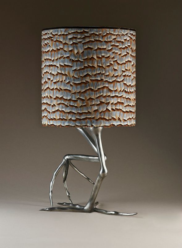
Shella Lamp, Inspired by the African Jacana with a handmade feather shade
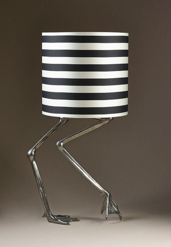
Shangra Lamp, Inspired by the flamingo with black & white silk shade
Using modern materials and traditional sculpture, these lamps are beautifully handcrafted in the UK and come in a variety of finishes ranging from copper, bronze to gold leaf. For lovers of texture, some are also adorned with feathers, beads and other interesting materials like this beautiful Multa lamp (pictured below).
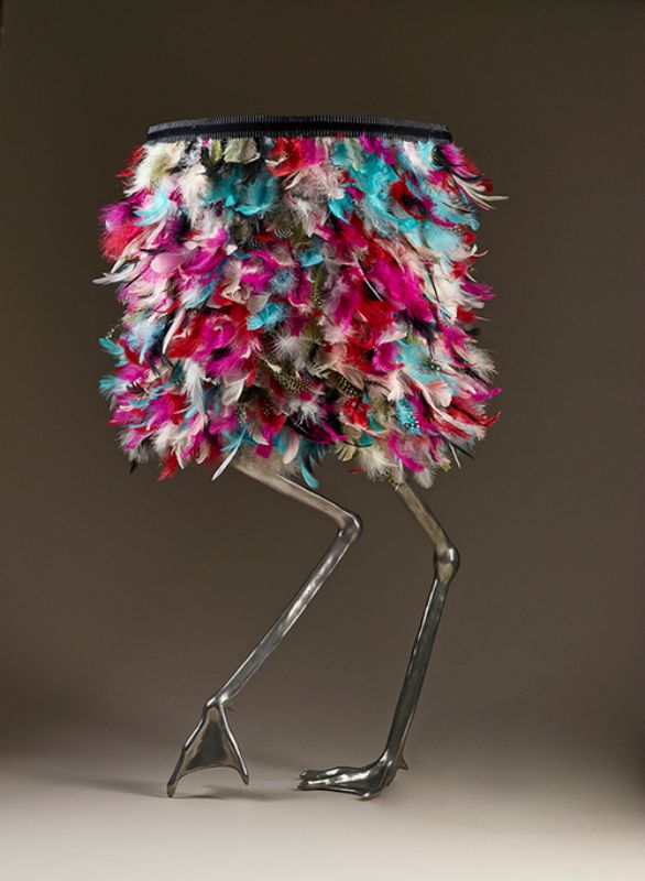
Multa Lamp Inspired by the flamingo in a multicolour shade
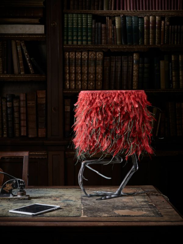
Kambu Lamp, Inspired by the African Jacana with red dual feather shade
Whether it’s a traditional or contemporary style room you’re decorating, these lamps are delightfully perfect for adding character and a unique sense of style. Certainly perfect for a Moody Monday interior!
If you’re looking to see more of these exquisite lamps, visit http://www.templeandivy.com/
Images were reproduced with their permission.


